


Ghost Town Oats
Outstanding Packaging: Milk / Alternative Milk / Creamer
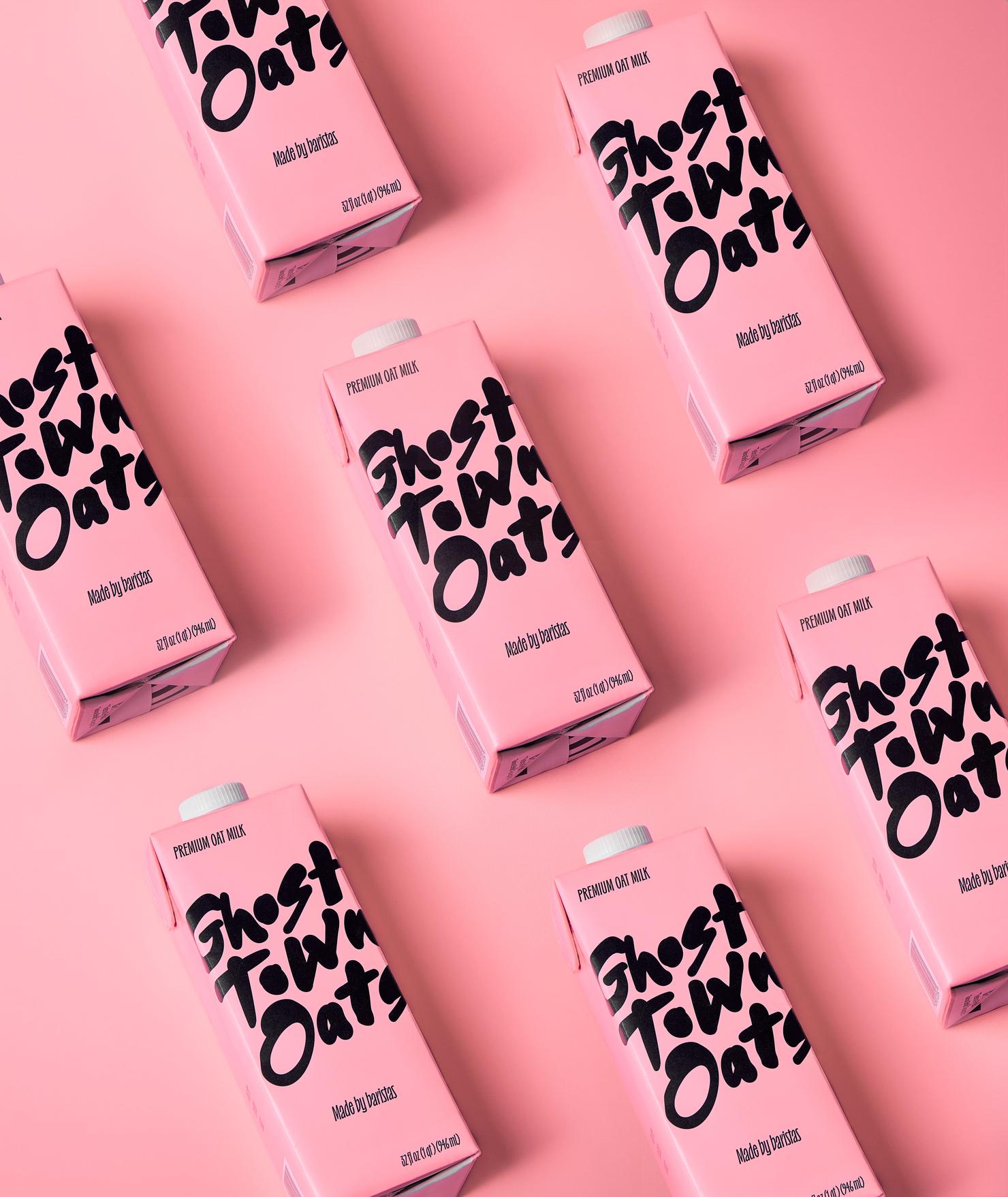
The Ghost Town Oats packaging, designed by Alisa Burzic, is a masterful fusion of minimalism, playfulness, and urban charm. Anchored by its striking blush pink hue, the carton commands attention without overwhelming, offering a refreshing contrast to traditional neutral-toned alternative milk packaging. The bold, hand-rendered typography of the “Ghost Town Oats” logo delivers both immediacy and authenticity, exuding an effortless coolness that resonates with its audience.
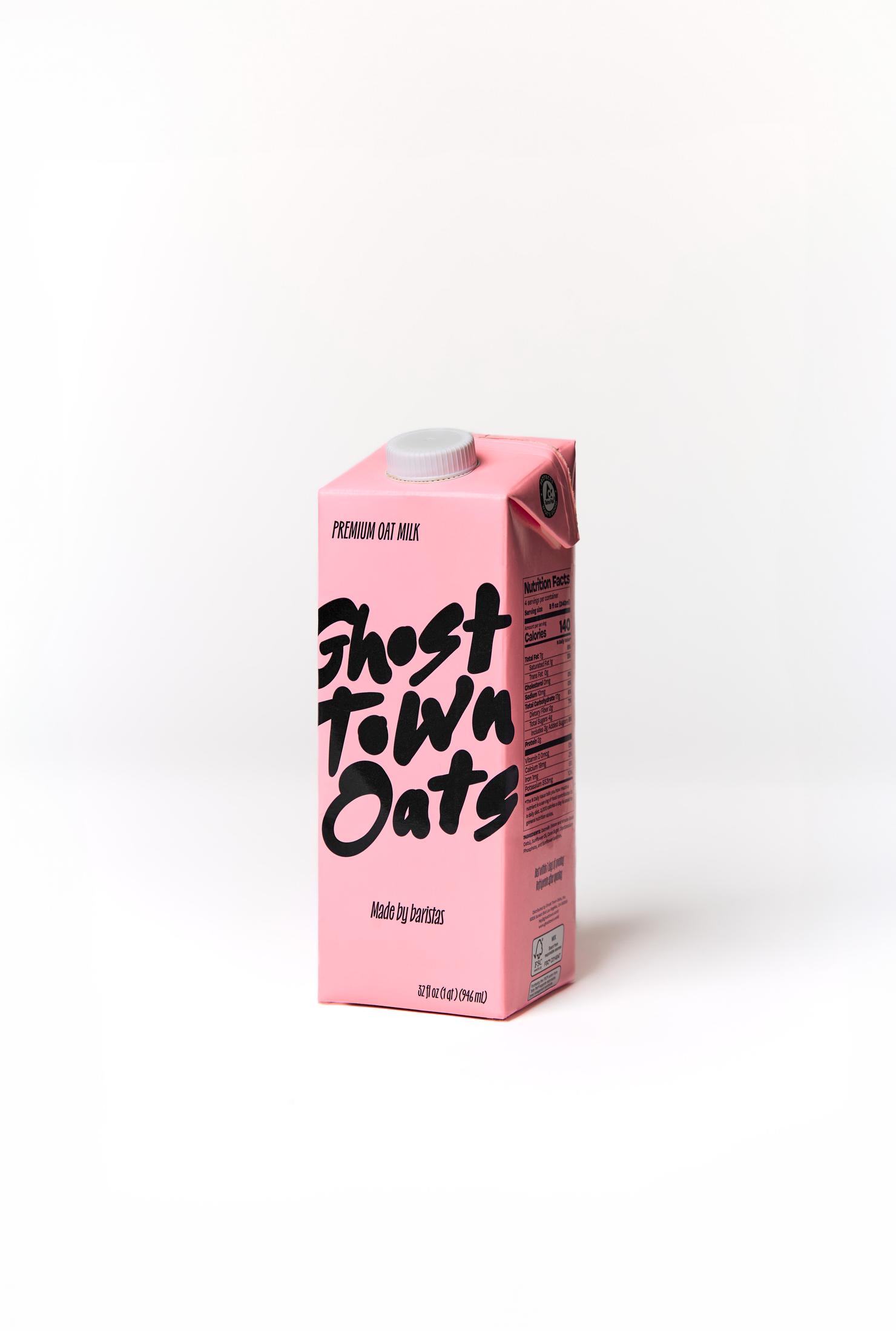
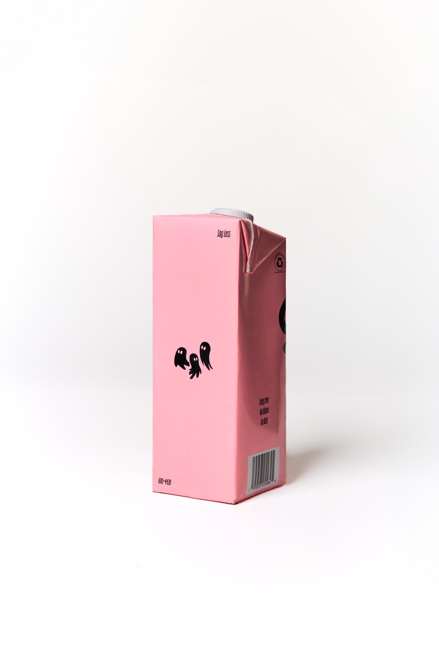
Subtle yet impactful, the whimsical ghost illustrations provide a clever nod to the brand’s identity, adding a layer of intrigue and personality. With the tagline “Made By Baristas,” the packaging speaks directly to its core demographic, reinforcing its premium positioning while maintaining approachability. Burzic’s design strikes the perfect balance between form and function—making the product a visual standout on shelves while telling a story that’s as thoughtful as it is imaginative.
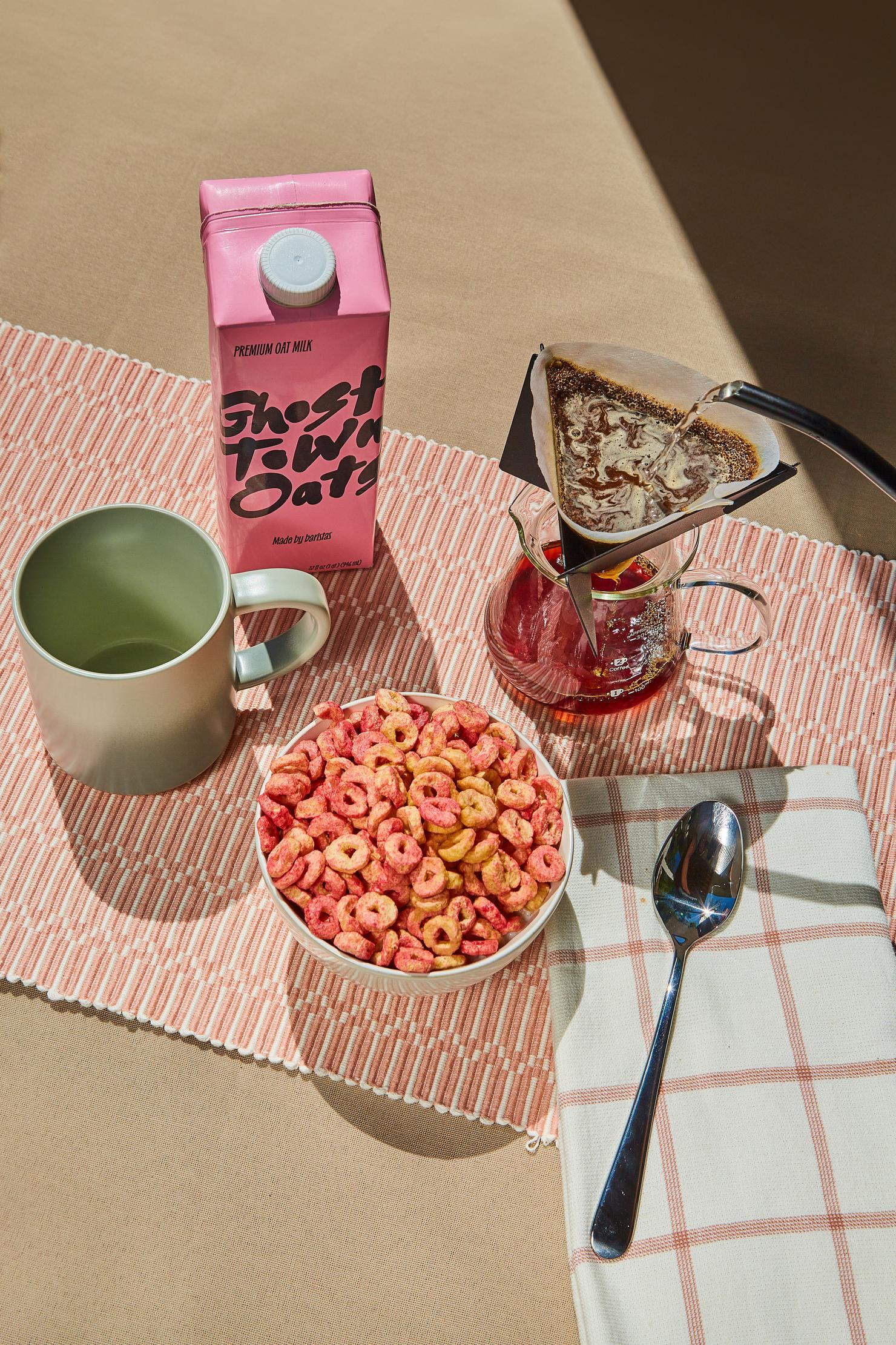
Featured photography by Keenan Hadley