


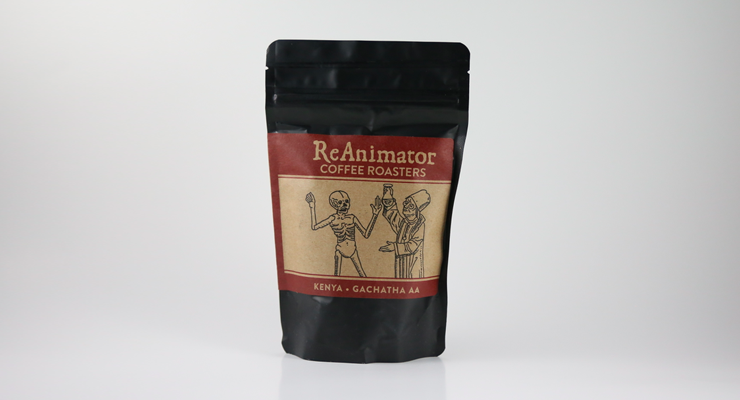
For our friends and partners at Reanimator Coffee of Philadelphia, the brand’s distinctive skeleton-and-alchemist design has won fans and converts from around the world—and become some of the most asked-about advertising art in our website’s history. When it came time for a refresh last summer, it wasn’t about changing that defining art, but rather freshening up everything around it. This is a brand on the grow—no more hand stamping now!


As told to Sprudge by Matt Scottoline.
When did the coffee package design debut?
We debuted our new bags in Summer 2015, after many months of careful design work.
Who designed the package?
The bags were designed by Mike Almquist, a really talented graphic designer and friend of ours who lives in our neighborhood in Philadelphia. Mike has done work with other Philly companies, including Little Baby’s Ice Cream (who we often do affogato collaborations with), and was really helpful in helping us create a bag design that preserved our aesthetic while updating and modernizing it.
Please describe the look in your own words!
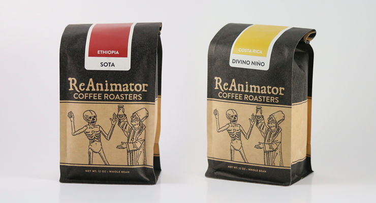
Traditionally, our bags have always been incredibly basic and functional, serving mostly as vehicles for the coffee, and nothing more. From the beginning of ReAnimator, we had used plain craft bags, and hand-stamped the logos and coffee information, one by one. As we’ve grown, we needed a more sustainable packaging solution, as our poor hands were starting to get very tired from all the stamping. Additionally, we wanted to create more visual differentiation between coffees that wasn’t just plain text on bags.
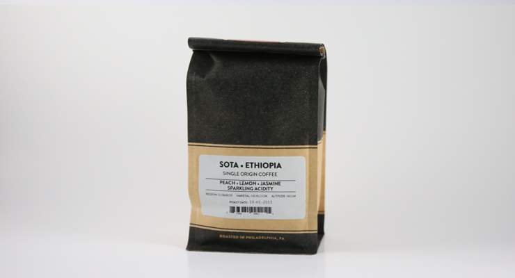
The solution we came up with was a seasonal color-coded sticker system, with unique colors attributed to different coffee-producing countries and regions. This acts as a visual cue for customers, and helps differentiate the origins of coffees and blends while they are on a shelf next to each other. Along with the colored stickers, we switched the bag from plain craft to a printed black craft to create a more distinct look.
Overall, we feel like this bag still serves as a functional vehicle for the coffee, but in its simplicity, it conveys all of the necessary information to customers. And we think it looks cool.
What coffee information do you share on the package? What’s the motivation behind that?
The front of the bags show the origin country and name of the coffee. We always attempt to be as specific as possible with the naming of the coffees, down to the farm, lot, washing station, co-op, etc. On the back of the bag, we have a sticker with our tasting notes, the region where the coffee is grown, the varietals of the coffee, and the processing method used. We also have the roast date and bar code printed on the sticker.
Where is the bag manufactured?
The bag is manufactured by Pacific Bag Inc.

For package nerds, what *type of package* is it?
It’s a printed craft block bottom bag with a custom form factor. It’s foil-lined, and has a one-way valve.
Is the package recyclable? Any other pro-environment info about the package you want to share?
Unfortunately, these bags are not recyclable. We’re hoping to work out the economics of using Biotre bags on our next order.
Coffee Design is a feature series by Zachary Carlsen on Sprudge. Read more Coffee Design here.