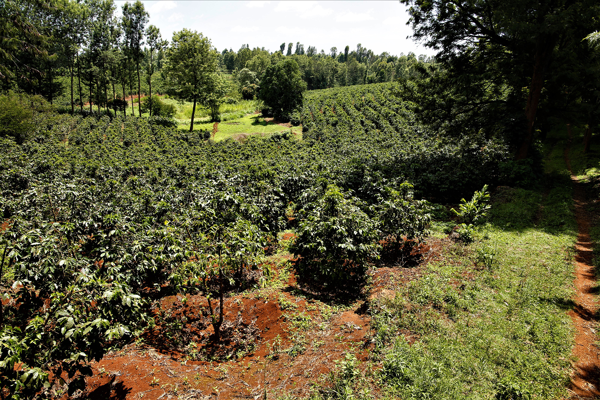


It’s always great to check in with Camber Coffee out of Bellingham, Washington, a brand that has been featured extensively on Sprudge over the last decade. This time we’re taking a closer look at Camber’s latest brand refresh, just in time for their 10-year anniversary. To learn more we spoke with David Yake from Camber.
What was the inspiration behind this design?

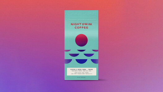
When we set out on a brand redesign to commemorate our 10-year anniversary, our goal was to arrive at a sleek, balanced, and refined expression of Camber that allows the complexity of our coffees to shine through.
The meaning of “Camber” is, simply, “curve” (a reference to coffee’s roast curve). We wanted to lean into this inspiration while also adding elements that pay homage to our original moon imagery.
In this new chapter, we aimed to create something grounded and timeless, while still feeling fresh and contemporary—both a step forward and a nod to our roots.

Who designed it?
Bellingham-based graphic designer Cameron Jennings.
From first vision to final product, how long did the design process take?
Well over a year.

Tell us about some of your favorite design details.
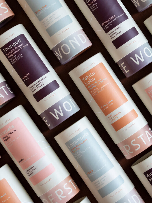
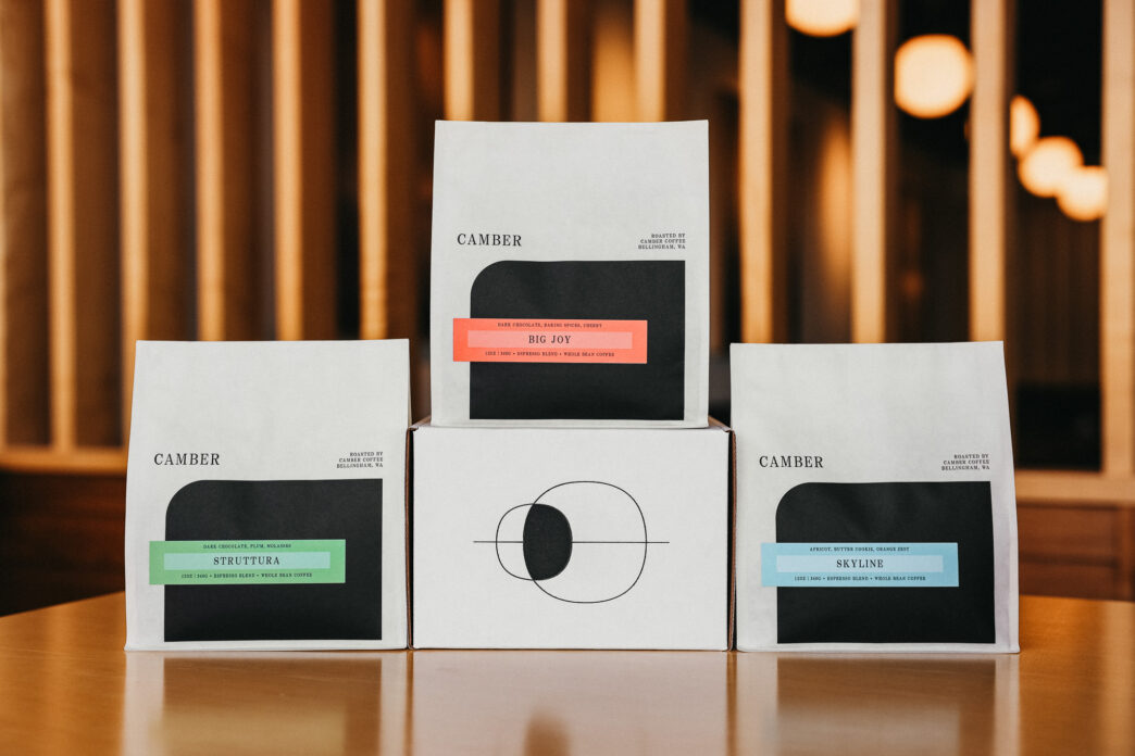
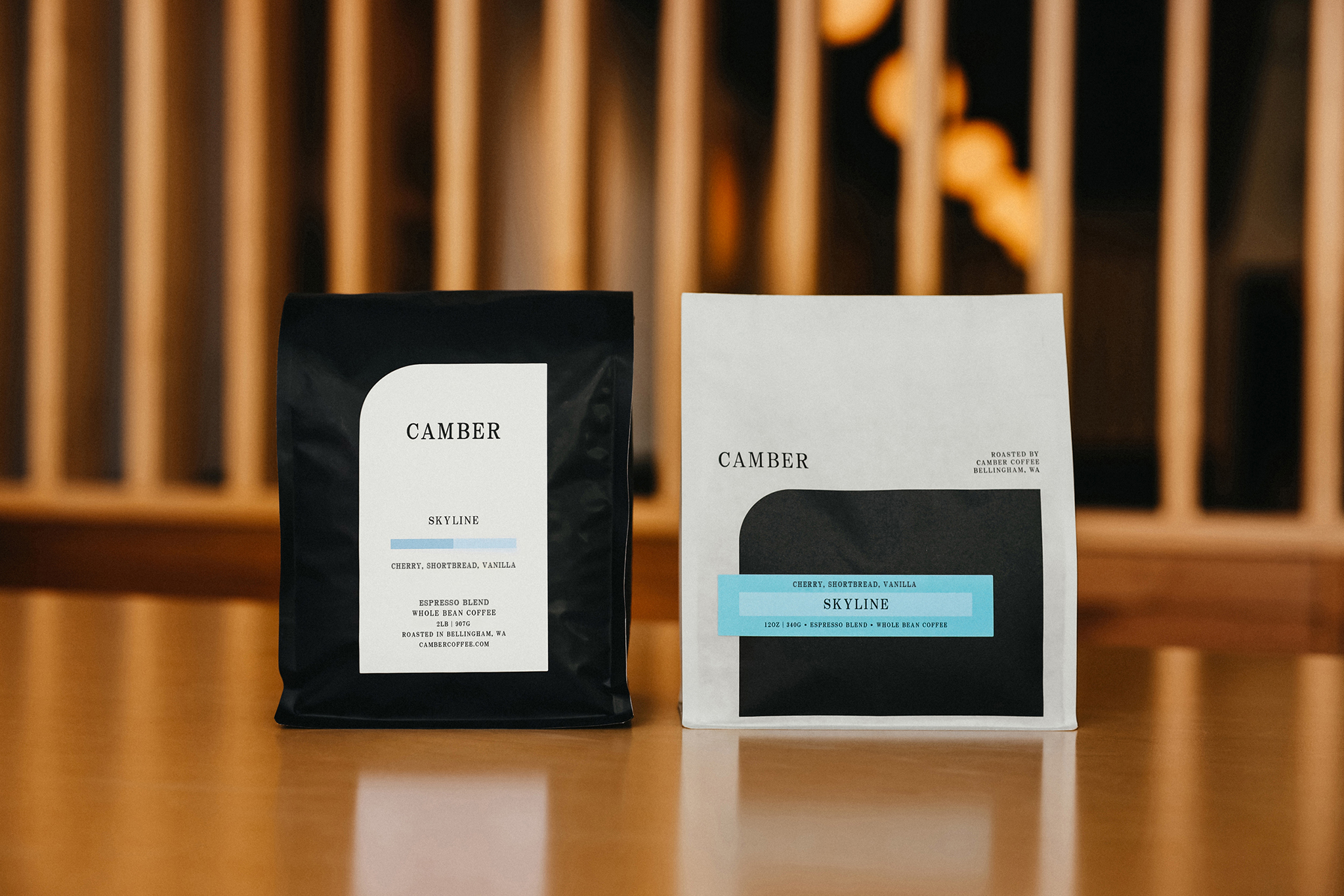
The curved black shape on the front of the bag draws inspiration from the meaning of Camber, which is “curve” (a reference to coffee’s roast curve). We wanted a bold, dark shape to provide contrast to the white bag, add balance to the asymmetry of the label and logo, and serve as an anchor for the design as a whole.
The ornamentation on the back of the bag was our way of integrating Camber’s original moon imagery and the brand’s connection to nature. Using the Golden Ratio, the mark consists of overlapping circles that evoke the feeling of moon phases or a lunar eclipse.
With the labels, we sought to incorporate colors that add balance, warmth, and energy to the design, and showcase the diverse spectrum of blends and single origin offerings in our ever-changing lineup.
How does the package design reflect the company’s overall branding and messaging?
The ethos of Camber has always been simple: to source exceptional coffees and roast them in a way that lets the unique qualities of those coffees shine through. By paring the packaging down to something simple and refined, we aim to allow the coffee to “speak for itself.”
Are there key elements of the packaging meant to educate the consumer?
Each blend label includes tasting notes, and each single origin label includes additional origin information (location, varietal, growing altitude, and processing method).

Are any of the packaging materials recyclable or compostable?
Our 12oz bags (Biotrē 2.0) are made from renewable plant-based materials. The bags are not recyclable or compostable.
Website URL: http://www.cambercoffee.com
Instagram: https://www.instagram.com/cambercoffee/?hl=en