


We’re always grateful for any opportunity to check in on the work of Blueprint Coffee, one of the defining third wave coffee brands of the midwest and still proudly collectively owned and operated since 2013. Blueprint’s new packaging design project gives us a wonderful opportunity to speak with Nora Brady, who is a “member” at Blueprint and also a decorated barista competition competitor. (Check out some 2013 and 2015 USBC coverage from our archives.)
Packaging redesign is a serious moment for any brand, particularly one well into its second decade like Blueprint. In this interview, Nora Brady tells us more about the team approach Blueprint took to this initiative, and how packaging design helps a coffee company convey what’s really important to them in a tangible, hands-on way.


As told to Sprudge by Blueprint Co-Owner and Wholesale Director Nora Brady.
What was the inspiration behind this design?
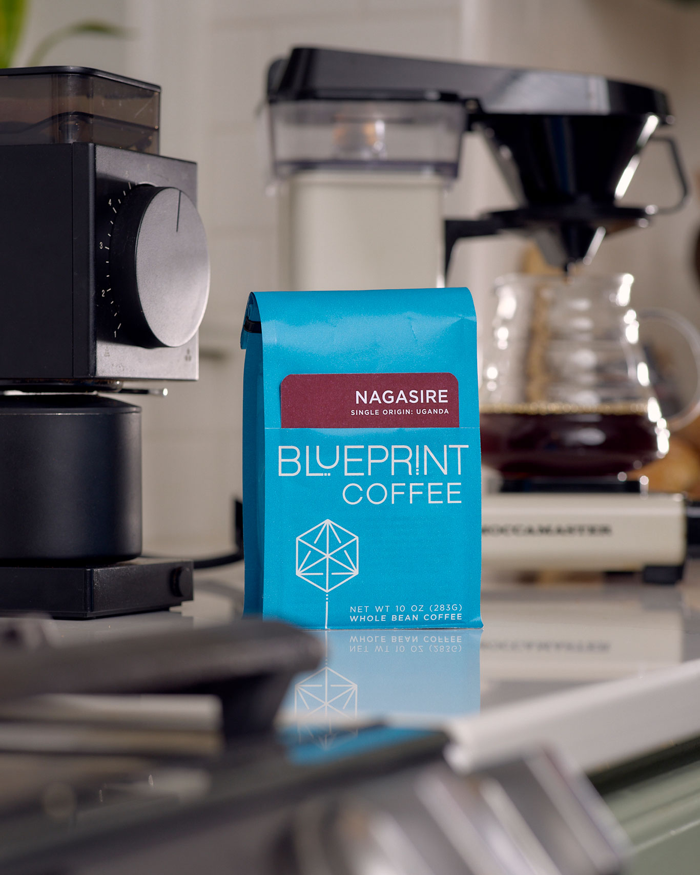
We challenged ourselves to incorporate more information about the coffees into the packaging—while also achieving an aesthetic that’s cleaner, more inviting, and still true to our brand. The card pockets were our clever solution. Each coffee is labeled by a removable, interactive, and collectible card that’s tucked into a pocket cut into the front of the bag. On the shelf, the bag is vibrant blue with clean, bold graphics. Pull out the card to find a trove of information about the coffee, and prompts to interact with as you brew.
Who designed it?
We designed these in-house. The team working on this project consisted of our graphic designer Mary Grayson Batts, Member & Wholesale Director Nora Brady, and Member & Director of the Roastery Mike Marquard.
From first vision to final product, how long did the design process take?
We started sketching ideas in August of 2023, and the new bags hit the shelves on August 23, 2025—so the process took about 2 years from start to finish.

Tell us about some of your favorite design details.
On the cards, we incorporated spaces for the customer to take their own notes as they brew. It’s a gentle prompt to record things like grind setting, water and coffee dose, and brew time, as well as tasting notes and other thoughts. We think it’s a great tool to help customers dial in brew parameters and record their impressions.
Are there key elements of the packaging meant to educate the consumer? (e.g., origin info, tasting notes, brewing tips)
All of the above! The cards include sourcing notes—a few words about the producers that grew the coffee and why we’re proud to partner with them. We also included tasting notes from our team. On the reverse, we provide stats like region and elevation, processing style, and varieties. For our blends, we’ve included step-by-step brewing guides.
Are any of the packaging materials recyclable or compostable?
The cards are printed on uncoated paper, so they’re fully recyclable.
How does the package design reflect the company’s overall branding and messaging?
We deeply value transparency and intentionality. Part of the reason for our company’s name is our desire to provide a blueprint to brew excellent coffee at home. At the same time, we always want to be welcoming and inviting—never inaccessible. By focusing on simple and bold graphics on the bag, and then providing a wealth of information on the cards, we found a perfect balance of being both approachable and informative. We think this packaging beautifully represents the thoughtful design and quality of craft that we’re known for.
Thank you!
Blueprint Coffee is available online, at their St. Louis cafes, and wholesale partners and stockists in the region and across the country.