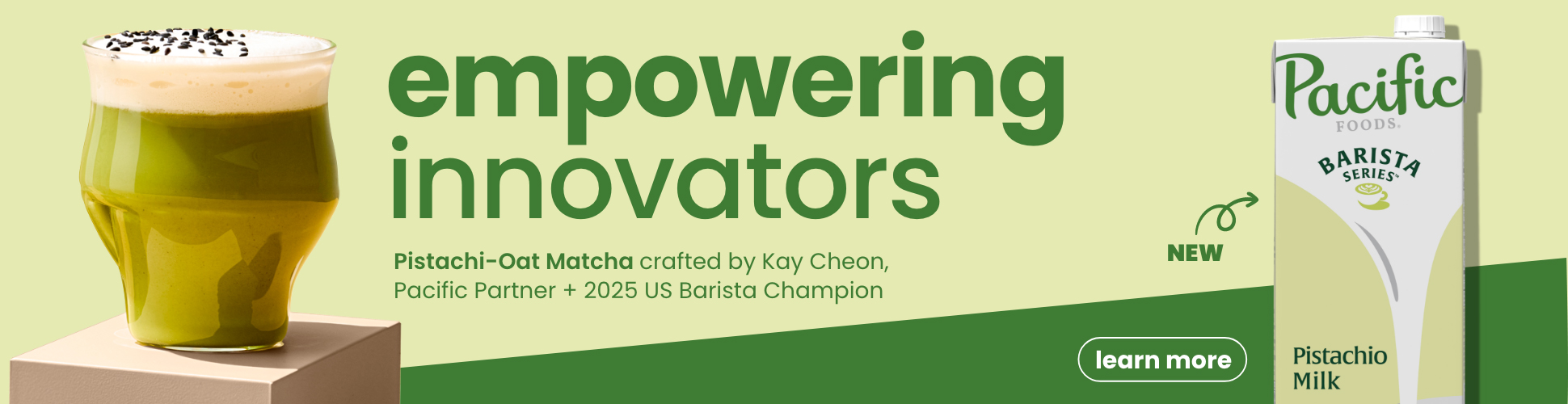


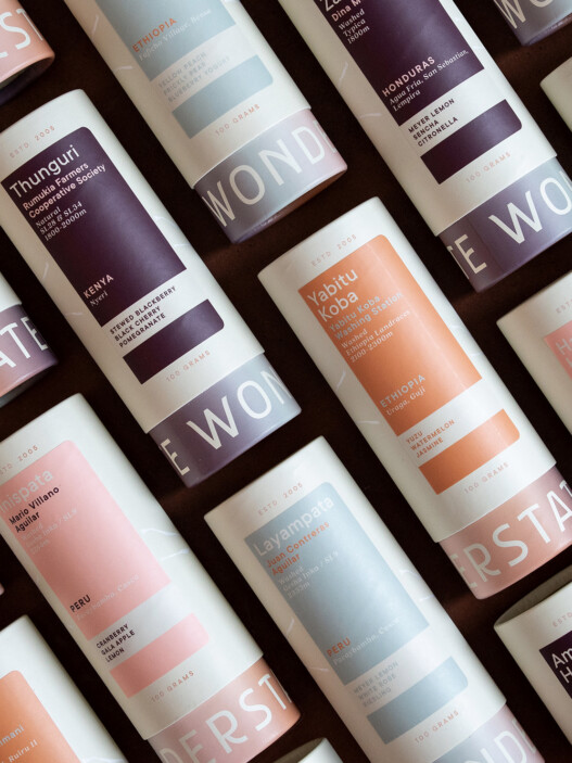
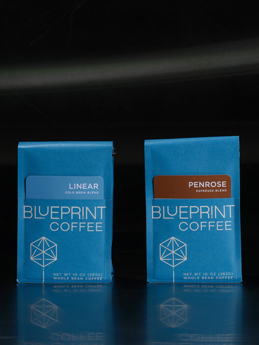
With an aesthetic that draws from the world of independent record labels, our friends & partners at Chromatic Coffee offer a design landscape theater of one-offs, collaborations, special editions and art pieces—if they could print these beans on colored vinyl, they would. This is a small specialty coffee company distinguishing itself through design. It’s some of the most dynamic and singular packaging you can find.

As told to Sprudge by Hiver van Geenhoven.
When did the coffee package design debut?
The Voyager debuted the week of May 11th, 2015.
Who designed the package?
I (Hiver van Geenhoven) designed the package, and created the blend and roast profiles for the final product.
Any design highlights you want to share?
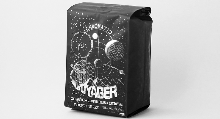
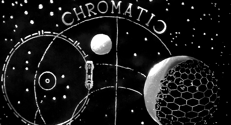
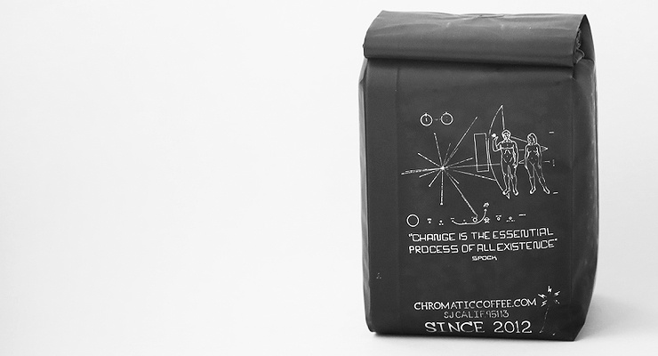
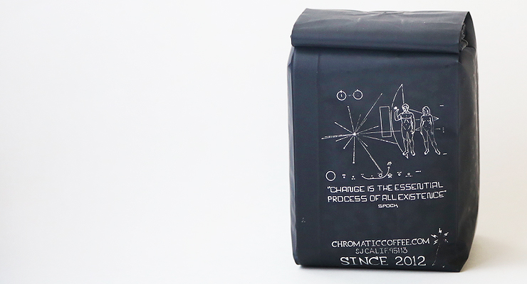
This package was stamped with a high-gloss metallic silver foil, onto a matte black, 3-ply, side-gusseted foil bag. The design is mostly hand drawn, with some designs made in Adobe Illustrator, and public domain images of the golden record found on the Voyager space probe.
Please describe the look in your own words!
The appearance of the bag is dark yet striking when viewed at the right angle. It calls for curiosity and may appeal to those who try and seek for a hidden message underneath an unassuming cover, with symbols that hold some mystery.
We have a friend that works at NASA that suggested we look for mission names, which lead us to Voyager. Another good friend designs space ships for Star Trek and urged us to watch the original Star Trek movie that goes into some pretty deep spirituality and philosophy. With that it just materialized into this particular expression. It was fun, and many minds contributed to its creation.
What coffee information do you share on the package? What’s the motivation behind that?
The blend is a concept to begin with. Given the specific quality we experience when preparing and drinking coffee as subject to variables in our environment, what one tastes is an experience only you will really know, regardless of how well you are able to express and communicate the specifics.
After the design of the “Holy Mountain”, I wanted to do another themed blend that would be fun for filter and espresso drinkers alike.
Where is the bag manufactured?
PBI is the manufacturer.
For package nerds, what *type of package* is it? What are the materials used?
The bag is hot stamped in-house by the production team. After the design is finished, I send the Illustrator file over to a die maker local to the Bay Area, where they use a process called photochemical etching to create a negative of the graphic. We then receive the die the next day, drill it, mount it, then hot stamp.
Is the package recyclable?
Sadly, not recyclable. We are still looking for viable sustainable packaging.
Location: Santa Clara, California
Country: United States
Design Date: May 11th, 2015
Designer: Hiver von Greenhoven, Chromatic Coffee
Coffee Design is a feature series by Zachary Carlsen on Sprudge. Read more Coffee Design here.

