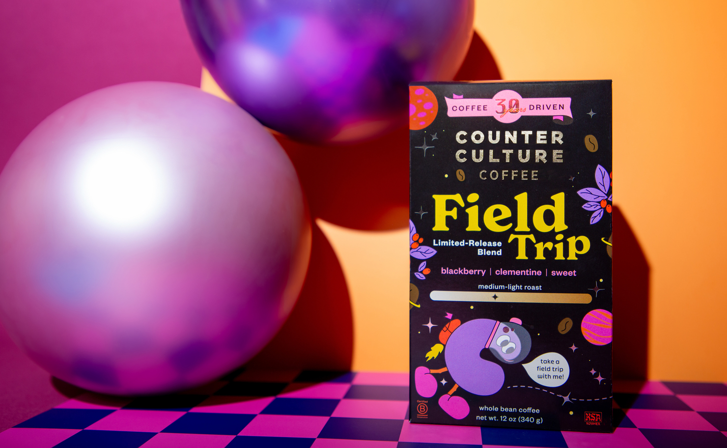


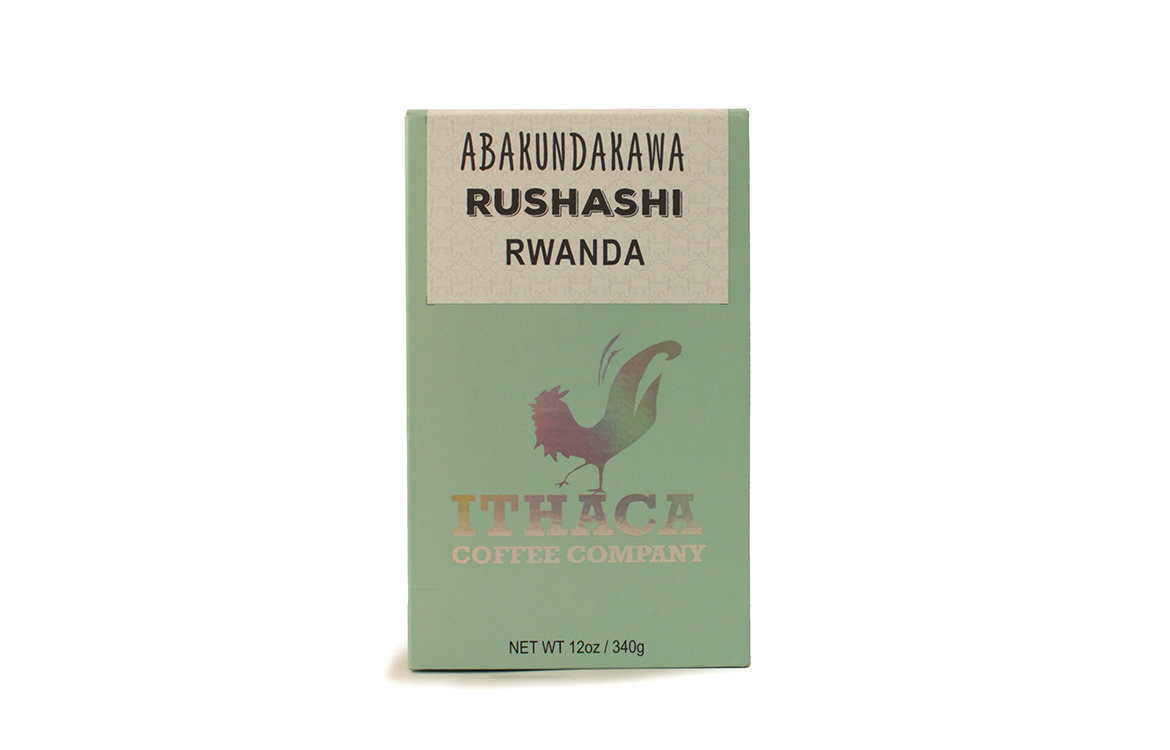
Ithaca Coffee Company brings bold colors and rainbow holofoil to its brand new packaging. The fifteen-year-old small-batch specialty coffee roaster out of its namesake Ithaca, New York operates out of two shops in the city. “Coffee is our primary focus, but we also have a nicely curated gourmet market and craft beer selection,” says Marketing Director Aaron Rovitz.

“There is a popular local saying that states ‘Ithaca, New York: 10 square miles surrounded by reality.’ We like to think of ourselves in that way,” Rovitz explained to us over email, “Our shops, and even our coffee, provide an opportunity to escape the day to day insanity while discovering something surprising, delicious, and… gorges (sorry… had to).”
When did the coffee package design debut?
We first rolled out the new package in our stores and online in early April 2019. Shortly thereafter we were selected to be featured in the 2019 Specialty Coffee Expo Design Lab where we debuted to the WORLD!!!! Woo-hoo!!! But in all seriousness, we really did appreciate the acknowledgment and exposure, so thank you SCA for keeping the Design Lab going.
How different is it from your previous design?
Our previous package was a tall 12oz kraft box using black ink printing, with some splashes of color coming from a few sticker labels. It had an earthy feel, but still reflected the sense of care and quality on which we pride ourselves.
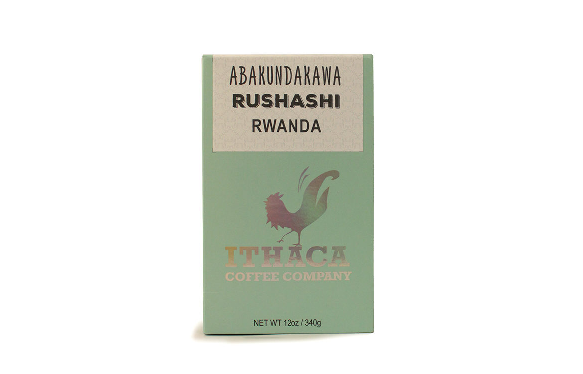
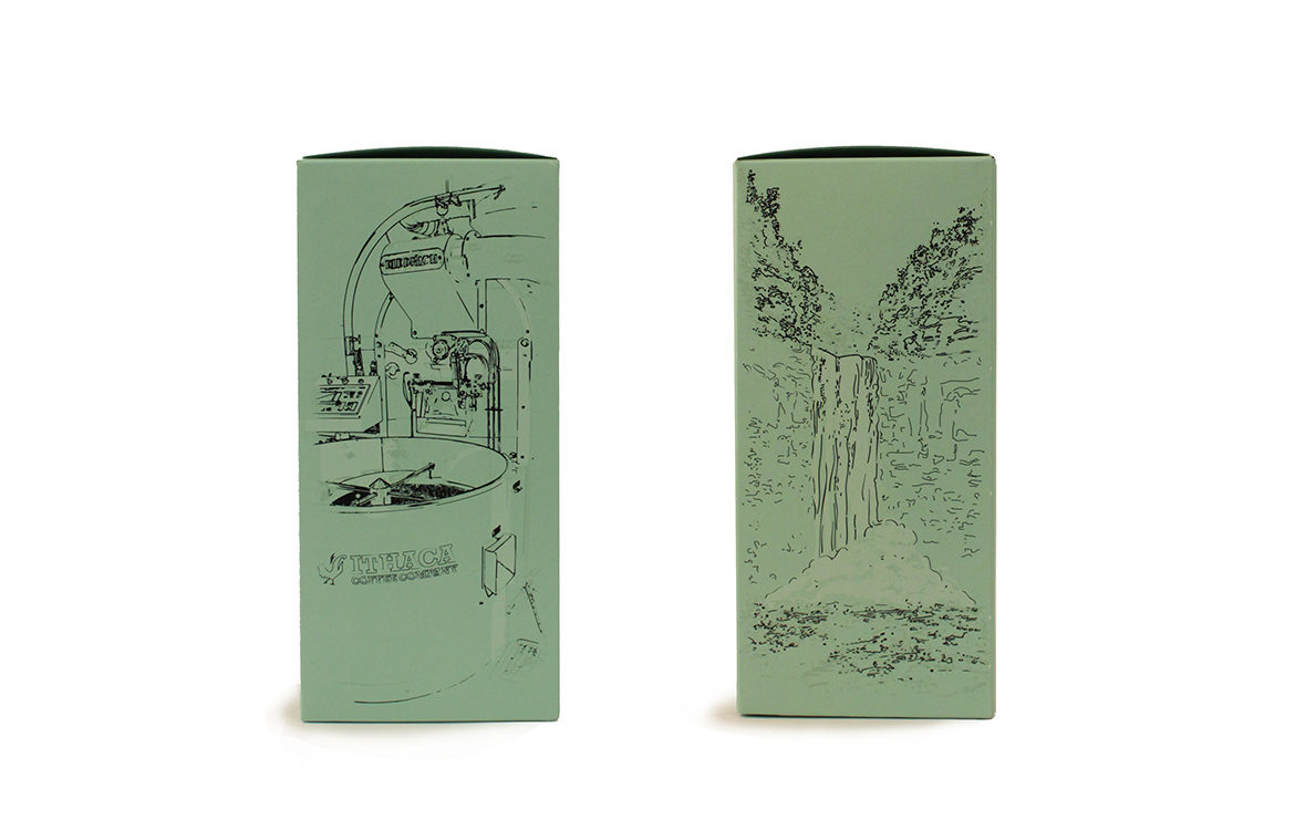
Our new package is still a 12oz box, but we have changed up the dimensions and format slightly so make it a bit more user-friendly. We also chose to print this box with fresh and vibrant colors, the two things we hope come first to mind when you think of Ithaca Coffee Company. We chose to feature bolder, cleaner, and more simple imagery while bringing the bling with our rainbow holofoil logo panel.
What was the inspiration for the new design?
We wanted the new package to better reflect our personality and principles as a specialty coffee roaster. The clean, fresh, and colorful design is meant to reflect the clarity and vibrant flavors highlighted in our roasting aesthetic, with a focus on sweetness and aroma. The side and back panels recognize the unique charm and beauty of our home city as well as our dedication to small-batch roasting. Finally, the labels are meant to acknowledge that as the coffee roaster we are merely the final link in the product chain, highlighting farmer or farm first, followed by region and country above our logo. Ultimately we hoped for a design as fun, exciting, and compelling as the coffee inside!
Who designed the package?
The package was conceived, designed, and executed 100% in house. The concept came from our head coffee roaster Chris Ganger, who worked with our graphic designer Nina Widger on creating the first pass. Then after some team input and collaboration, we ended up with the final design.
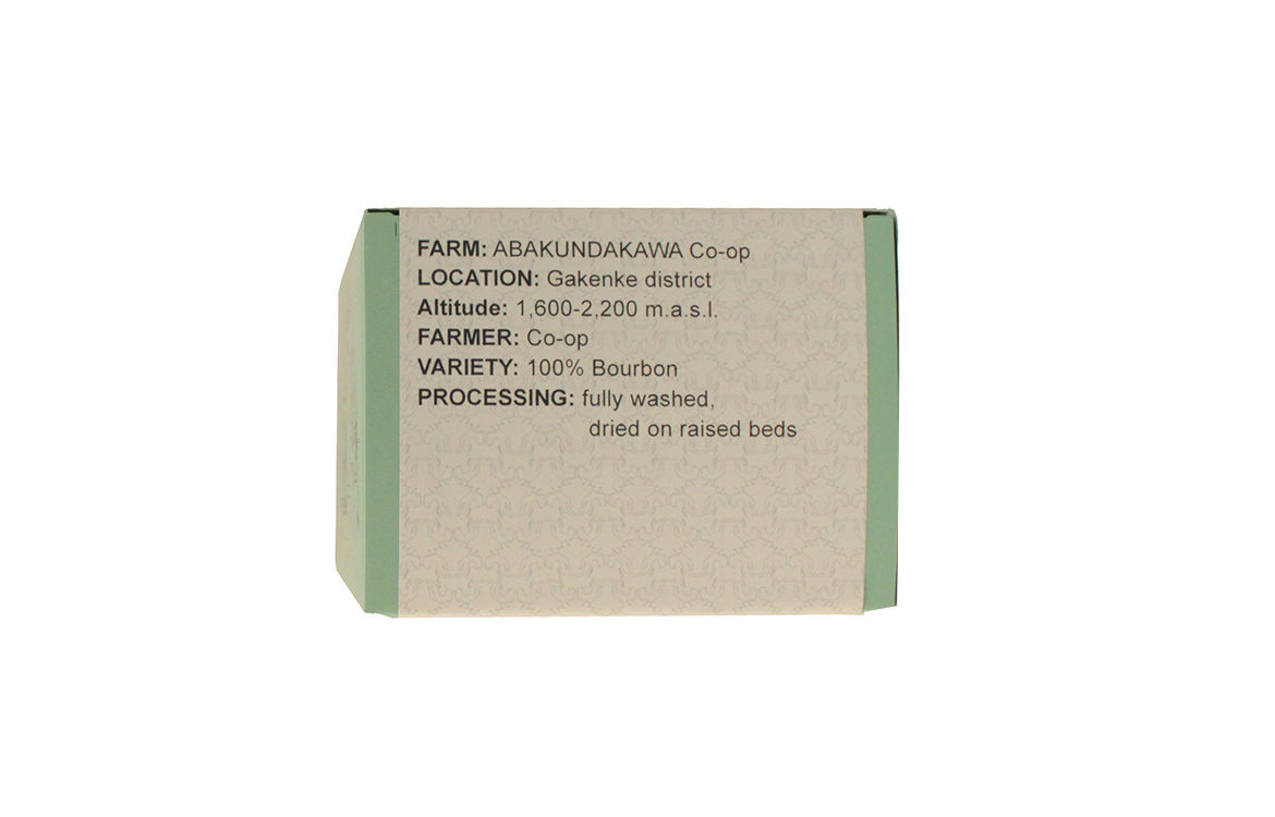
What coffee information do you share on the package?
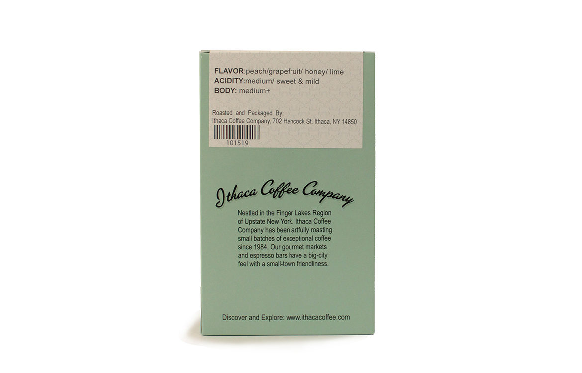
On the front the customer sees the farmer or farm, region, and country. On the top we elaborate on this with altitude, variety, and processing information. On the back we add a brief tasting profile outlining flavor, acidity, and body.
Why are aesthetics in coffee packaging so important?
For many people the package is their first introduction to your product, so of course you want something that is going to catch the eye and make them pick up the box to find out a little more. You also want it to be something that adds to their brewing ritual at home, something they can leave out on the counter or shelf that will enhance the experience with a pleasing visual element. For us, the most important aspect is to somehow convey something about the coffee inside as quickly and simply as possible. They aren’t able to smell and typically can’t see the coffee they are purchasing so they’re really taking a gamble if they’re just giving you a try without doing any research. If the aesthetics of the package can signal toward the aesthetics of the coffee, it can serve as a great guide to the customer.
For package nerds, what type of package is it?
Our boxes are printed and assembled by Professional Image who have been great to work with on this and past projects. The exact dimensions of the box are 4 x 3 x 6.5 inches. Our new box is printed on 18pt C1S stock, and used a matte aqueous finish. Our logo is printed on using a holographic foil from Infinity Foils.
Where is it currently available?
On our website and in our two retail locations in Ithaca, NY. We are also in Wegmans Markets in Ithaca and Johnson City Binghamton, and occasionally in the Kingston, NY Adams Fairacre Farms market. We are always looking for new wholesale customers and would be happy to ship some samples.
Location: Ithaca, NY
Country: United States
Design Debut: April 2019
Designers: Chris Ganger and Nina Widger
Zachary Carlsen is a co-founder and editor at Sprudge Media Network. Read more Zachary Carlsen on Sprudge.