


We’ve featured just about every kind of designer there is over the last five years of Coffee Design on Sprudge, a globe-spanning survey of the intersection between coffee culture and graphic design. Big firms, little start-ups, in-house designers, freelance illustrators, and just about every other version you can imagine. But how about a jack-of-all-trades coffee roaster? That’s the situation out in Omaha, Nebraska, where roaster Jason Burkum capably wears the graphic designer hat.
We spoke to Burkum to learn more about his multi-role approach to coffee, roasting, and design at Archetype Coffee.

Tell us a bit about Archetype Coffee.
I met owner Isaiah Sheese when he moved to Omaha in 2013. I was roasting for a different company at the time and there really wasn’t much specialty coffee to speak of in Omaha. We discovered we both had a love for Nordic/Scandinavian style coffee and were very calibrated in not only our taste in coffee, but our goals for what a coffee company could become.
Isaiah is a great visionary and began working on a plan to bring specialty coffee culture to the city of Omaha. It wasn’t long before I got onboard with his vision and in the spring of 2014 Archetype Coffee was born. Since then Omaha has a booming coffee culture, and we’ve grown from a single location small multi-roaster shop, into three locations with a new roastery that provides for our cafes and numerous wholesale accounts, and full kitchen that pumps out amazing food and pastries. Our style of roasting and brewing (something we jokingly call Scandi-merican, or American Scandi) is something we will always be honing and perfecting.
We’ve tried to be smart about growing slow and steady and it seems to be paying off. We’ve weathered the pandemic so far and have been able to take care of our small tight-knit family of staff, keeping everyone employed.
We are excited for what the future holds!
Who designed your packaging?
I designed it!
I’m first and foremost the roaster, but we all tend to wear a lot of hats, so I wound up as default graphic designer as well.
Except for our original logo and very first bags designed seven years ago (by local company Awful Creative) I’ve done all the graphic design for the company since rebranding about 4.5 years ago. Recently we’ve brought in some local friends to help out with merchandise design.
Tell us about the design and the significance of the colors and the shapes.
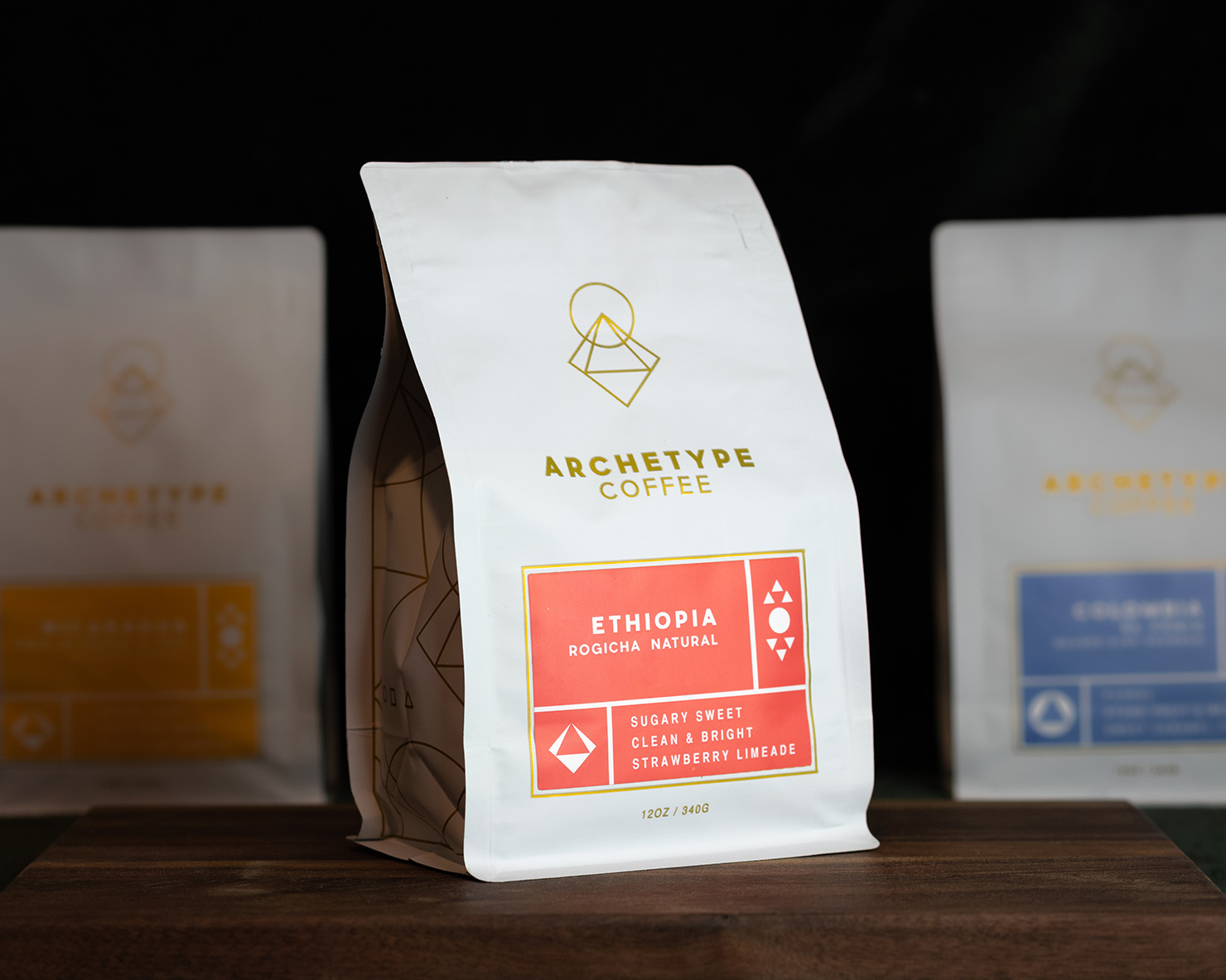
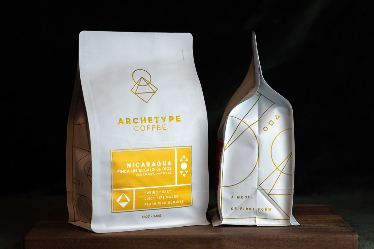
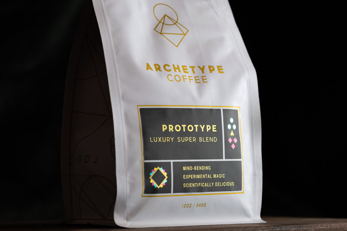
Archetype has always been a tough concept to get across. Either you get it or you don’t. We’ve heard some very interesting interpretations of what it means or even how to pronounce it. Originally we had a logo with a compass shaped like an A, with a bunch of companion images of other archetypal tools laid out to also be shaped like an A. It was a sort of “high-concept-high-fashion-black-and-white” look, and though it was done well there was a bit of a disconnect for a lot of our customers. A few years ago we wanted to bring more color and a more cohesive feel with the meaning of the name to the branding so we headed in this current direction.
The simple meaning of archetype is “a model or first form.” It’s an original. A leading design, construct, or concept to be followed.
So we took the idea of using the three main basic shapes and three primary colors, which are the building blocks of all shape and all hues, to visually symbolize the concept of archetype.
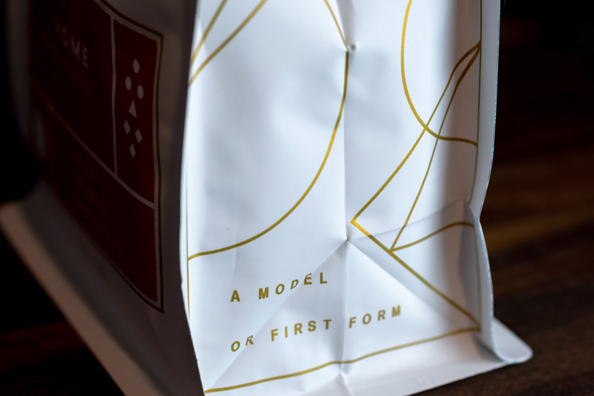
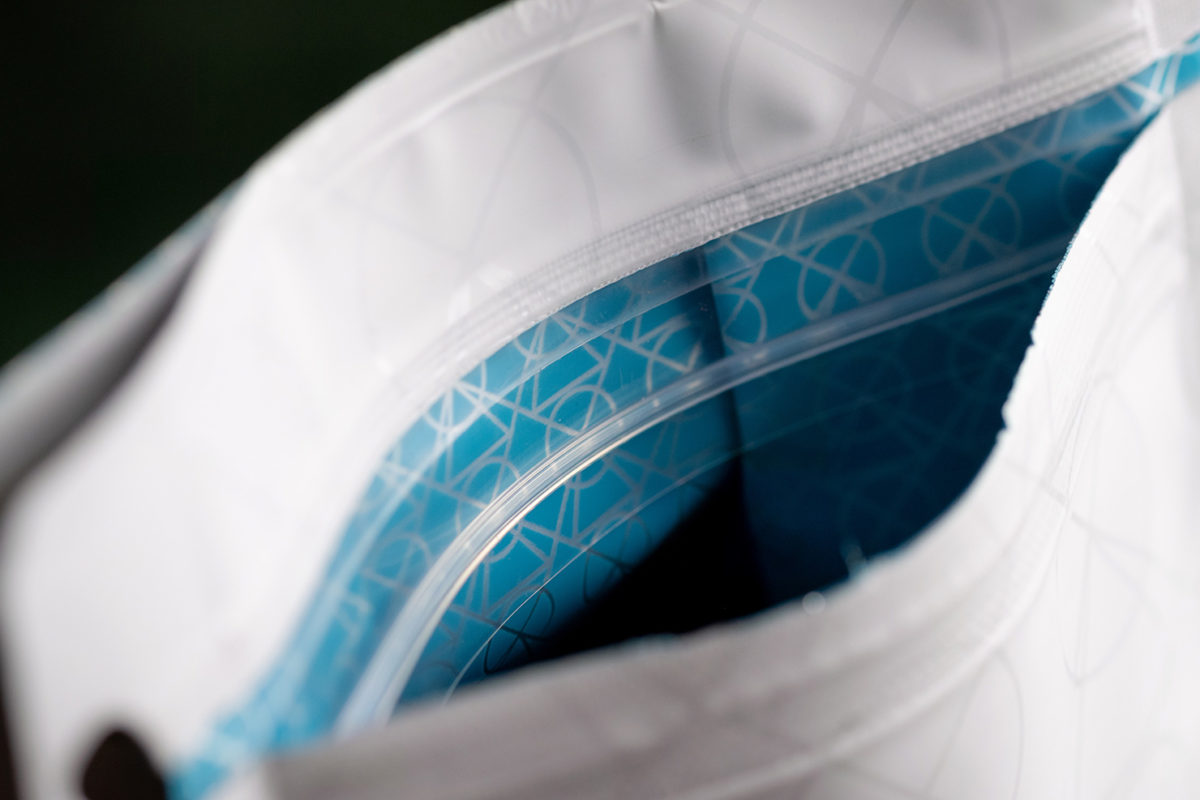
The “squircangle” logo (as we affectionately call it) usually appears as it does on the retail bag, in a single color as outlines. But it has also shown up in other variations with primary or CMYK colored shapes, often in layered, solid form. I suppose it’s a bit of a subconscious riff on the old Bauhaus School of Design study of color and shape as well. I think those images were buried in the back of my mind and made their way to the surface while trying to conceptualize a new design for the company.
Along with using these archetypal shapes and colors for the overall feel of the brand, we have attributed certain qualities to the individual shapes. The circle, for example, is used for comfort coffees, the triangle for adventure coffees, and the square turned on its point is a diamond for luxury.
You can see the general style and profile of the coffee represented in these symbols on the bottom left quadrant of each coffee label. Some are singular, some have a combination of two, or all three. The upper right quadrant of the label has the processing depicted by using the shapes to form droplets for washed, a sun for naturals, or a honeycomb for honey process, etc.
We didn’t want a million words on each label so we tried to keep it more icon-based and less verbose. This way it just has the name of the coffee and three tasting notes. The rest is shape and color.
Where is your coffee available?
My favorite way to enjoy it is in our cafes, but if that’s not possible we have wholesale accounts all over the midwest in Nebraska, Kansas, Iowa, Minnesota, and Missouri, and a few regional Whole Foods carry a limited version of our offerings. We ship coast to coast and even worldwide on our website. If you want Archetype we’ll find a way to get it to you.
How should we spend the perfect day in Omaha, Nebraska?
Well, of course, it would start with coffee and breakfast eggrolls at Archetype Little Bohemia but after that…
Hop on one of our many bike trails for an early morning ride and tour the midwest landscape with the city as the backdrop. After that hit up Olsen’s Bakery for a little doughnut carb backloading, then head to Henry Doorly Zoo. It always feels weird suggesting the zoo as a major attraction, but it seriously is world-class. It is usually duking it out with San Diego for the best zoo on earth. Also, Lauritzen Gardens (close to the zoo) is beautiful.
After walking all morning at the zoo and gardens get some brunch at Saddle Creek Breakfast, then head to the Blackstone District and get the best ice cream you’ve ever had at Coneflower Creamery, (if you need more coffee at that time the OG Archetype in Blackstone is right across the street). Then head to Jocelyn Museum, they’ve always got some amazing stuff on rotation in the gallery.
Make sure to make reservations to get sushi at Yoshitomo for dinner in the Benson area, and maybe if you are lucky there will be a great show playing at one of several live venues in the same neighborhood. Or great cinema at Film Streams in Dundee.
Late-night head back down to the old market for some interesting people watching then get some drinks. (Maybe the other way around! The people-watching will be much more interesting).
If cocktails are your thing hit up Mercury or get some boozy milkshakes at Fizzy’s. If you want great beer hit up Kros Strain in Millwork Commons.
Thank you.
Coffee Design is presented in partnership with Savor Brands. Explore Coffee Design archives at our exclusive Coffee Design hub.