


This week on Coffee Design we’re featuring the design and branding of the three-month-old SHORE Coffee Roasters out of Southern Shores, North Carolina. Co-founders Matt and Lauren Kneisel continue to build-out their cafe and roastery space while tending to a robust online shop featuring their coffee offerings and fun merch (dog plush toys are a favorite here). The pair teamed up with designer Kevin Tudball to help bring their vision to life.
Kevin Tudball has been a leading designer in specialty coffee for over a decade and we’ve featured his work with Verve Coffee Roasters, Amavida Coffee, and Craftsman Coffee. “Working with Shore Coffee Roasters has been a great opportunity to build a brand from scratch with the founders,” Tudball tells us.

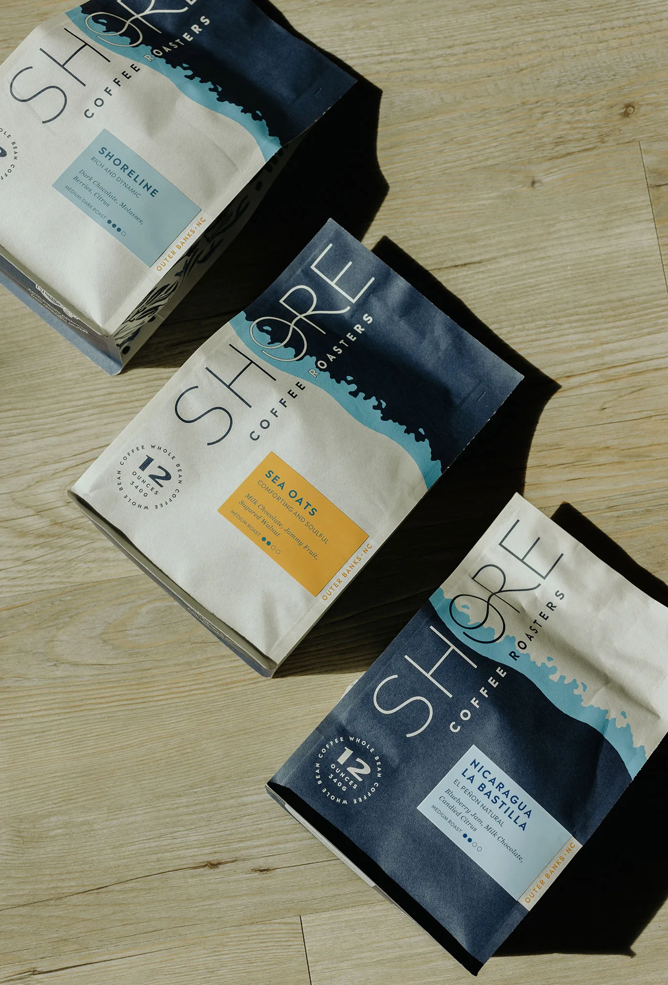
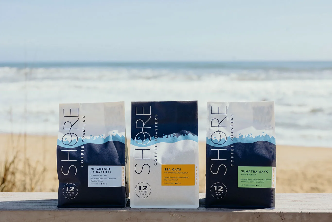
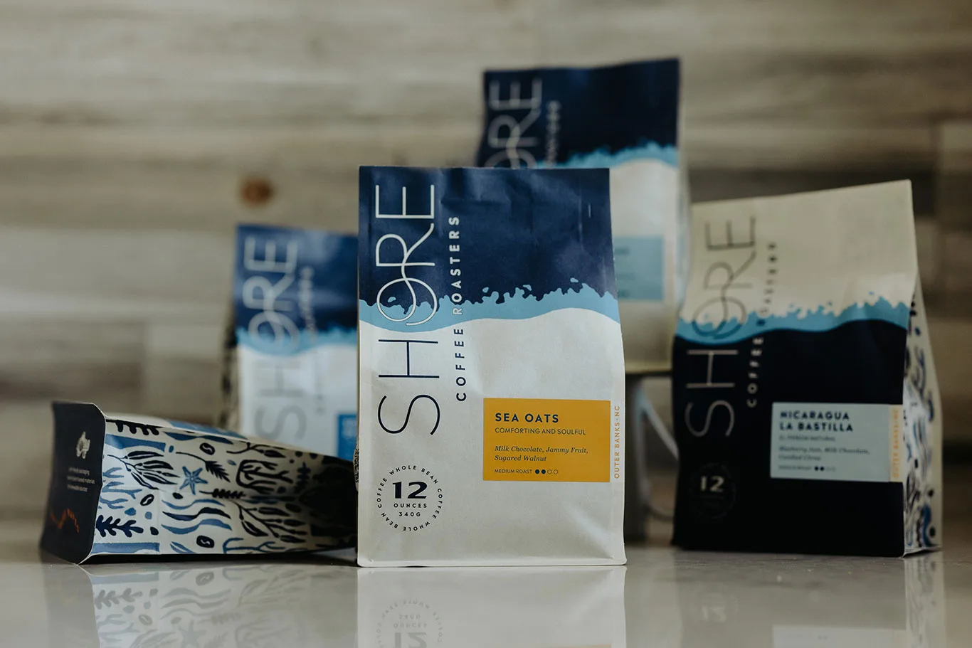
“We started by defining the brand, using their location and mission as a jumping-off point to define their visual identity and their unique voice in the coffee industry. After designing their logo and brand guidelines we immediately started designing their packaging and a line of merchandise,” Tudball explains, “the packaging is intended to be inviting and calming, using images of water, sea life, and coffee beans. We used the same design for both Single Origins and Blends but did a simple flip of the colors to indicate the difference. My favorite aspect of the bags is subtle, but when you see them lined up on a shelf the water graphic connects across the entire row, creating a tide. As anyone in Outer Banks, North Carolina would tell you, the ocean is a central part of their lives.”
We spoke with Shore Coffee Roasters founder Lauren Kneisel to learn more.
How long did the design process take?
Shortly after we completed the brand logo design process (six months), it was a seamless transition into packaging since we worked with Kevin [Tudball] on developing the brand guidelines early on and flushed out overall design goals. The packaging design process took roughly six months to complete.
What were some of the goals for the new look?
Having a deep background in the coffee industry and extensive experience in branding for various companies, ranging from small local businesses to national brands, we recognized the need for a designer who not only understood our history but could also blend a classic yet modern aesthetic. Our goal was to create a fresh, fun, and timeless design.
Additionally, we were seeking a creative partner who could infuse our vision with a fresh perspective and surprise us with innovative ideas. Through collaborative exploration and concept meetings, we uncovered our shared passions for the coastal lifestyle, music, and the concept of our logo resembling a record cover. Our aim was to capture the essence of the Outer Banks, with its natural elements like sea oats and junipers, while incorporating modern graphics.
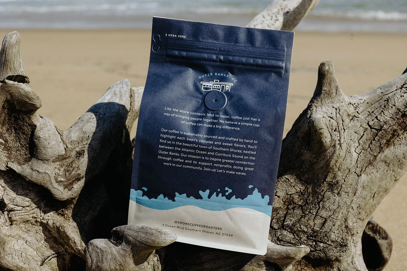
Inspired by the resilience and dynamism of our coastlines, we wanted our branding to reflect the spirit and movement that coffee represents. Throughout history, waterways have served as vital routes to transport coffee from farms to shores, and shorelines are among the most ecologically significant spaces on our planet. The shore symbolizes strength and inspiration, guiding SHORE Coffee Roasters in nurturing and supporting our community. Through coffee, we aspire to make a meaningful impact with every sip.
Tell us about some of the details in the design.
In essence, the design of the SHORE packaging captures the spirit of our coastal community, the history of Southern Shores, and our dedication to making a positive impact through coffee. It visually represents our story and values, bringing people closer to the beauty and significance of our coastal environment.
Here are some key details in the design:
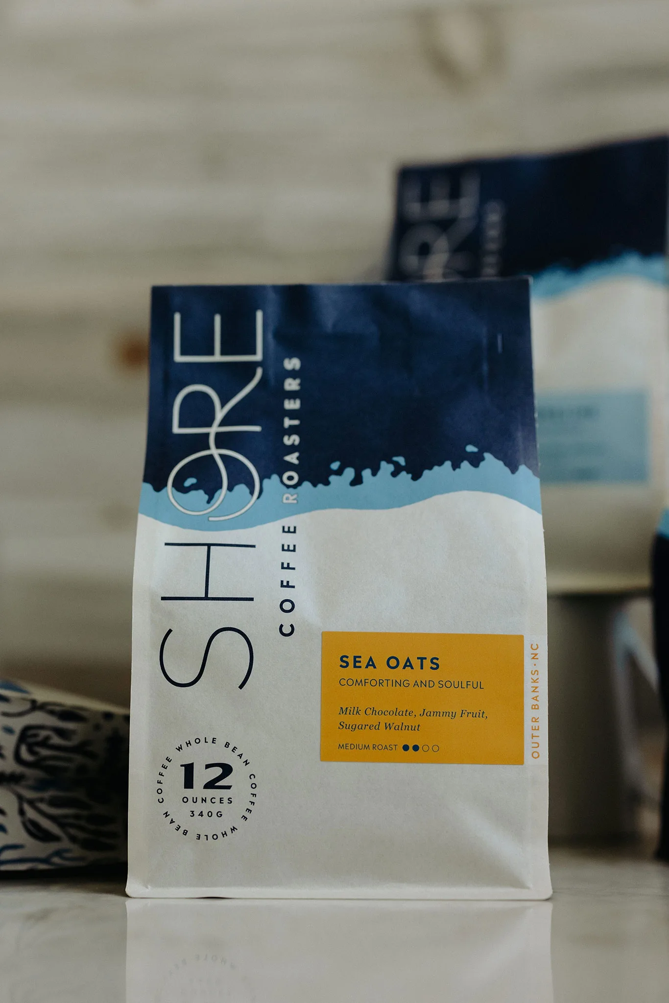
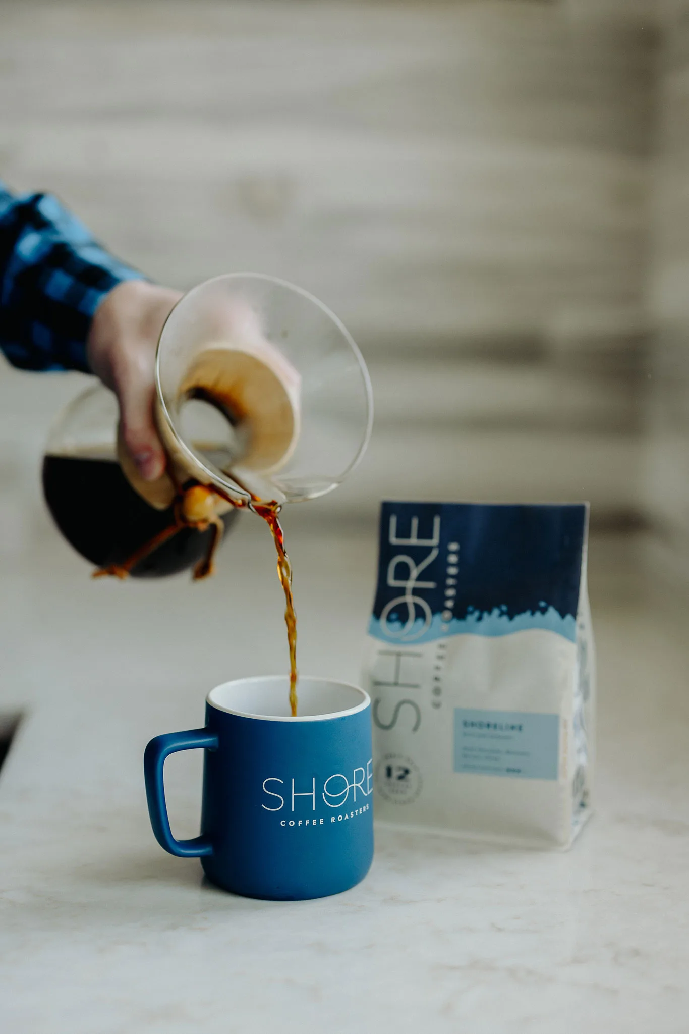
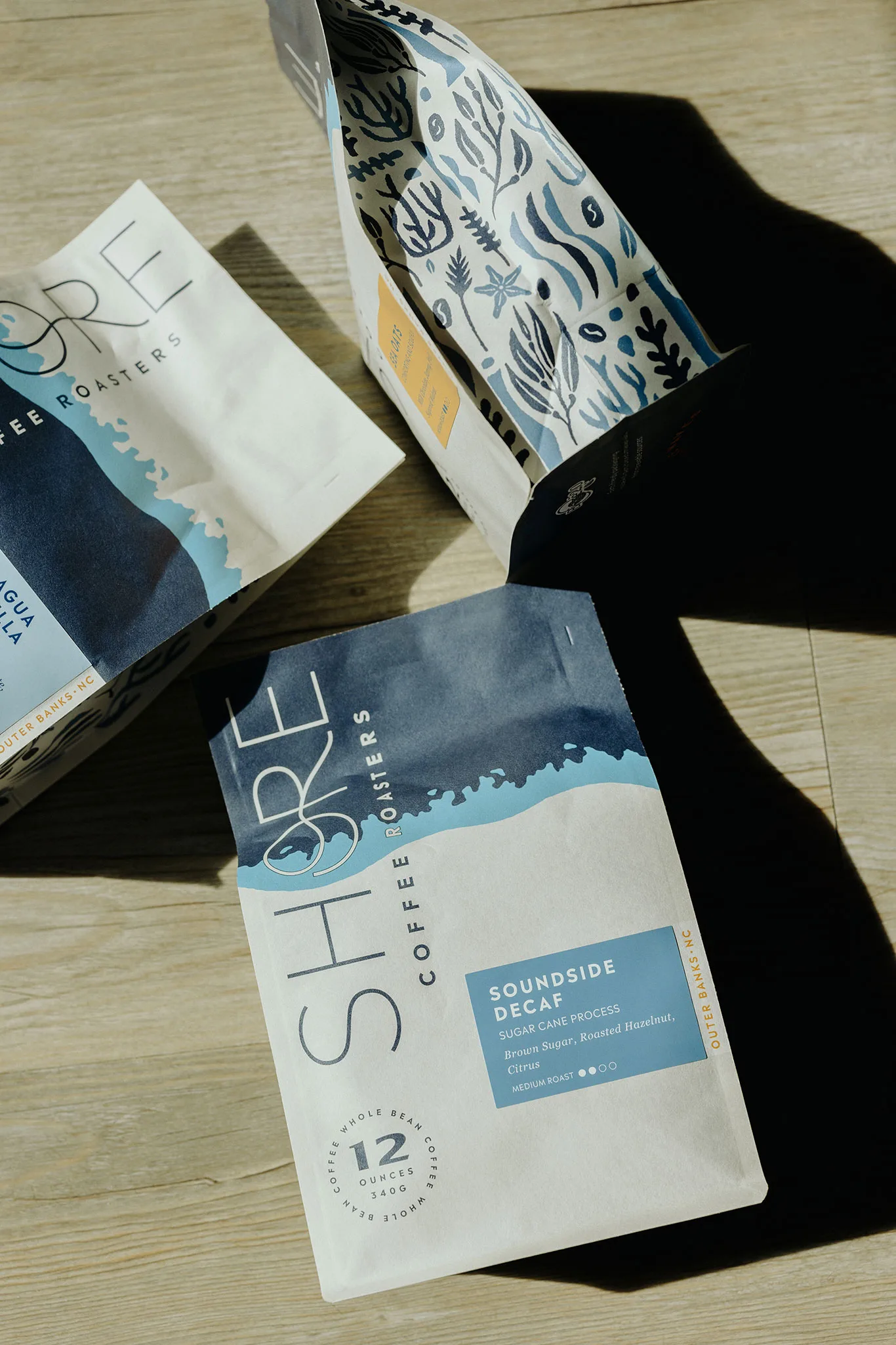
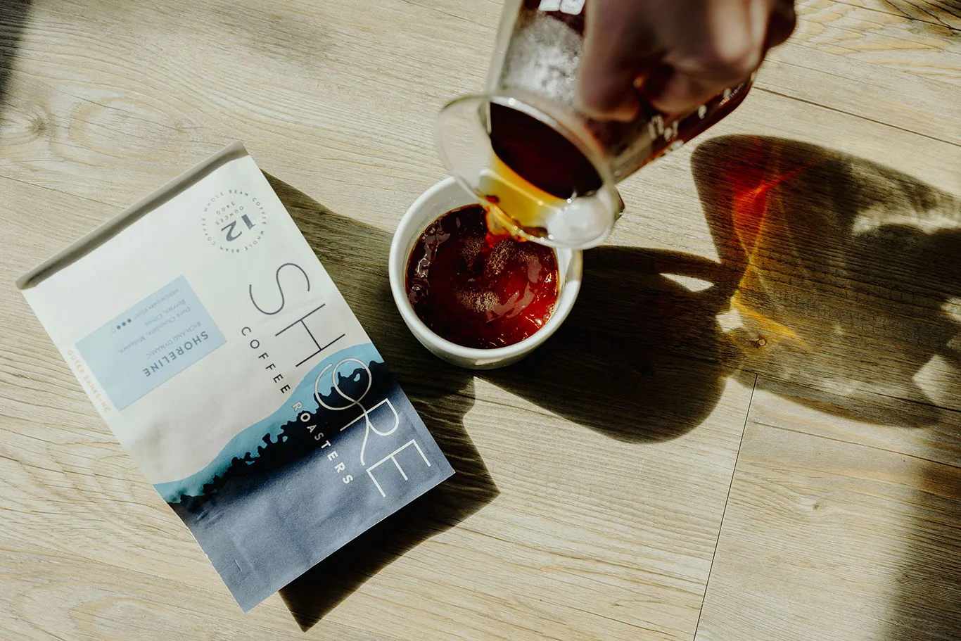
Shoreline Illustration: The shoreline illustration pays homage to our location in Southern Shores, situated between the Atlantic Ocean and Currituck Sound on the Outer Banks. This illustration represents the unique geography and topography of our coastal area, including the water, waves, coastline, and shore. When multiple bags are placed side by side, the design creates a larger coastline, symbolizing the unity of our community and the impact we can make together.
Flat Top Icon: The Flat Top icon in our logo is a tribute to the rich history and dynamic spirit of
Southern Shores. This design is inspired by the signature architectural style of cottages created by artist, modernist, and conservationist Frank Stick. More than just an emblem, it serves as a guiding principle that reflects our commitment to honoring our heritage while contributing to the community’s future.
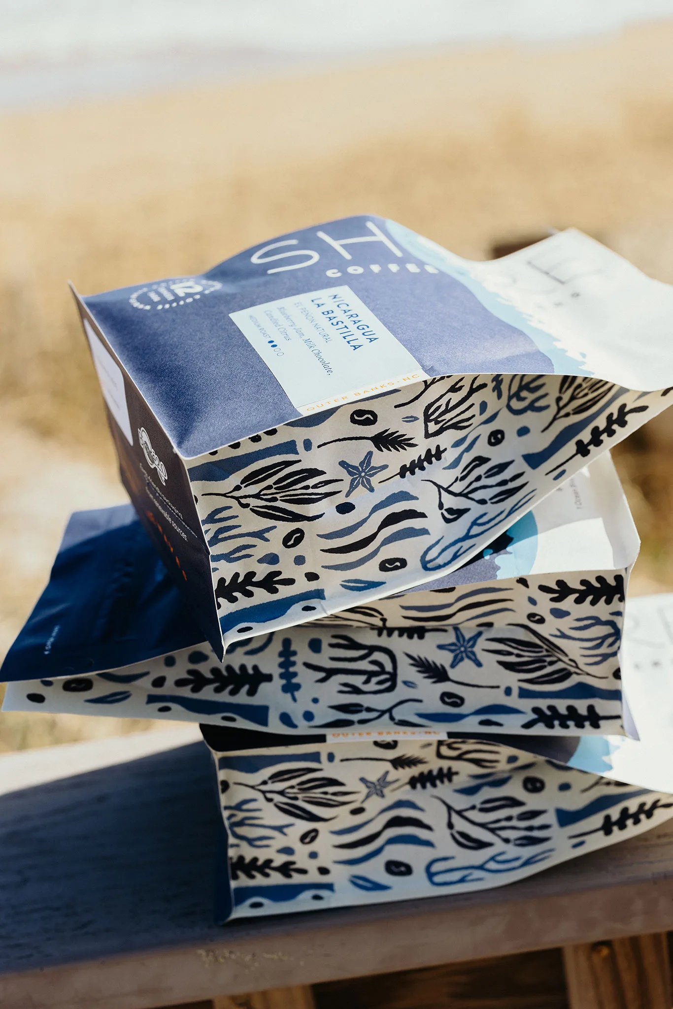
Coastal Elements: The packaging incorporates various coastal elements, symbolizing the natural connection between our farm-to-shore principles. These elements are open to interpretation, allowing each person to connect with their own memories of the beach, coast, and coffee. Whether you see a coffee blossom, sea star, juniper, seaweed, sea oats, or coffee beans, the design aims to evoke a sense of discovery and personal connection, making you feel a part of our story.
Colorways: The packaging uses two colorways, one for blends and when inversed, they signify single origins.
What kind of materials are used in the new packaging?
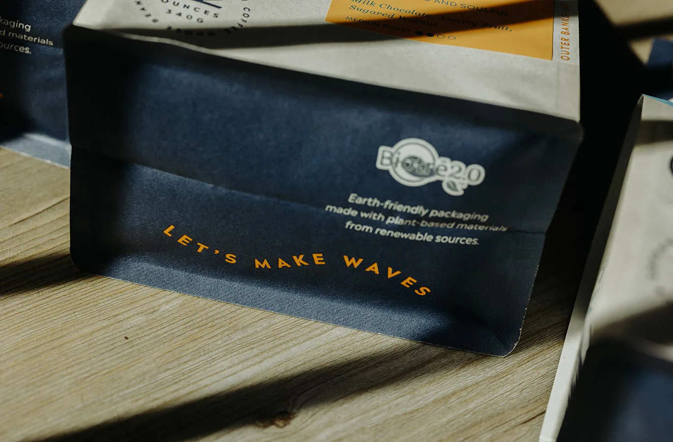
Our packaging is designed with sustainability in mind (as much as the current packaging industry empowers)—a nod to our dedication to environmental responsibility.
Biotrē™ 2.0 Block Bottom Bag: This innovative bag features a block bottom design for stability and a pull zipper for easy resealing.
Earth-Friendly Materials: We prioritize eco-friendliness by using plant-based materials sourced from renewable sources.
Where is this available to purchase?
The Shore Coffee Roasters online shop.
Thank you!
To stay up to date with the build-out and to learn more, visit the Shore Coffee Roasters official website and follow them on Instagram.
Photos courtesy SHORE Coffee Roasters by Sarah D’Ambra Photography / IG @sarahdambraphoto.
Coffee Design is a feature series on Sprudge by Zachary Carlsen. Read more Coffee Design on Sprudge.