




The Coffee Design feature series on Sprudge showcases new, inventive branding and packaging. What of brands…that have never rebranded? What about companies that have enjoyed success keeping their iconic branding the same since the 1960s?
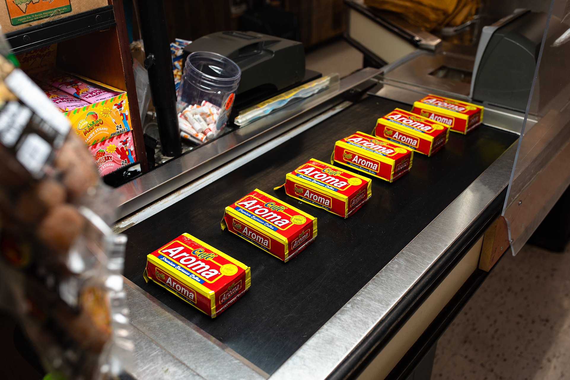
Cafe Aroma is family-owned and has been chugging along out of Hoboken, New Jersey for six decades. The original branding and design—with bright reds and yellows—was done by the company’s founder. It has undergone limited, iterative updates since, all handled in-house. VP Bernadette Gerrity personally oversees these iterative refreshes—and we had so many questions.

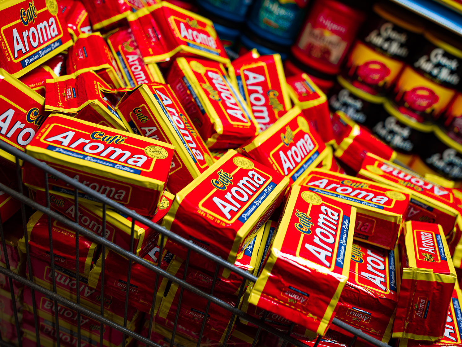
We spoke with Cafe Aroma Vice President Bernadette Gerrity to learn more.
What was the core inspiration behind the design?
Cafe Aroma’s original packaging was personally designed by founder, Rogelio “Roy” Montes de Oca. Upon his immigration to the U.S. from Cuba, he and his wife Ines began roasting coffee in their kitchen and selling it door to door to their neighbors to bring the strong, flavorful coffee they had grown to love in the Caribbean to their growing Latino community. The recipe Roy created in 1961 later became known in retailers as “Cafe Aroma” and just like the contents within, the packaging was equally homegrown.
Roy drew inspiration for Cafe Aroma’s packaging design from the colors of the flags of Latin countries – many of which contain red, blue, yellow, and white—to communicate to customers that this was a Latin-style (and specifically, Cuban-style) espresso. However, it is worth noting that he specifically chose the name “Cafe Aroma” to communicate the brand’s universal appeal to a broader customer base. Roy also included a callout for “premium” on the front of the original packaging to communicate the dedication to quality that still holds true.
Who designed it?
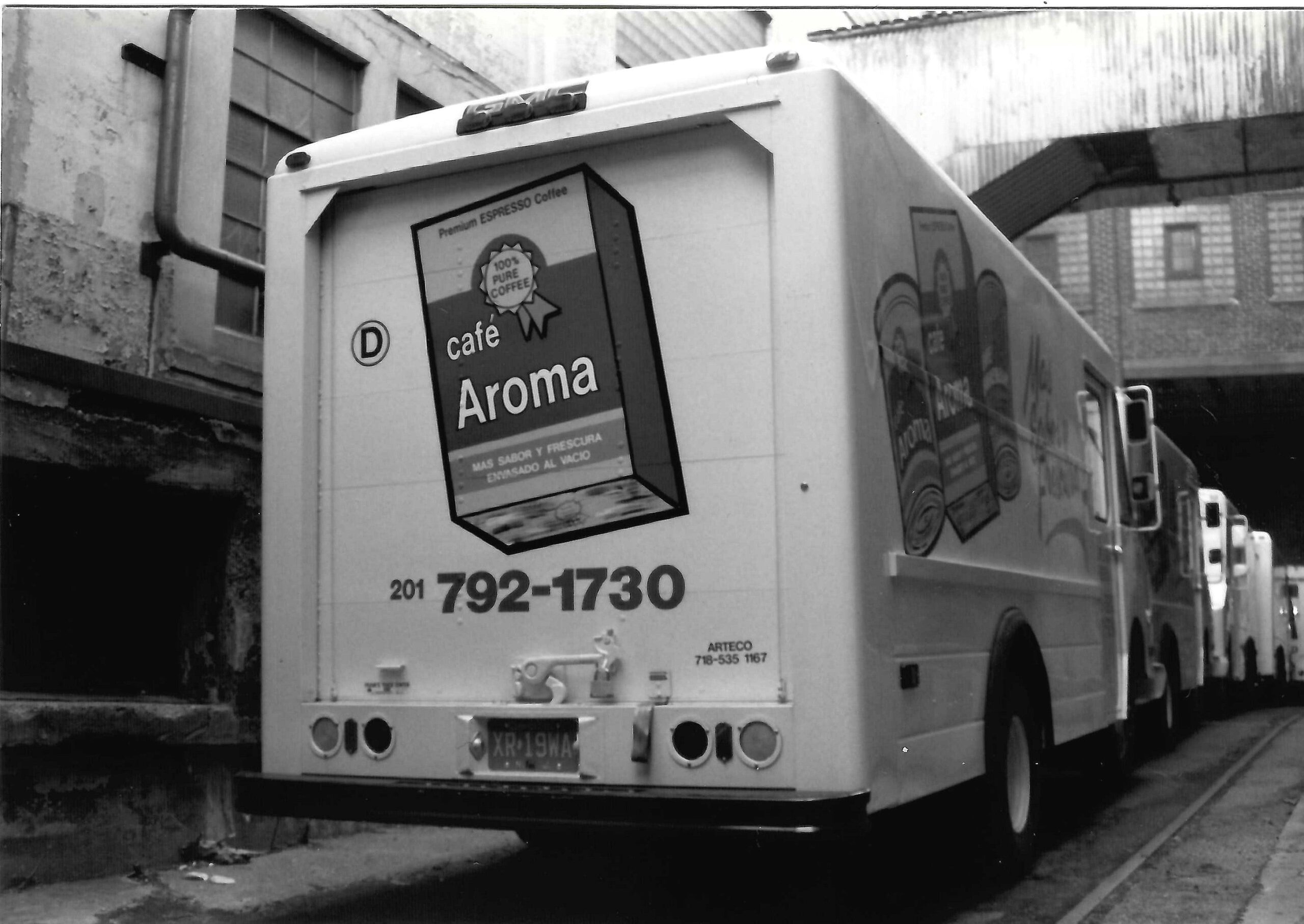
Cafe Aroma’s original branding and packaging was personally designed by founder Rogelio ‘Roy’ Montes De Oca when the brand first hit retailers in 1991. Since then, it’s been carefully refreshed to compensate for modern times and contemporary packaging styles while still winking at nostalgia by maintaining our colors, orientation, and key components of our packaging so as to say, “we’re still here and just as good.”

How does collaboration play a role in your design process?
We’re a family and we operate as one. Therefore, collaboration comes into play whenever a new product is released or the packaging is updated. I typically spearhead much of the packaging design with third-party partners, but nothing is executed until we all approve it, together.
From first vision to final product, how long did the design process take?
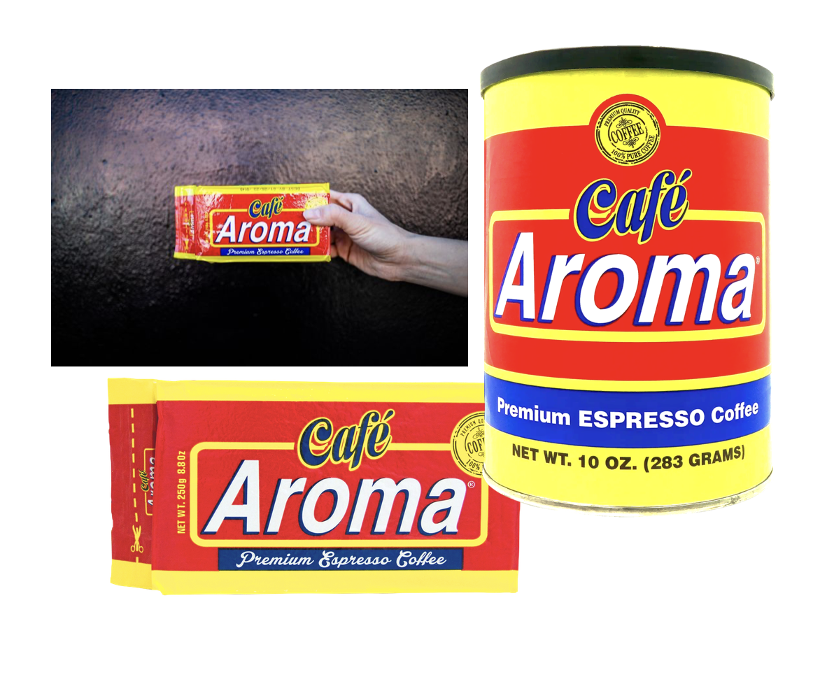
Cafe Aroma’s original packaging design took several iterations to bring to life from the first sketches in Roy’s home kitchen to the first bags produced in our facilities. Since those original designs launched, we’ve really only made small tweaks here and there, like brightening up the colors, adding more movement to the logo, and changing the orientation of the design on our bags from vertical to horizontal to work for the retail setting. We’re really proud of how well our packaging design has withstood the test of time!
When did it launch?
Cafe Aroma’s original espresso recipe has remained the same since launching as a B2B brand in 1961. However, Cafe Aroma officially made its debut on retail shelves in 1991 with its original packaging. The current iteration was released in 2015.
In every iteration, we continue to pay homage to our roots and the original packaging renditions and have been careful not to veer too far from Roy’s original vision. We actually have had so much fun as a family discovering and revisiting some of my grandfather’s old drawings. It’s an interesting lens into his thought process and creation of the product but it’s equally heart-warming for us to remember all of his hard work and creativity. We love both the original designs and updates so we try to continue to honor both. In fact, we just released new merchandise based on a photo of an old Cafe Aroma shirt our grandfather was wearing with the original packaging on it! It is now available on our website.
How does the package design reflect the company’s overall branding and messaging?
Cafe Aroma’s mission is simple: to continue our founder, Roy’s, legacy and dedication to quality by bringing our signature, premium Cuban-style espresso blend to customers across the country. Our bold yet straightforward packaging design is intentionally simple to pay homage to our roots and wink at the nostalgia of our history. We want to ensure our customer base, both old and new, can see that we are consistent in our quality and messaging. Further, the simplicity of our packaging and design ensures that we can offer our product at an accessible price point. To that end, we focus more on the contents of the package rather than a fancier outward presentation.
Tell us about some of your favorite design details.
While I love the simplistic color palette and appealing typeface, I appreciate the packaging format the most. The vacuum-sealed brick pack is one that has been used specifically for espresso coffees which is very cool. Functionally, however, the vacuum seal also greatly maintains freshness. We’ve opened up packages in our archive from years ago (for kicks!) and the aroma of the coffee is still present! I also love our cans, which can be reused or refilled—we have customers who use them as flower pots or for storage.
Are there key elements of the packaging meant to educate the consumer?
Yes! Our brand colors—primarily red and blue accented with yellow—are a nod to the colors of the many Latin flags, which we hope has signaled to our customers that our coffee was created to meet the profile expectations that the Latin community loves! Our newest packaging in our single-serve varieties also features directions and information in both Spanish and English, which is so important to us as well. In the near future, we plan to add this feature all existing packaging.
Is the design optimized for shelf presence? How does it aim to stand out?
Yes, as Cafe Aroma grows its presence in retail, standing out on shelves is more important than ever. We’ve optimized our packaging for shelf presence through elements like primary red and blue hero colors accented with bright yellow. These colors naturally attract the eye but are also a signal to in-the-know customers that our coffee is Cuban-style—you’ll see a similar palette on other Cuban-style brands. The design is at once nostalgic yet modern, evoking memories from those who grew up in families where no day was complete without a cafecito but straightforward enough to appeal to new customers browsing the shelf.
Are any of the packaging materials recyclable or compostable?
Cafe Aroma’s metal coffee cans are recyclable, and we’ve also seen customers upcycle them into fun flower vases and storage containers for things like kitchen utensils.
Where is this available to purchase?
Find Cafe Aroma espresso online at cafearoma.com, on Amazon, and at thousands of retailers nationwide including Walmart, Winn-Dixie, CVS (Fresco y Mas), Stop & Shop, Shop Rite, Navarro’s, Sedano’s, C-Town, Food Town, Met Food, Key Food and more. For a full list, visit the store locator on our website.
Thank you!
Visit the Cafe Aroma official website, follow @TheCafeAroma on Instagram, and @thecafearoma on Tiktok.
Coffee Design is an original feature series on Sprudge curated by Sprudge co-founder Zachary Carlsen. Read more from our Coffee Design archives.