


Coffee Design is a many-splendored thing, but it’s also a bit of a moving target—no two design stories in the field of coffee are quite exactly the same. Over the years we’ve profiled big, bold new brands bursting on the scene with an explosion of original consumable art. We’ve also told many stories of established brands looking to re-assert their identity with a total rethink, a big shift in how an existing company communicates their coffee to the world around them.
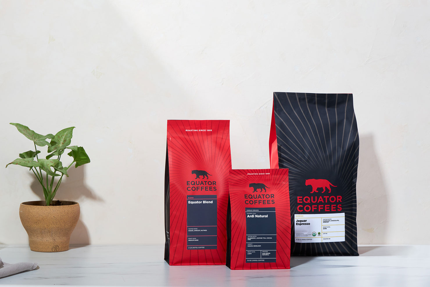
Today we’re telling another sort of story. What happens when a brand is, in many ways, already quite happy with their design, but wants to subtly tweak things to convey a new approach? Equator Coffee’s bags are iconic, and as the brand approaches 30 years in business, their instantly recognizable bold red-and-black color scheme and tiger logo remain an integral part of the experience. But in the hands of Swasti Mittal, a designer whose work spans media, fashion, food, beauty, and entertainment, an impactful series of changes have been implemented to Equator’s design scheme. Most immediate is a radiating sunburst pattern, but that’s just the start, as we learn below in this illustrative interview with Equator Head of Marketing Shelby Colley.

Design work speaks to us in so many different voices, with shades and subtlety and intentionality that continues to delight and surprise. This story offers all that in a big way.
As told to Sprudge by Equator Coffees Head of Marketing Shelby Colley.
What was the core inspiration behind this design?
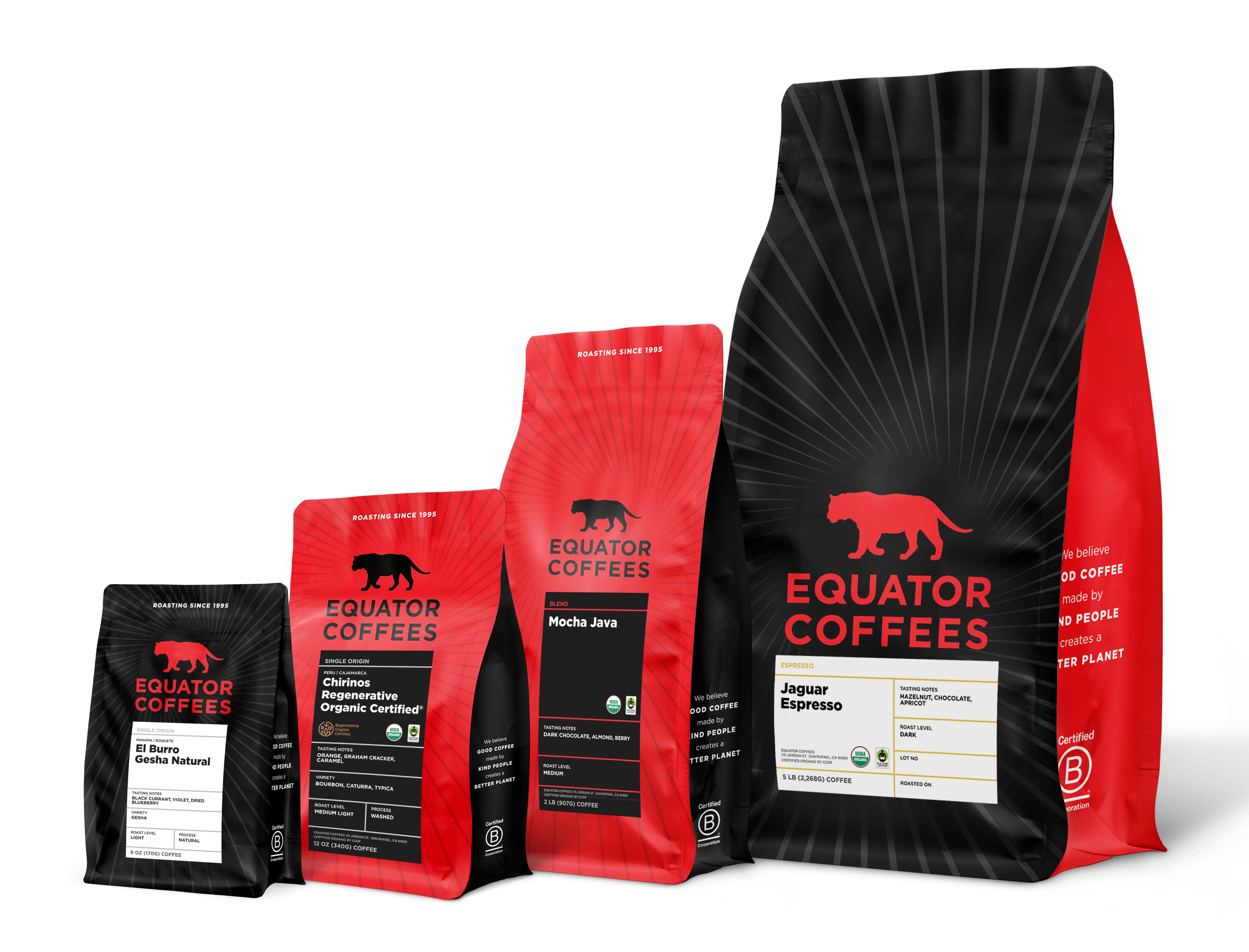
We started this project by revisiting the role our packaging plays in communicating the Equator brand and information about our coffees. We wanted to refresh the design elements on pack, balancing celebrating Equator’s legacy with setting the stage for the future. We also wanted to take the opportunity to make all four sizes of our bags part of a cohesive family, and create a labeling system that functioned across product formats (bagged coffee, instant coffee, etc).
Who designed it?
The redesign was done in partnership with designer Swasti Mittal, who in addition to her skill and keen eye as a designer was an incredible thought partner to us as we explored different routes through how to refresh our packaging. Her approach brought so much respect for the Equator Coffee’s legacy; she spent time in our roastery, meeting with our founders and team, and really absorbed who Equator is, was, and will be. Her eye for deep product detail and creativity were such a joy and helped us evolve our core packaging to align with the vision of the future of Equator as we approach our 30th year.
How does collaboration play a role in your design process?
The art and science of designing something new for Equator always starts with a discussion – often involving folks from across the company. We want many perspectives: What’s really important here? What do we need to protect? Where should we test the boundaries of what we’ve done before? With this particular project we had a fantastic group including our founders, Helen Russell and Brooke McDonnell, with whom we discussed visual direction, the importance of information hierarchy and staying approachable, while guiding our consumers deeper into the coffee world.
From first vision to final product, how long did the design process take?
We spent about a year from finding the right design partner and developing the new system, to finalizing materials and dimensions, colors, versioning the many different labels, and eventually having this lovely new packaging in hand.
When will it launch?
We are still in the middle of our roll out, as we are working through our previous bags before transitioning, rather than disposing of any old packaging. Our 5lb bag will be the last to transition, likely in late May.
How does the package design reflect the company’s overall branding and messaging?
Our new design still feels so familiar to who Equator is and has been. We still have our key brand elements – the bold red and black, our iconic tiger silhouette. But we have a few new elements that help amplify where the brand is now. For example, the new sun ray pattern that emanates from the center. We really wanted to bring in that sense of optimism and forward momentum that’s so core to Equator, as guided by our founders.
Tell us about some of your favorite design details.
I love how all four bag sizes relate to one another as a cohesive system of packaging – from the colorway to the new consistent bag shape and zipper.
Are there key elements of the packaging meant to educate the consumer? (e.g., origin info, tasting notes, brewing tips)
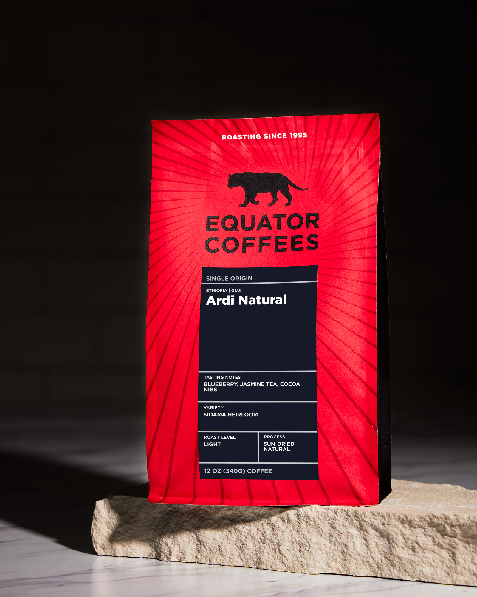
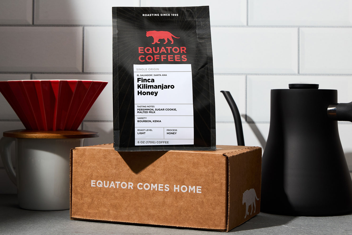
In addition to the bag itself, we revisited our label structure entirely – not only adding roast profile, which we know is a crucial portion of how the everyday coffee consumer makes decisions about coffee choice at shelf, but also building out a ledger like structure that accommodates coffee variety, more detailed origin, and processing method information for our single origin coffees. The new label color system, which features our extended secondary brand color palette, more clearly differentiates between blends, single origins, espressos, decaf coffees, and our chefs collection.
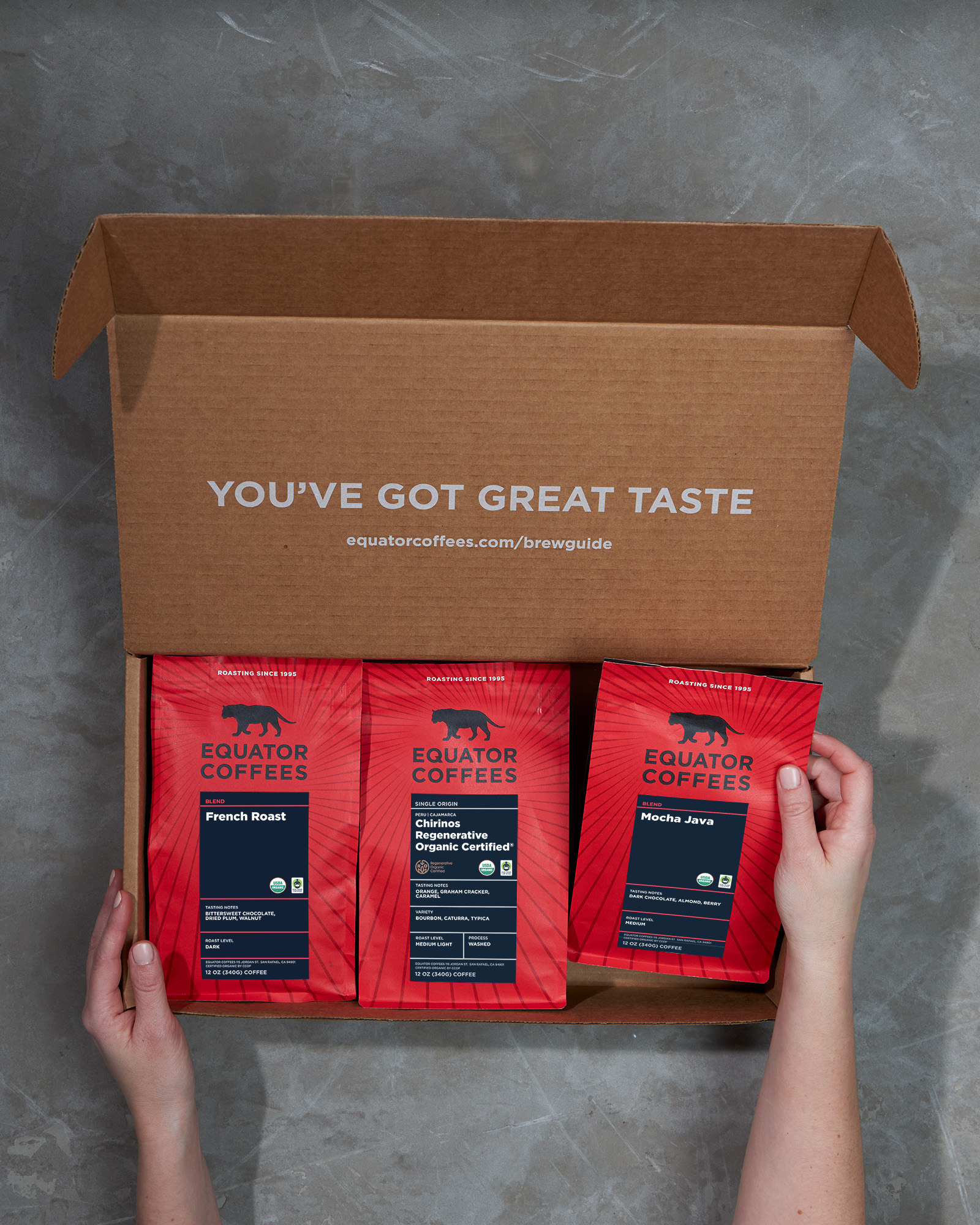
We also added a QR code on the side gusset of the bags that the customer can scan to take them to our brew guides on equatorcoffees.com (with new video guides dropping soon!). We also added “Change is brewing, visit us at equatorcoffees.com/impact,” to the bottom of the bag providing access to our current impact report and links to past reports, initiated in 2022 as a means of transparently communicating our business practices. Our 5lb bag, most popular with our wholesale customers and cafes, invites the customer to drop us a line if they need help and includes our toll free number and customer support email address.
Is the design optimized for shelf presence? How does it aim to stand out?
Absolutely—the bags feature our eye-catching bold red background color, and our new sun ray pattern which literally guides the eye in to focus on the Equator Coffees lockup, and then follow the line down to learn more about the coffee. On the label, we were sure to understand what the consumer is looking for at the shelf. In the summer of 2023, we conducted a customer survey, inviting our audience to share their thoughts, perceptions, and behaviors regarding coffee. The insights we gathered played a crucial role in shaping the direction of our new labeling hierarchy. Customers expressed a need for more information to easily navigate our products on shelves. We also inquired about their origin preferences to gauge the desired level of specificity, which, to no surprise, varied based on the respondent’s coffee knowledge. We were therefore careful to retain a mention of the country of origin for our single origin coffees, as well as a deeper region of geographic importance, depending on the coffee. We expanded the size of our labels, reoriented them to be vertical, and added the educational and wayfinding elements like roast profile, variety and processing method on single origins, a collection wide color system, etc., all which serve to attract and engage consumers.
Are any of the packaging materials recyclable or compostable?
Our 6oz, 12oz, and 2lb bags are all made of BioTre material!
Where is this available to purchase?
In Equator cafes, equatorcoffees.com, and everywhere else our coffees are sold!
For more, visit Equator Coffees official website and give ’em a follow on Instagram.