Welcome to Design Week on Sprudge, a very special week of content focused on the vivid and exciting interlocking worlds of coffee and design.
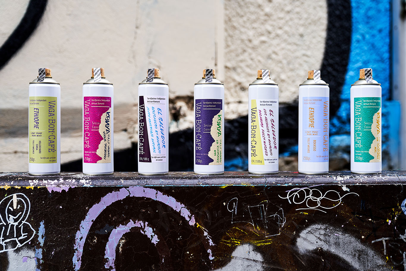
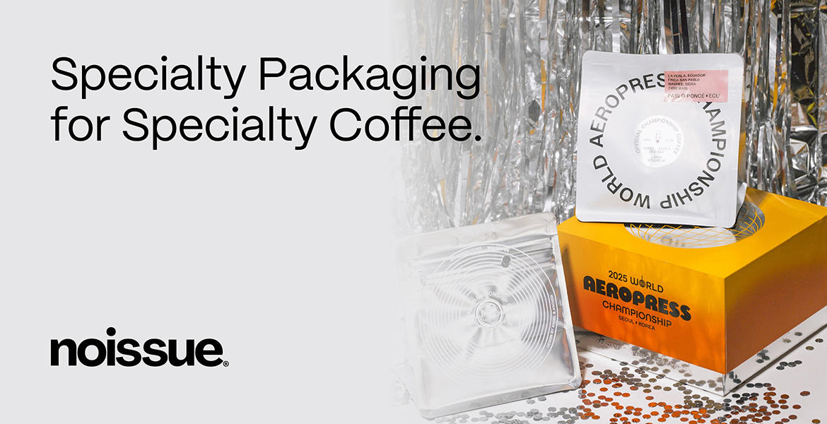
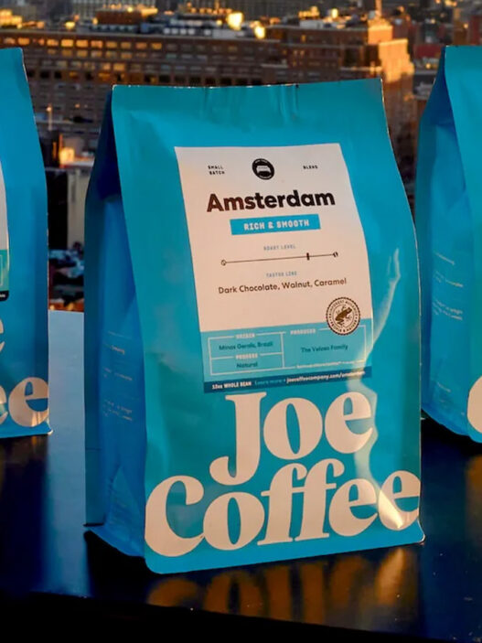
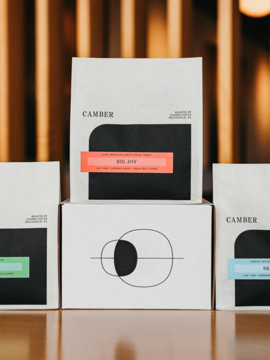
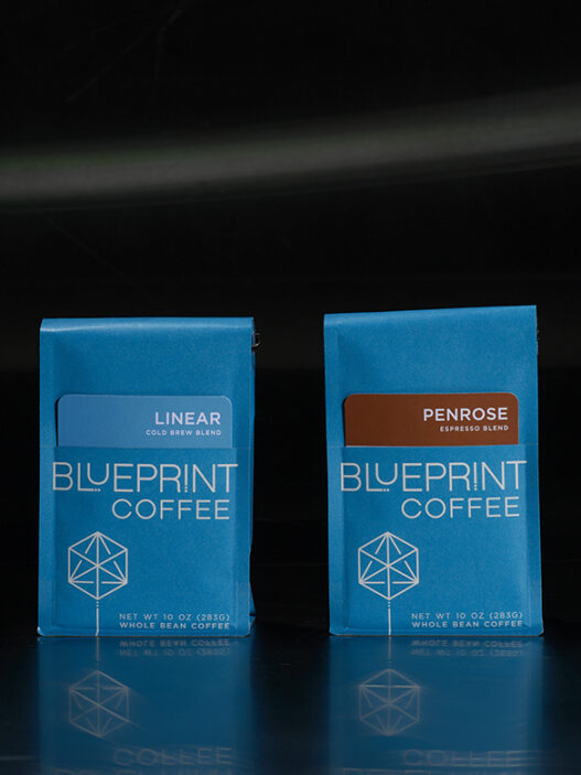
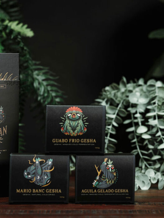
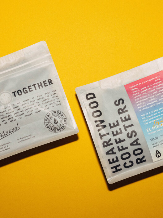
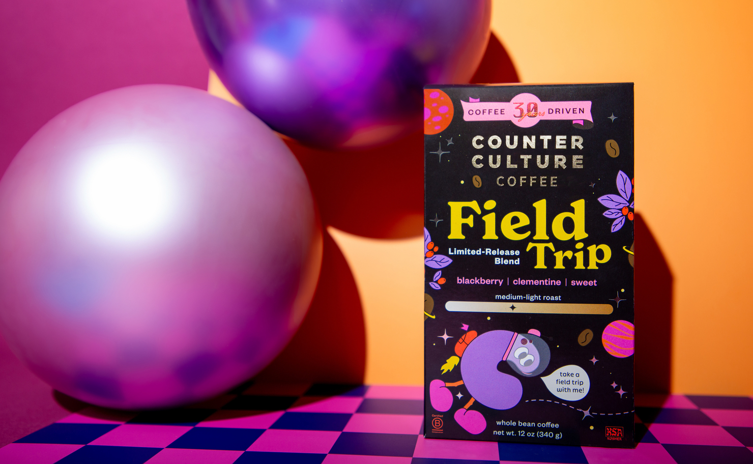
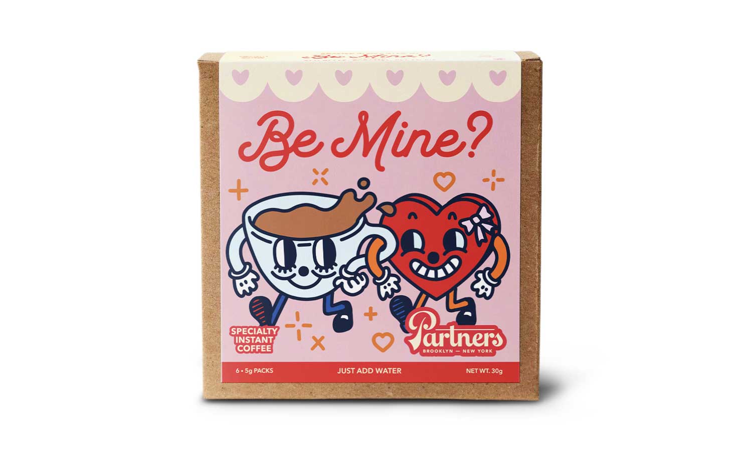
Here at Sprudge, we love spotlighting coffee companies from around the world that are creating beautiful packaging and branding. Since 2014 we’ve run a regularly published feature series dedicated to coffee design, inviting our readers around the world to learn more about the design process, get inspired, find outstanding designers and branding agencies, and think deeper about how design enriches the coffee experience at every step of the story.
For the next few days we’re looking back (and looking forward!) at the last nine years, showcasing some of the most exciting and popular articles from the series.
Coffee design is a continuum, and for every brand new fresh shiny product to launch, there are a pressing set of decisions: how to establish oneself visually? And where do these choices lead? We often tackle such questions here in the Coffee Design series. We also explore what it means for an existing company with an established brand to reinvent itself visually.
Coffee Design: Hasbean Coffee’s Redesign With Ozone Coffee Roasters
Bright colors, muted colors, no color at all! Bold type, fanciful hand lettering, distinguished serif! Tags! Tabs! Cards! Labels! Notes! String! Pins! Wax! From coffee start-ups just getting into the game to established companies branching out with fresh new concepts, Coffee Design has really seen it all.
Even though we’ve been at it for a long time, we feel like we’re just getting started. If you know of an exciting design-forward coffee company that we should check out, let us know!
Stick to Sprudge all week long during Design Week, as we celebrate the consumable art of coffee packaging design!
Coffee Design is proudly sponsored by Savor Brands, your boost in coffeedence through maximizing designs in packaging, sustainability and tech.

