


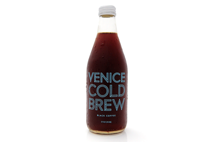
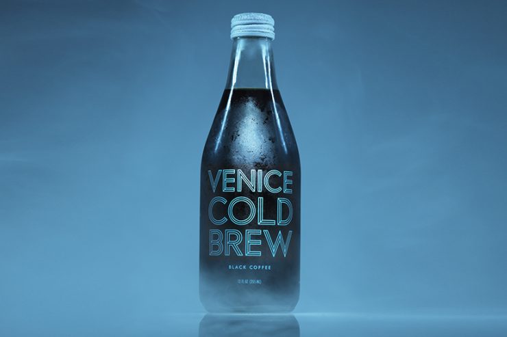
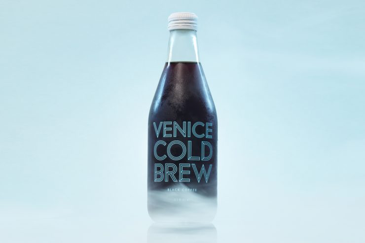
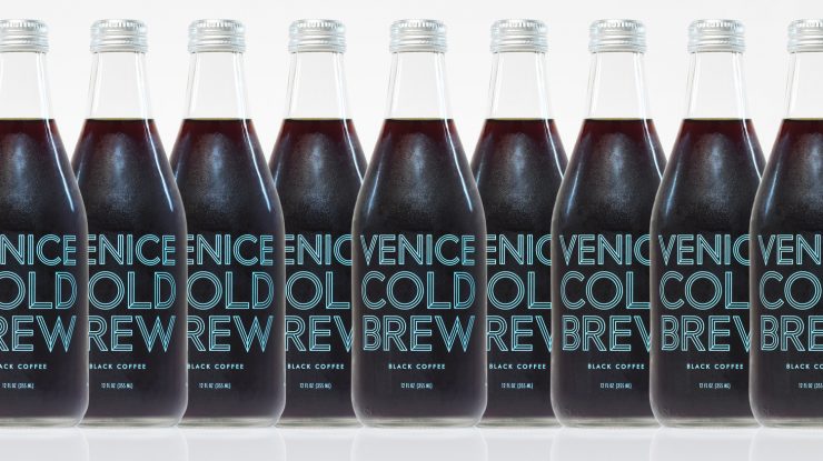
Venice Beach, California. This peachy-keen beach scene has a new player in town: Venice Cold Brew, launched in the heat of summer and poised to keep you thirsty all year long. We’re gaga for the Futura type face, subtle tropical blue tones, and easy recyclability of these tasty little bottles. Sounds like we’ve found one more reason to love Venice Beach.

As told to Sprudge by Kristina and Chris Mueller.
When did the coffee package design debut?
Venice Cold Brew “Black Coffee” packaging launched on June 21, 2015. The launch was timed to coincide with the first day of summer, a time of year that we feel defines the vibe of our brand. This feeling radiates throughout and influenced our tagline “Take your coffee with sunshine”.
Who designed the package?
After extensive exploration, our design was handled in house and led by my wife Kristina Mueller who works as an advertising Art Director. Nike and Apple are also clients.
Any design highlights you want to share?
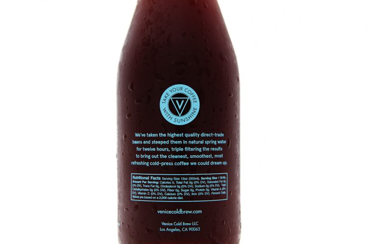
The Venice Cold Brew word mark displayed on the front of the bottle is our signature element. It’s a highly modified rendition of the classic typeface Futura. From the beginning, we were attracted to Futura’s clean and timeless look but needed something signature that would stand out on the shelves. We played around with adding dimension by using a beveled drop shadow to the letterforms, but when that wasn’t working, we turned it to outlines. That was the moment when we knew it was our final mark. Our Pantone is 305C—it’s primarily blue with a hint of green taking q’s from the ocean and tropical vibes. The overarching goal was to have nice pop and a bright separation against the color of the coffee.
Please describe the look in your own words!
A primary goal at Venice Cold Brew is to further dimensionalize and expand the category of RTD cold coffee. With packaging, we wanted to create something decidedly different than what was currently available. To accomplish this, we paired a clear glass bottle, silver cap and clean, uncluttered art that would work to show off the beauty and character of the liquid inside. The glass bottle feels great in hand and the silkscreened type gives an elegant, colorful finishing touch.
What coffee information do you share on the package? What’s the motivation behind that?
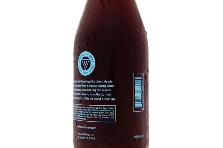
Our goal at every turn is to inform and at the same time keep it minimal. Our “Black Coffee” simply states Coffee + Water as ingredients. Additionally, we have a statement on the rear of the bottle that talks to our signature vision: To craft bright, clean and refreshing ready-to-drink cold coffee. Past this we talk of direct trade beans which gives the viewer an indication that we are using premium coffee and that we are working to help create great relationships from crop to bottle. Lastly, and we feel this is big, we only steep in pure spring water. This gives an incredible mouth feel with great mineral content.
For package nerds, what *type of package* is it?
This is a great question! The art on our bottles is individually silkscreened by hand here in Los Angeles and then fired to 1200 degrees to create a beautiful/ bulletproof look and feel.
Is the package recyclable?
Yes, both our glass bottle and aluminum cap are fully recyclable.
Photos provided by Kristina and Chris Mueller.
Coffee Design is a feature series by Zachary Carlsen on Sprudge. Read more Coffee Design here.