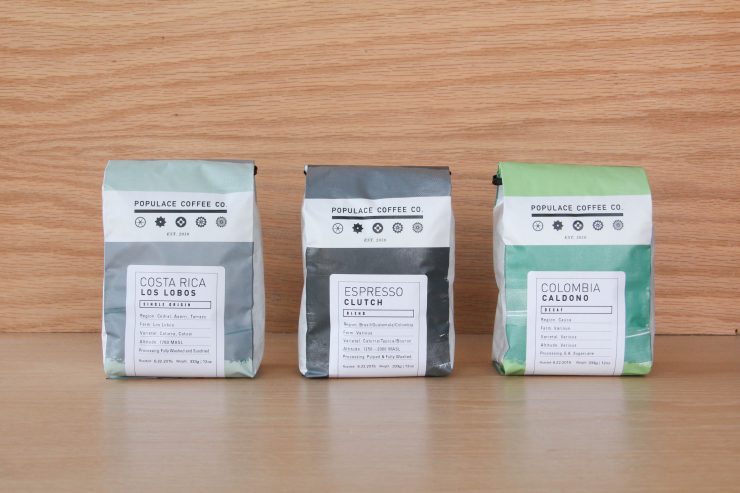
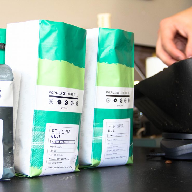
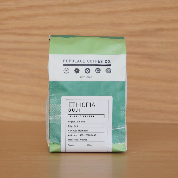
Packaging can be so much more than simply a bag to stuff coffee into. For our partners at the independent microroasters Populace Coffee Co. of Bay City, Michigan, packaging is “a way to communicate our purpose, our attitude, and our energy.” This new branding just launched a few weeks ago; you can check it out at Michigan cafes like Strange Matter Coffee, Lantern Coffee, Comet Coffee, and Harless & Hugh, or visit the Populace webstore and shop direct.
As told to Sprudge by Andrew Heppner.
When did the coffee package design debut?
June 22nd was the first day we started sending out our new bags.
Who designed the package?
The packaging was designed in-house by our marketing/designer/roasting production guy Dave Daniele.
Any design highlights you want to share?
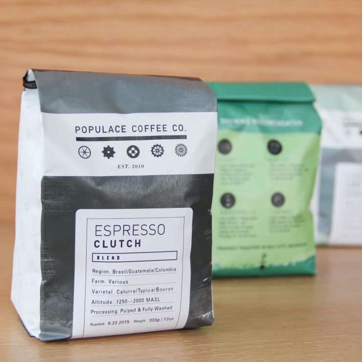
One particular thing about the choice of typeface, DIN, is that we chose to use it because of DIN’s industrial history. It was primarily used as a geometrical typeface that was legible enough to be engraved, printed, stamped, and burned into machinery. We modified the typeface a little bit by rounding the edges slightly, humanizing it just a touch.
Please describe the look in your own words!
The Populace Coffee Co. bag redesign came along as a necessity to grow our business. Our bags are a way to communicate our purpose, our attitude, and our energy. We have designed the new bags with halftone dot brush textures, a nod to our industrial, gear-centric brand inspiration, while infusing those textures with a selection of different colors. Our goal as Populace Coffee Co. has always been to “Work Harder”, and to make delicious and flavorful coffees. These bags are not only working harder to communicate our vision, but they also communicate a bright and flavorful character that resembles our product.
What coffee information do you share on the package? What’s the motivation behind that?
Our bags have 2 sets of information. The first set on the front of the bag has all of the information of the coffee, region, farm, elevation, varietal, and processing type. This is to help people identify with more variables of the coffees that they like outside of just region. And the second set of information is on the back, showing different profiles of brewing with a few parameters on how to get the best tasting coffee from each method. This is to help educate those who may not know where to start when it comes to brewing coffee at home, to help someone who may not know why they aren’t getting the desired taste they want when brewing at home.
Where is the bag manufactured?
The bags are printed in Wausau, Wisconsin by Roastar.
For package nerds, what *type of package* is it?
It is a gusseted bag with a one-way valve, lined with a high barrier film foil.
Location: Bay City, Michigan
Country: USA
Design Date: June 2015
Designer: Dave Daniele
Manufacturer: Roastar
Coffee Design is a feature series by Zachary Carlsen on Sprudge. Read more Coffee Design here.

