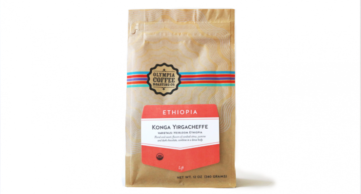
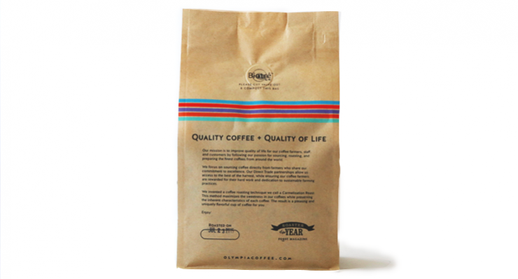
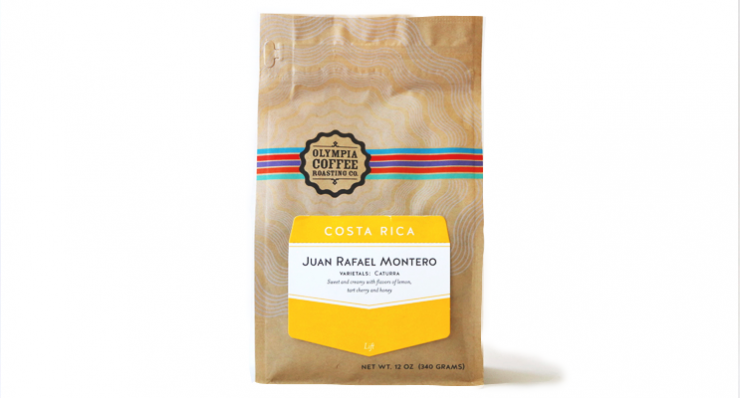
A redesign is a precious thing. Since launching in 2005, the brand has gone through an ownership change, expanded to several new cafes, and helped define what a quality-focused coffee brand can look like in a small market. Today our friends & partners at Oly Coffee (as the locals call it) have a major HQ expansion on the horizon, supported by a loan from the city of Olympia itself. Sounds like the perfect time for a packaging refresh, and they’ve done exactly that with a new look that’s endlessly customizable and reverent to the distinct coffees they procure and roast at OCRC.
The end result? One of America’s best independent roasters just got a little better, thanks to their spiffy new look. 2015 is a huge year for Olympia Coffee; why not look your best under the bright lights?
As told to Sprudge by Oliver Stormshak.
When did your new coffee package design debut?
July 22nd, 2015.
Who designed the package?
It’s collaboration between our design company, The Sherwood Press, and ourselves.
Any design highlights you want to share?
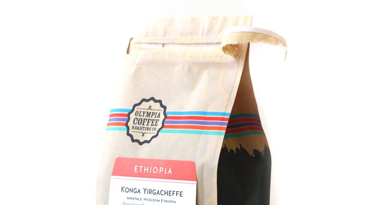
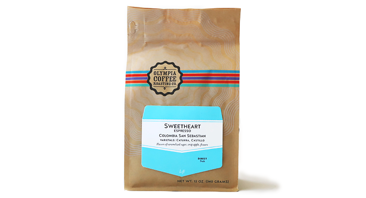
The color band rainbow represents our single-origin lineup and is composed of five of a total of twenty Pantone spot colors. For the letterpress labels, five anchor coffees will retain their assigned Pantone color, while single origins will each be assigned a color in the system to set it apart.
Please describe the look in your own words!
Northwestern, sustainable, DIY, and crafty.
What coffee information do you share on the package? What’s the motivation behind that?
We are really passionate about telling the full story behind our coffees, which is why we created the letterpress flip up tab. When you flip up the letterpress label, you read where, why, how, this coffee was created. We try to detail every step of the intentional pursuit of perfection these coffees are on with as few words as possible. On the front, we try our best to keep it simple and not confuse people by listing the major details of a coffee. The letterpress label is also perforated so you can tear it off and collect them to love forever.
Broadly, we wanted packaging that preserved the longevity of the roasted coffee better, but we needed to continue with sustainable compostable materials.
Where is the bag manufactured?
For package nerds, what *type of package* is it?
It’s a Biotrē Film material composed of 60% recycled materials that is fully compostable. It’s built into a block bottom form for clean retailing. It has a zipper pouch with a reseal zip lock built in for ease of use and freshness. It contains a one-way valve for degassing and slower oxidation of roasted coffee.
Is the package eco-friendly?
It is fully compostable, made from recycled materials and papers, printed using all-natural inks.
Location: Olympia, Washington
Country: USA
Design Date: July 22, 2015
Designer: The Sherwood Press in collaboration with Olympia Coffee Roasting Company.
Manufacturer: Pacific Bag
Coffee Design is a feature series by Zachary Carlsen on Sprudge. Read more Coffee Design here.

