When our friends & partners at Berlin’s Five Elephant Coffee debuted their new packaging at the 2015 Amsterdam Coffee Festival, the “oohs” and “ahhs” went bouncing off the walls of coffee Twitter. We just had to know more.
As told to Sprudge by Kris Schackman.
Who designed the package?
The package was designed by Sunst. Studio, who are the brothers Sebastian and Tobias Amberger and their design firm. Lucas Dietrich on their team worked particularly intensely on the layout.
Any design highlights you want to share?
The current visual identity of the Five Elephant brand is based on a sans-serif font and an entirely unique self-developed hand script font by Sunst. Studio.
Please describe the look in your own words!
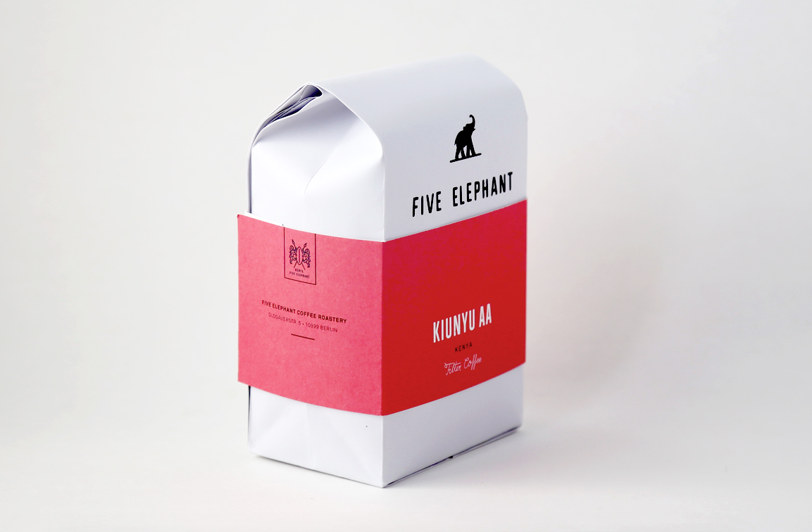
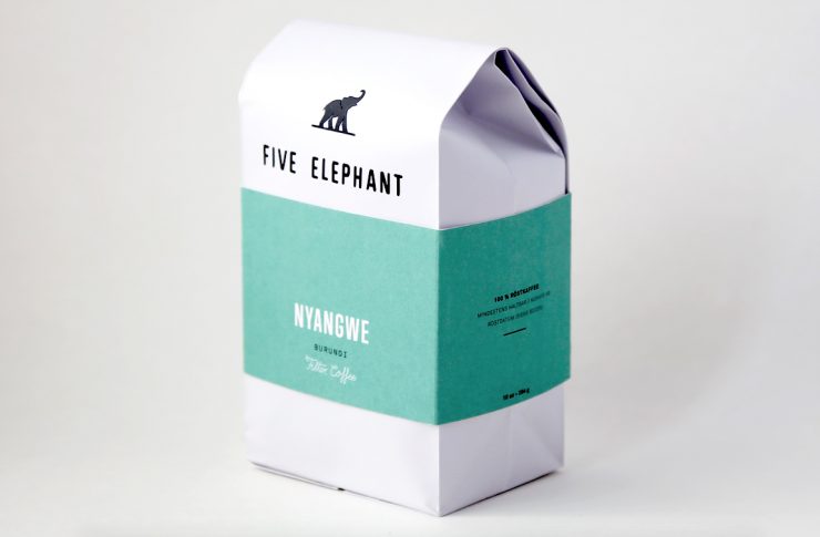
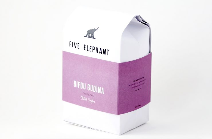
The bag was meant to have a solid feel, much like a box and is a mix between traditional craftsmanship and modern influences, just like the coffee we roast. The seasonal changing coffee menu and roasting information needed to be easily adjustable, therefore Sunst. Studio designed a basic stock bag. For this reason, the white paper bag is branded only with the Five Elephant Logo via heat foil press and then we use a banderole to communicate the individual coffees.
What coffee information do you share on the package? What’s the motivation behind that?
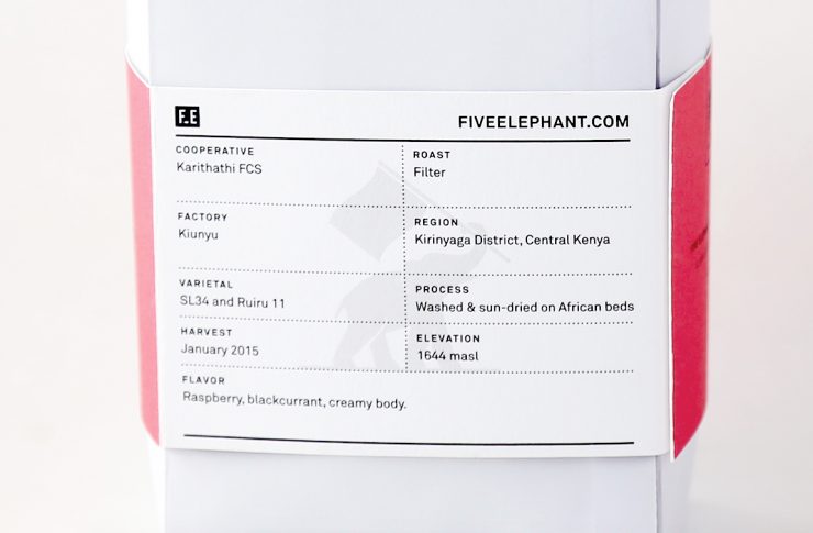
On the back of the flexible banderole there is a minimalistic and clean information chart which can easily be changed weekly to be up to date with the flavor and taste of current coffees and taste profiles.
It is even possible to produce a very small range of coffee with the same design for a special edition. We wanted to keep it simple, but make sure we had the basics. So we include all info in a uniform way for all coffees. This is, Country, Farm or Cooperative, Region, Elevation, Variety, Process, and also some flavor notes.
The development of a trademark icon for each country was meant remind one of an old seal of approval. Sunst. developed a color chart for the different coffee roasts types:
Saturated color = espresso
Dulled color = filter coffee
When we send coffee to our customers, we include a postcard that also has a brief summary about the coffee, perhaps two paragraphs or so that describe what makes it special.
Where is the bag manufactured?
The bags are from a small company in the USA who install the valve and custom form the square bottom. Then, we add the banderole and our logo here from materials made or printed in Germany.
For package nerds, what *type of package* is it? What are the materials used?
We have a one-way degassing valve installed, and at the moment, affix the Five Elephant logo by hand here in the roastery. The flat bottom is formed by hand in California before it is sent here—with a process I have never seen on any coffee bag anywhere. We actually looked for over a year for someone who could do this for us. Our banderole is offset printed at a local printer on Gmund Paper.
Is the package recyclable? Any other pro-environment info about the package you want to share?
The banderole can be saved or recycled, and in some municipalities, the bag itself can be recycled, but you have to check with your local recycling center. As material for all print products, the Gmund-brand paper we are working with is eco-friendly.
Coffee Design is a feature series by Zachary Carlsen on Sprudge. Read more Coffee Design here.

