Post Falls, Idaho specialty coffee makers Doma Coffee Roasting Company have helped define their brand by an innovative approach to packaging. Vivid, technicolor designs abound across their product range, resulting in multiple national and regional ADDY Award wins for excellence in brand design. The coffee’s no slouch either; Doma’s Ethiopia Suke Quto was a 2015 Good Food Awards finalist. You can find Doma’s coffee at cafes, restaurants, and specialty grocery stores across the Inland Northwest, from Boise to Spokane, plus the occasional appearance as far west as Portland, Oregon.
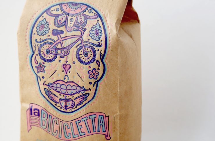
We spoke with Doma’s Terry Patano to learn more about the striking design you see above, for Doma’s La Bicicletta.
As told to Sprudge by Terry Patano.
When did the coffee package design debut?
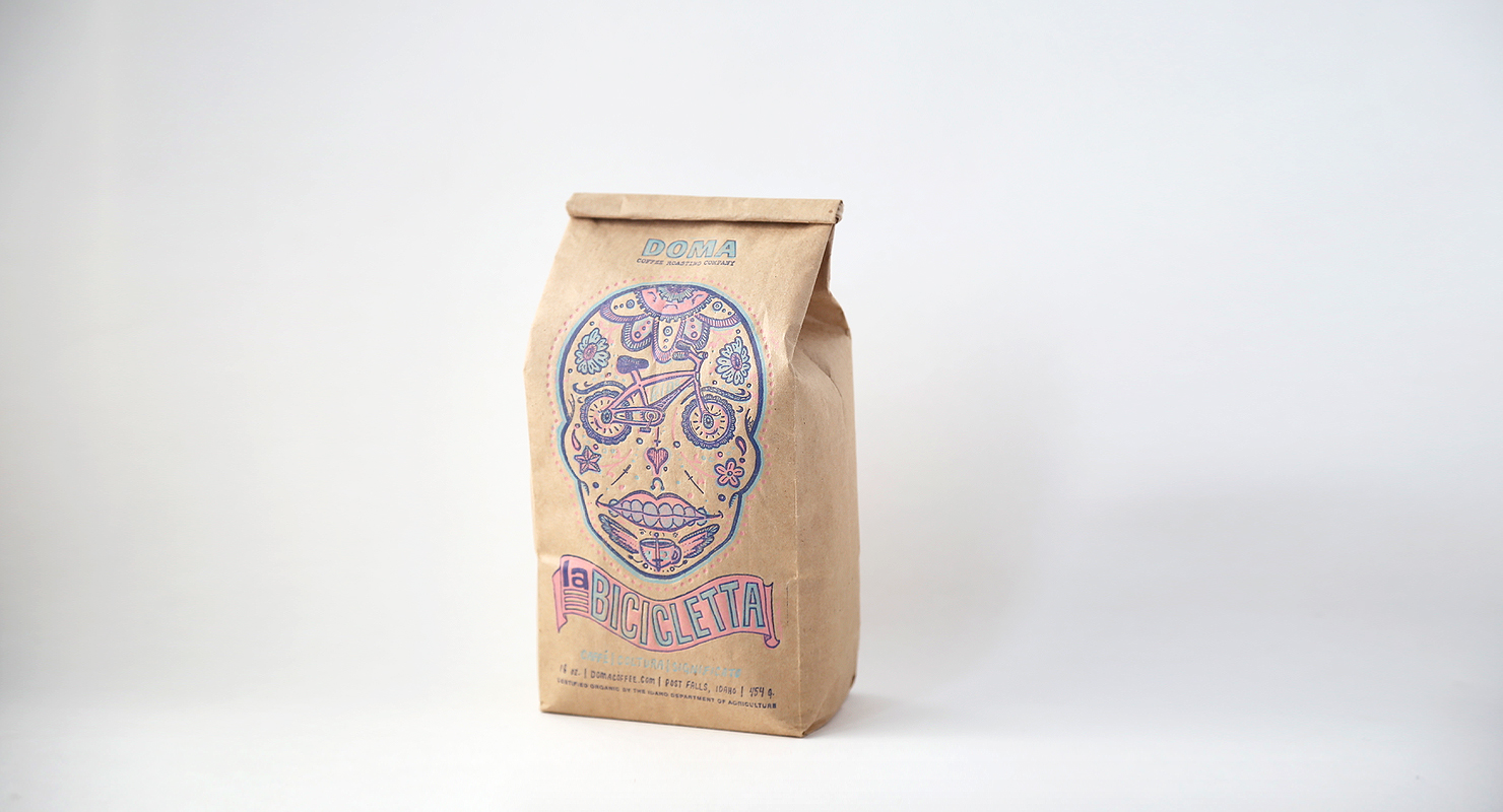
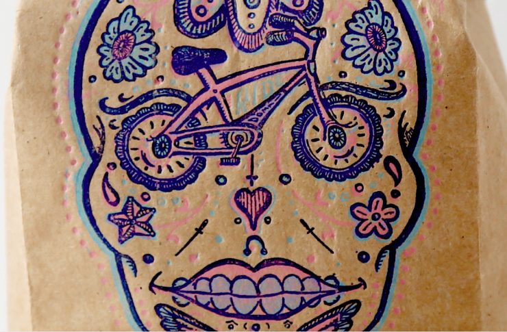
This coffee package made its first debut in 2009 when a local woman’s cycling team approached us for sponsorship. We designed the sugar skull to be badass, as these women were really making changes in our community. La Bicicletta (the bicycle in Italian) does great work all over our region every year. With the proceeds from the sales, DOMA has sponsored bike races, race teams, events, and even used it to fundraise for an injured cyclist.
Who designed the package?
Chris Dreyer and Rebecca Hurlen-Patano worked in collaboration to refine this current edition of the design (there is a boy version too). Chris Dreyer prints this on a letterpress.
It’s a sugar skull incorporating a bike as the eyes of the skull, paying tribute to a local women’s cycling club. The design was done to highlight the letter press printing process. 3-color. Custom mixed inks.
Please describe the look in your own words.
Uniquely DOMA. We have very strict brand standards which we purposefully bend the rules on for these artist series bags. For instance, the only time you will see the DOMA logo in outline form is on these bags. We also use hand-drawn type.
What coffee information do you share on the package? What’s the motivation behind that?
Logo: Always on our packaging, but a different size for the La Bicicletta.
Name of coffee: La Bicicletta – Pronounced La-Bee-Chee-Ka-let-ah.
Tag line: Coffee | Culture | Meaning – we changed the spelling to be in Italian, like the name of the coffee.
Weight: In ounces and grams.
Organic Certification: Certified Organic by the Idaho Department of Agriculture. We did not include the USDA icon for design reasons. We follow the labeling requirements set forth by our organic certifying body, in this case the Idaho Department of Agriculture.
Where is the bag manufactured? What *type of package* is it?
It is manufactured by Pacific Bag. This is their stock one-pound Ingeo kraft tin-tie bag with EarthFirst liner. 40% recycled natural kraft paper, 25% post-consumer. EarthFirst is a compostable film bake from annually renewable plants. Tin-tie removes before composting.
We choose a kraft bag not just for look and feel, but because you can compost it—there’s no valve. DOMA is always looking for high-quality, sustainable packaging that make sense for the planet. This seemed like the best choice at the time.
We print all of our 2-color one-pound and five-pound bags in house on our 1928 12×18 Chandler & Price letterpress. This ancient printing process gives us the look we like and we can run small minimums.
Coffee Design is a feature series by Zachary Carlsen on Sprudge. Read more Coffee Design here.

