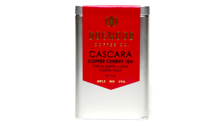
For our longtime friends and partners at Dogwood Coffee, special projects mean special packaging. Whether it’s limited edition farm verticals like their La Lia box set, consistently excellent merch, or the tasteful cascara tins featured in this here feature, design and packaging are multi-faceted ways for the Minneapolis (and Winnipeg!) brand to express identity. We love receiving the occasional Dogwood care package because their looks are always surprising: a playful hodgepodge of zamboni dogs, funny tasting notes, blendy “mixtapes”, and some of the best coffee currently being roasted anywhere in North America.
As told to Sprudge by Stephanie Ratanas.
When did the coffee package design debut?
These labels were actually made for our regular bags for “reserve” coffees around Christmas last year. We sold our La Lia project coffees in 12oz bags adorned with these labels. They are a version of our regular coffee labels, we used the same die cut for them as the red and white ones you are used to seeing. When we were looking for a delightful way to package the cascara, we thought we should bring these pretty labels out again.
Who designed the package?
Our regular label design was done by Jeff Holmberg and we used the same cut and layout for these labels with a new approach by Studio on Fire. We have a long relationship with Studio on Fire—they letterpress all of our labels, our Zamboni Cold Brew print, and other random stuff.
Sort of side note: Studio on Fire is moving to a new space in the St. Anthony neighborhood of St. Paul this fall and we are opening a full coffee bar in the same building. It’s an old converted warehouse space they are building out right now, and it’s going to be pretty awesome. Unlike our other coffee bars, it will be a fully enclosed space of our own, but tucked into SOF’s production area. There will be windows in our space where you can see their awesome old Heidelberg presses in action!
Any design highlights you want to share.
I reached out to Ben Levitz and Travis Bookler at SOF to answer this one:
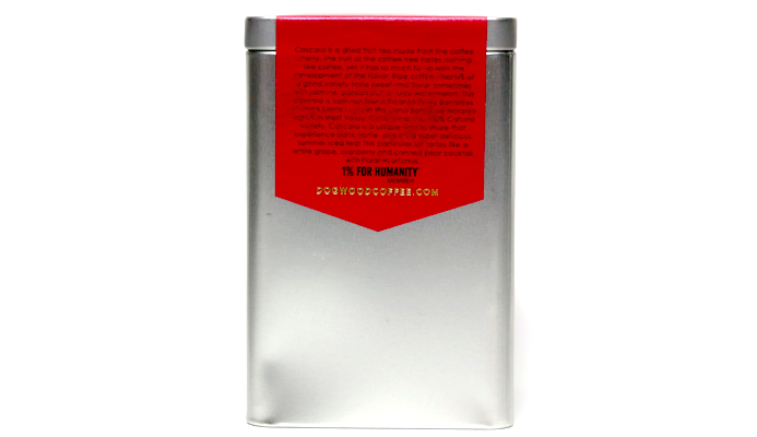
The material is Neenah Stardream Jupiter Red label stock, with a thickness of 81# cover weight. The sheet size was 8.5 inches by 11.5 inches, printed 3 up…so 3 labels per sheet.
We used gold foil for all text and logos. The foil was Infinity MX86 Gold, pressed into the label stock using a heated copper die. Each label was then kiss cut with a custom steel rule die. This cuts the outside diameter of the label, while keeping the entire sheet intact for later use.
Please describe the look in your own words!
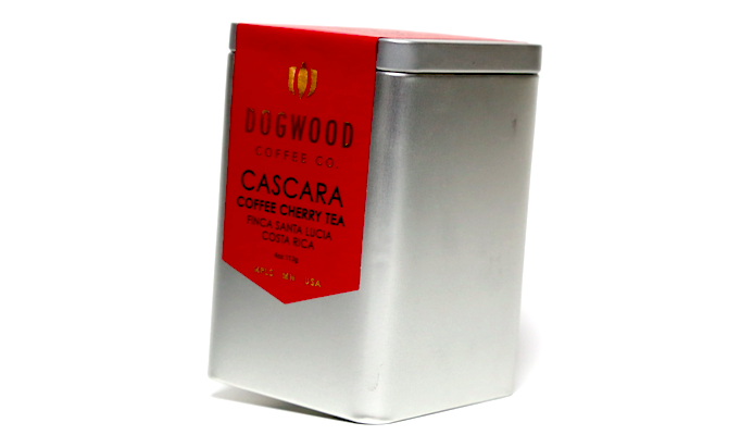
We try to find excuses to put metallic gold on things, because we are glam like Gaga.
What coffee information do you share on the package? What’s the motivation behind that?
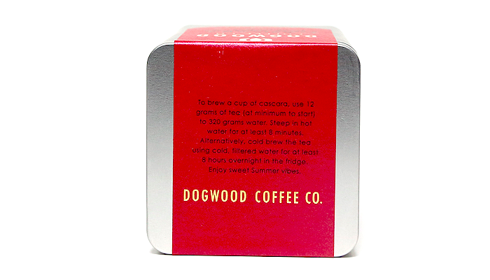
Because the label was made for our kraft retail bags and not the tin that it’s on for the cascara, we had to strategically place our words on the label to make it look intentional. (It was intentional.) On the back side of the tin/label, we give information about what exactly cascara is, and the producer, Ricardo Peréz Barrantes of Helsar de Zarcero. There is always more info we want to share than will fit on the label, but we try to highlight the things we think most of the coffee drinking (or in this case, fruit tea drinking) public would want to know. On the top of the tin, we give some very brief suggestions for brewing.
I sort of think about words on the coffee bag like content on the cereal box. A whole paragraph might be overkill for when you’re shopping for coffee, but when you’re brewing or drinking, the bag is still there and that’s when people take the time to chill out and read about what is inside.
Is the package recyclable? Any other pro-environment info about the package you want to share?
It’s recyclable in the sense that you could keep it and use it to hold dog treats, paper clips, coupons, jolly ranchers, illegal stuff, bottle caps, dead bug collection, diamonds, googley eyes, bay leaves, bobby pins, cough drops, thumbtacks, sand…the possibilities are endless!
Coffee Design is a feature series by Zachary Carlsen on Sprudge. Read more Coffee Design here.

