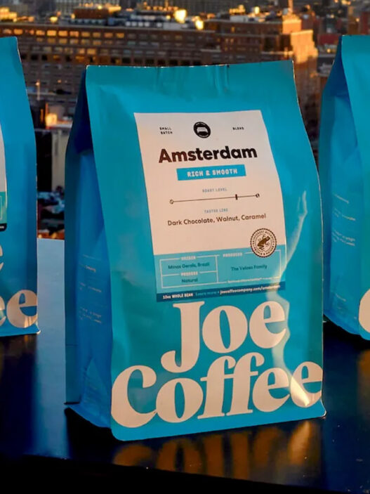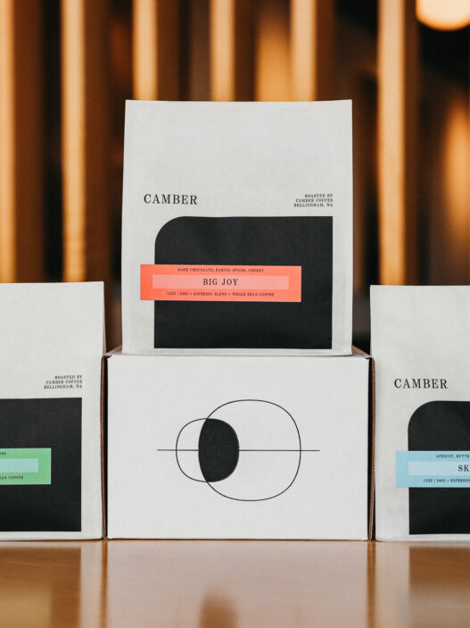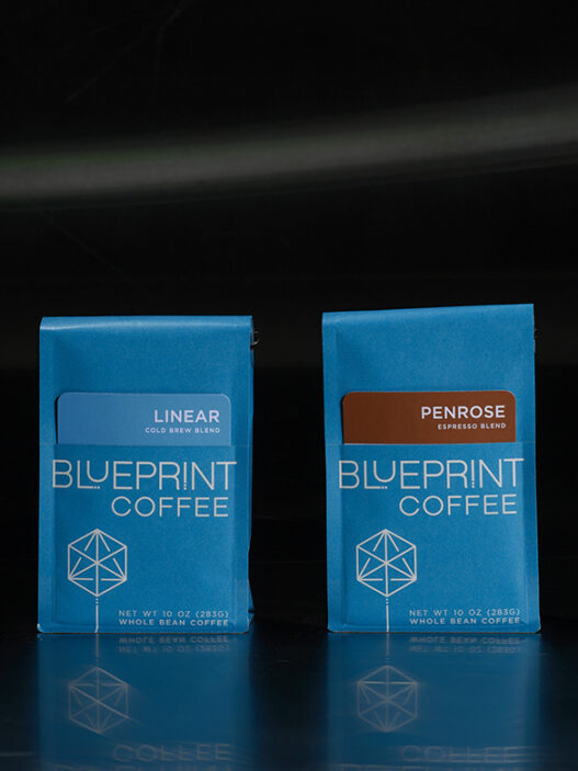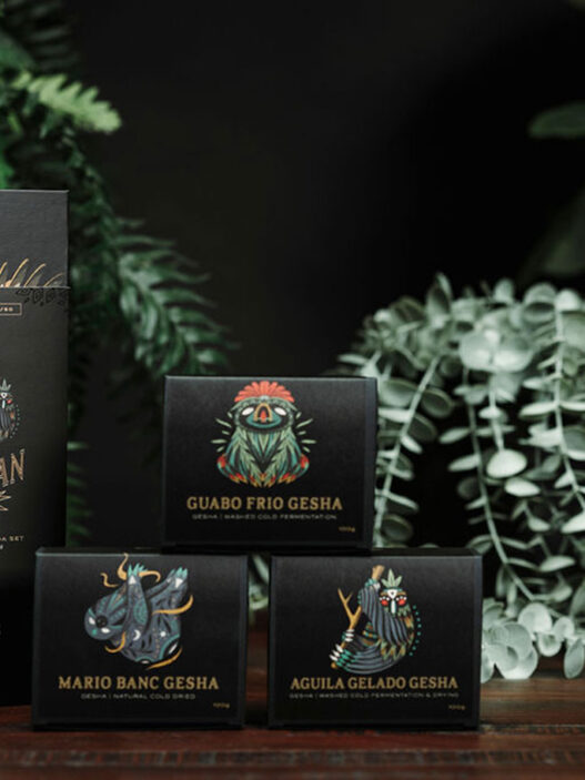
Our friends & partners at Coffee Supreme have repeatedly distinguished themselves through design in their 20+ years in business. From their artful and distinctive cafes—Seafarers in Auckland, Supreme Supreme in Christchurch, the Abbotsford Club in Melbourne, and on—to their distinctive merch and takeaway cups, there’s no mistaking the Coffee Supreme brand. Supreme’s coffee design choices are made with inspiring intentionality.
As told to Sprudge by Benn Crawford.
When did the coffee package design debut?
We first released the packaging in June 2014.
Who designed the package?
We wanted to make sure we got our packaging spot on, so we enlisted the help of some friends by the name of MARX Design. They helped us work through the process from start to finish. Our in-house design team, the Art Department, already had some strong ideas of what we wanted to see in our packaging, but definitely wanted a second pair of eyes on it.
Any design highlights you want to share?
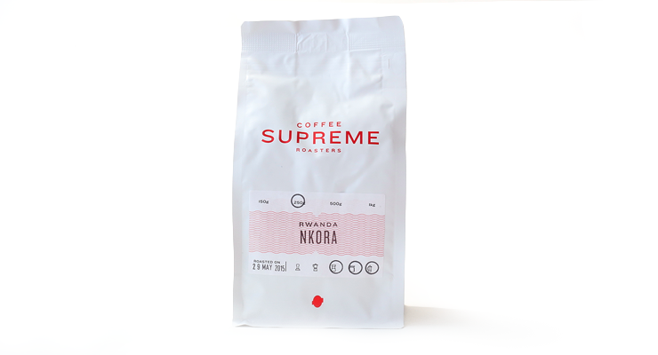
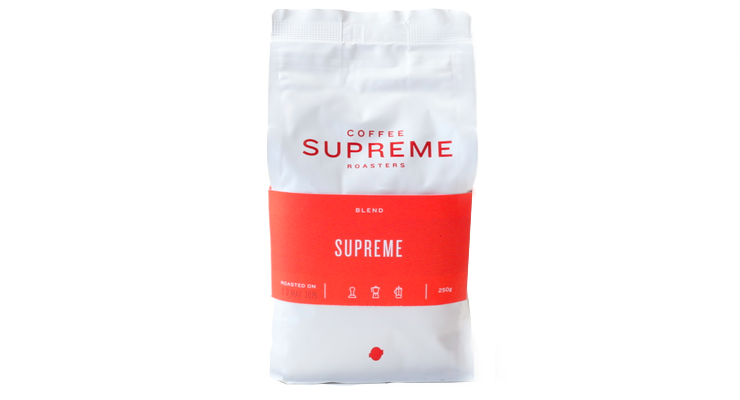
We were able to utilise the foil lining of the bag in a clever way to mimic a foil print process. By leaving negative space and then overprinting with Supreme red, it gives a premium feel to the bag.
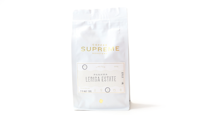
The Coffee Supreme Roasters logotype uses two weights of the Knockout family by Hoefler & Co, which we’ve been using across the Supreme brand since 2011.
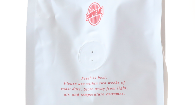
The foil barrier and heat-sealing has extended the peak lifespan of our coffee. Where our previous bags gave our customers a 10-day window of optimal use, the new bags extend that to 15 days.
The white colour used on the bag was one of the elements we prototyped the most. We wanted something classic but not clinical. We found a brilliant white to be too harsh and other options too creamy/ yellow. We settled on a ‘black white’ which almost enters the grey spectrum.
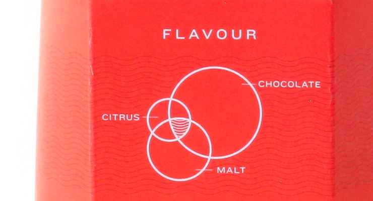
Our 250- and 500-gram blends have a custom bag wrap/ sleeve. The bands use bold colour blocking to identity each blend and incorporate a novel venn diagram that shows the prominence of the three most noticeable flavour dimension in the coffee.
Please describe the look in your own words!
We wanted to make sure we had a bag we would be happy with the next 5-10 years. Something classic and that we could be proud of for a good period. We love progression and doing new things here at Supreme, however, we wanted to ensure our packaging was a solution that we could settle in with for a while. The white bag was a conscious step away from a lot of brown kraft bags in the market at the time.

What coffee information do you share on the package? What’s the motivation behind that?
We have three packaging solutions for our coffees.
1) Our blends get a printed wrap that is placed over the bag with all the corresponding info for that coffee. These coffees we sell in high volume and also don’t change as much, so they warranted a solution that was a little more complex. The band provides the blend name, roast date, weight, icons for what the coffee is suitable for, and our venn flavour diagram and copy about the blend. On the back side of the wrap, we include some simple brewing tips to make sure people are getting the best from their coffee.
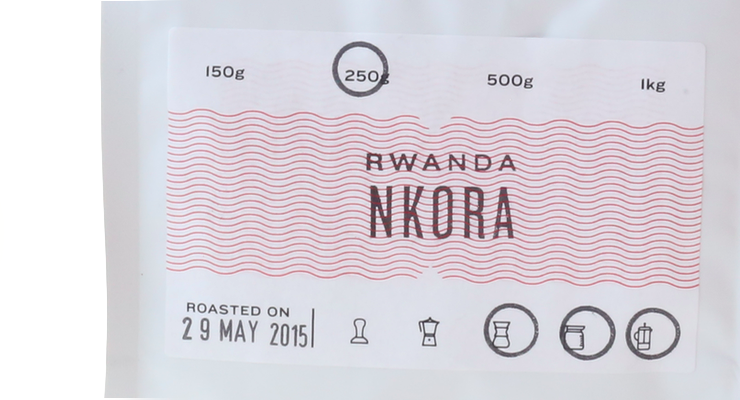
2) Our single origins and revolving coffees carry a generic label, which is then marked appropriately with the coffee being sold. This label carries the origin, coffee name and possibly a third defining attribute, roast date, weight, and suitable for icons.
3) Our top-shelf coffees, often rare microlots, with exceptional provenance get carefully packaged in a gold foil variant of our packaging. We call this range Limited as these coffees are exclusive to Supreme in the Australasian market.
All our coffees have corresponding tasting cards, which provide further details for each coffee should the customer want it. This card provides the back story of the coffee, producer details, altitude, processing, flavour venn, and a QR code to link directly to that product online.
Where is the bag manufactured?
Taiwan.
For package nerds, what *type of package* is it?
The bags are foil-lined and carry a one-way valve and a resealable zip lock. The bags are heat-sealed when filled.
Coffee Design is a feature series by Zachary Carlsen on Sprudge. Read more Coffee Design here.

