


Kansas City is a place of best-kept secrets: the food & cocktail & beer scenes (it’s so much more than BBQ), the fast Google Fiber wifi, and a remarkable culture of talented graphic designers and letterpress artisans, for starters. There’s more, of course—it’s one of the most interesting cities in the United States right now, and almost entirely unencumbered by the ego and fronting that accompanies cool shit in bigger cities.

So that the wider cultural zeitgeist in KCMO would dovetail with specialty coffee culture makes a lot of sense. This is one of the first places in America where specialty coffee popped, back in the first years of the 21st century, and today the city’s home to some of the country’s top cafes and roasters, many of whom sport fantastic homegrown design and packaging.
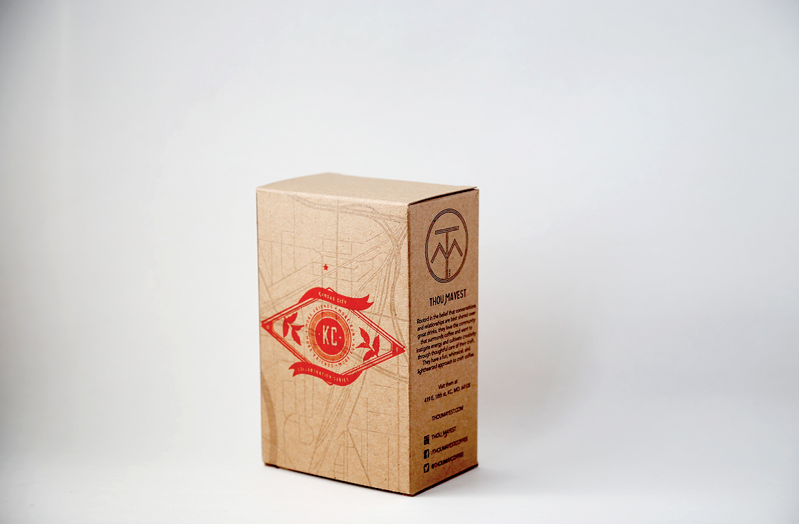
So here’s an emblematic look at that, in the form of a collaboration between Thou Mayest and Blip, two of the city’s best indie coffee brands. You’d sell out this packaging from the shelves of every lifestyle boutique in America on design cred alone. Let’s learn more.
As told to Sprudge by Bo Nelson.
When did your package design debut?
Friday, June 5th.
Who designed it? Do you do it in-house, or through a design firm?
Idea brainstorming session from all parties involved, but brought together and executed by Survival Letterpress, a small design/letterpress shop here in Kansas City.
Any design highlights you want to share?
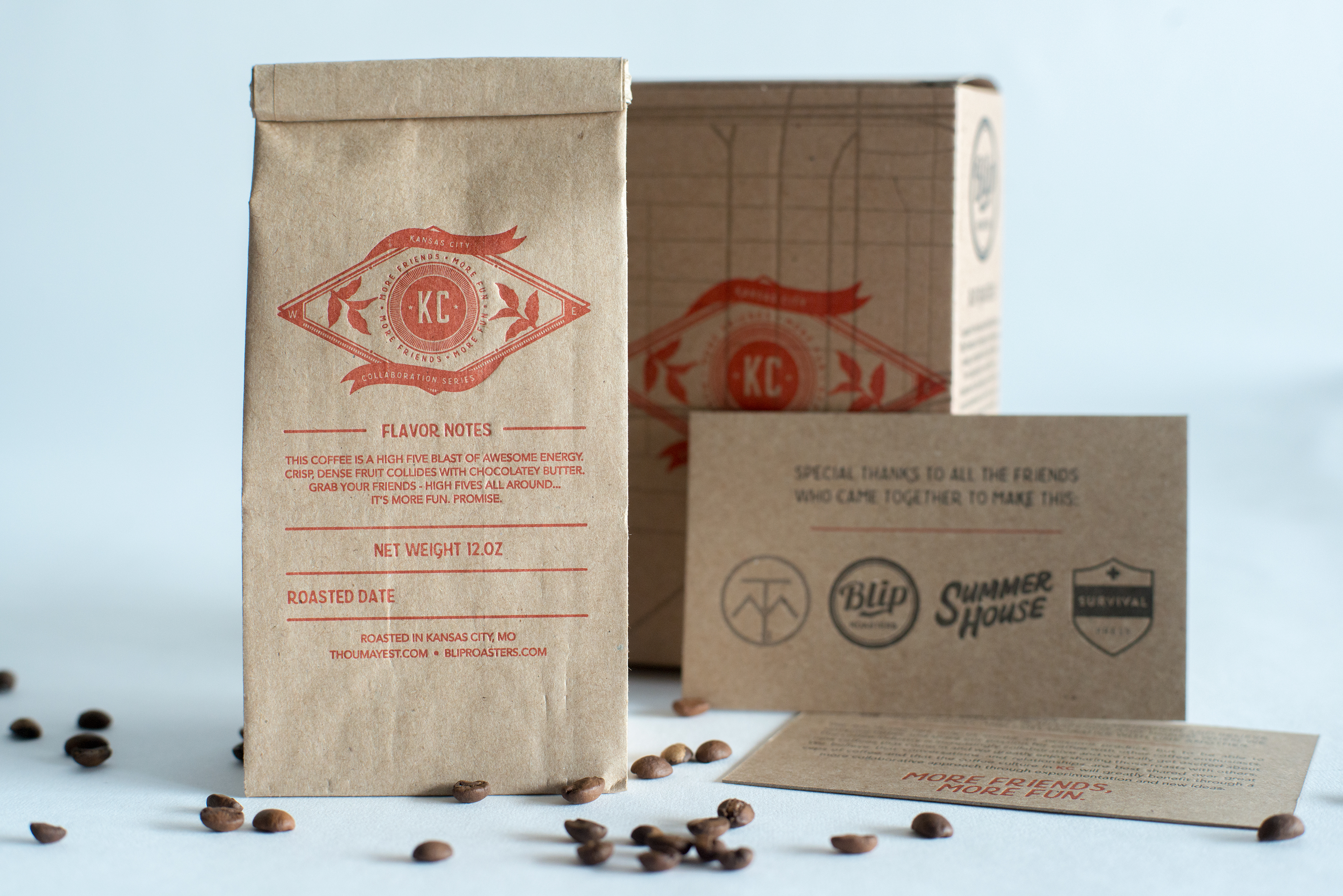
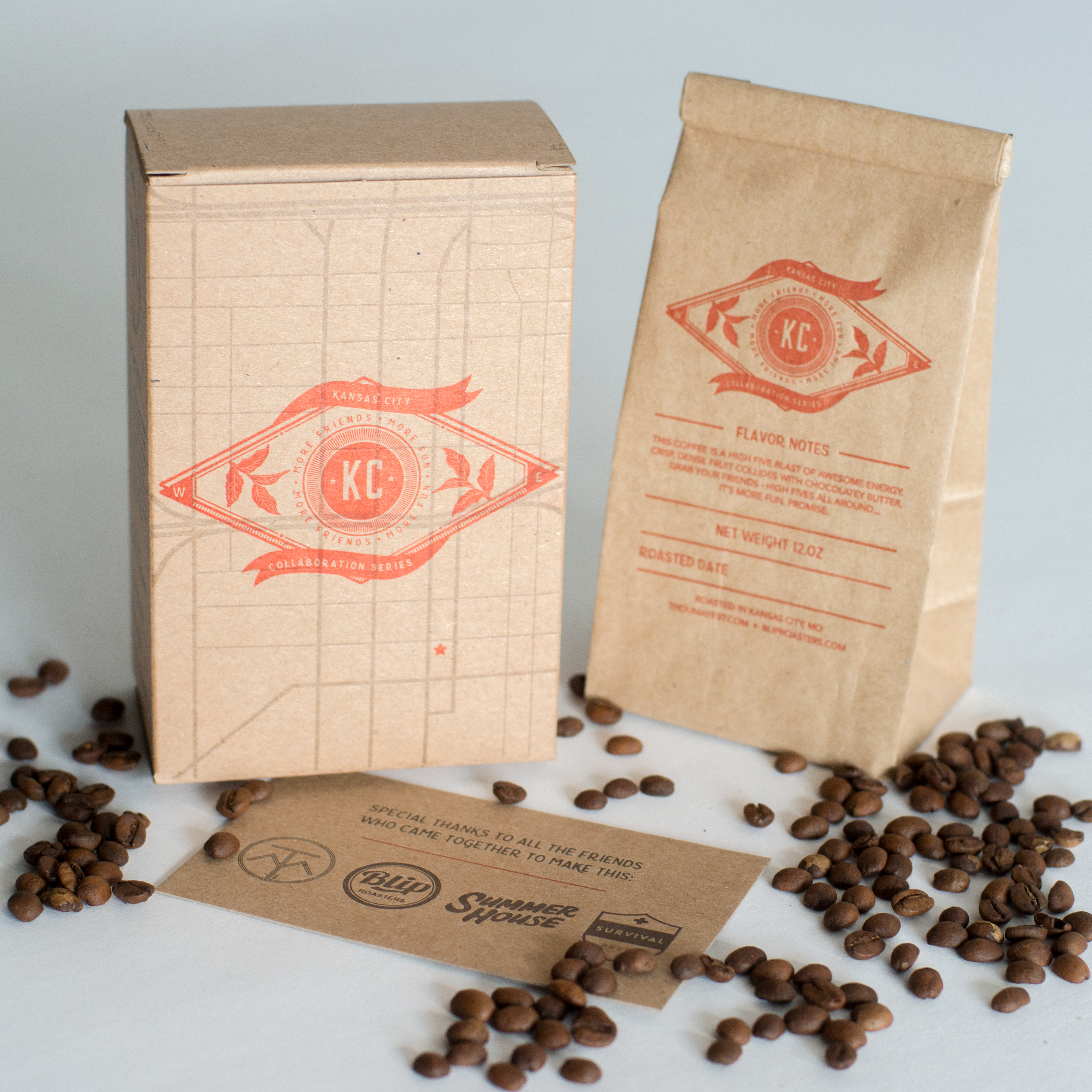
In total, we used 3 different fonts to design the KC Collaboration Series logo and the rest of the packaging. Fonts used were Bourbon, Yonder and Avenir for the body copy. Colors were Pantone Warm Red and Black out of the can and a 20% tint of black for the maps on the boxes. We wanted those to be subtle in the background. Everything was designed digitally and then printed letterpress. The bags and insert card were printed on a Heidelberg Windmill and the boxes were hand fed on a Chandler & Price printing press.
Please describe the look in your own words!
There were several different directions we could have gone with the look and feel of the brand/packaging for this project but the one we kept coming back to that made the most sense (especially for the boxes) was the vintage maps for each roaster’s shop/location, respectively. Being able to highlight the two areas in Kansas City where the coffee was being roasted seemed pretty awesome and then we added the stars as markers on each side for both shops.
The logo, like most logos, started out as something totally different and quickly evolved into the diamond shape. It worked well being able to highlight East and West (Thou Mayest is located in the East Crossroads and Blip is in the West Bottoms) and still have room for some hand-drawn elements like the coffee leaves and flag/banners. We think it will hold up for other collaborations we are hoping will take place in the KC Metro area in the future. We knew from the beginning everything was going to be letterpress printed so we designed within the parameters of that as well; flat line artwork and simple detail go a long way with the letterpress process.

What coffee information do you share on the package? What’s the motivation behind that?
We worked on this collaboration for about a month with plenty of cupping in the weeks leading up to the release. Each roaster brought their respective beans to the table. We cupped, took notes, compared and talked it over, and came up with a description that encapsulates both roasts—a chocolatey-toffee Guatemalan from Blip and a dense-fruit, butter-bomb Kenyan from Thou Mayest.
Where is the packaging manufactured?
The box was from a local box/packaging company called All Pack Co., which both companies have a prior relationship with. Blip Roasters currently packages their coffee in this style of boxes. Thou Mayest uses kraft bags from Nashville Wraps. We combined the two packaging styles to come up with the final product.
What *type of package* is it? Hand-pressed? One-way valve?
Because this particular coffee was a limited release and fresh out of the roaster, we decided not to use a one-way seal. We packaged the coffee in “1/2 lb, Natural Kraft Tin Tie Bags. Made from 50# basis Natural Kraft paper with laminated clear poly liner and tin-tie closure. FDA approved for direct food contact. Made in the USA.”
Is the packaging recyclable?
Both boxes and bags – everything but the tin-tie is recyclable.
Anything else you’d like to share?
We did make a few mistakes in this project. We now know that this type of a collaboration has, in fact, been done before. We have seen collabs like this between cities and across state lines, but we were unaware that Chicago has a rich history of co-branded, co-labeled collaboration blends within the metro area. We know Dark Matter and Bowtruss have worked together and there are a few more in there. It was a lack of knowledge on our part—an innocent mistake.
Coffee Design is a feature series by Zachary Carlsen on Sprudge. Read more Coffee Design here.