


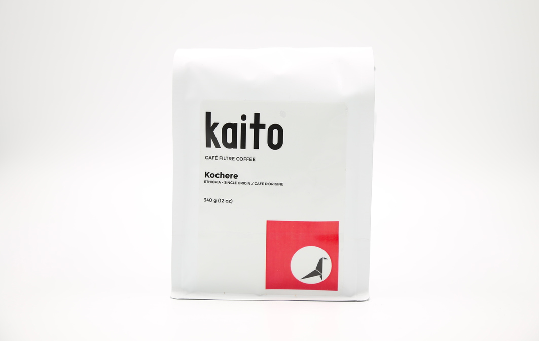
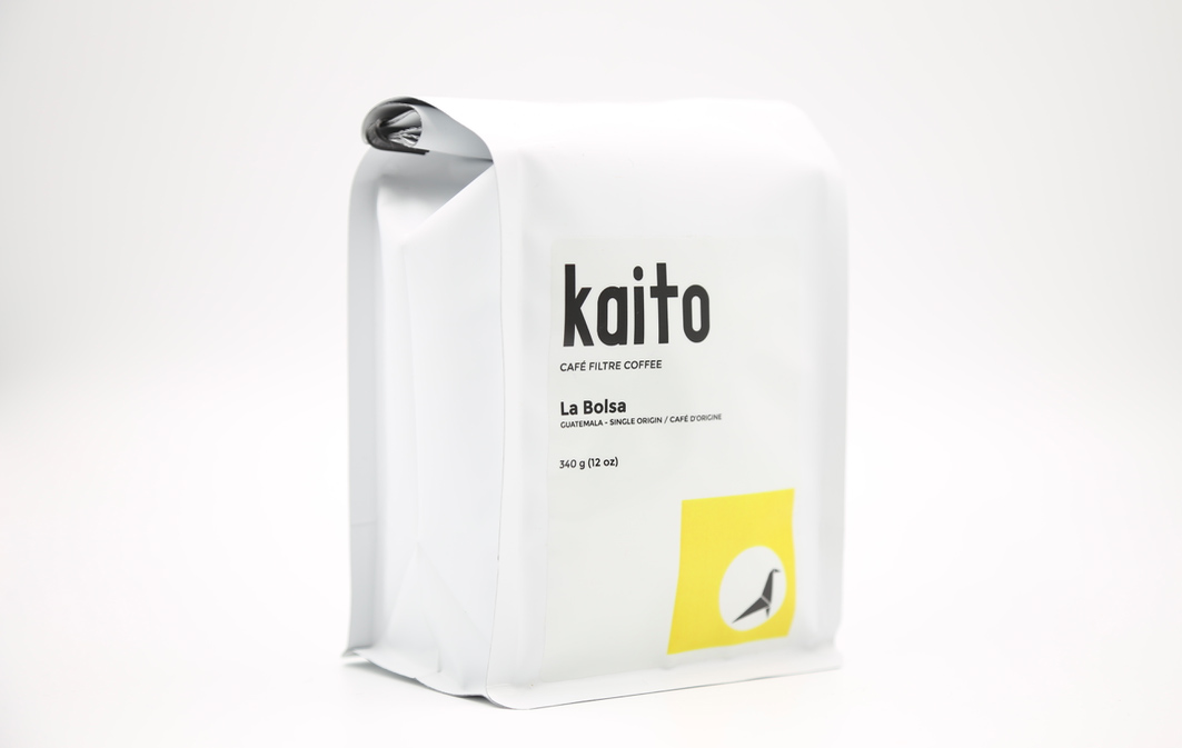
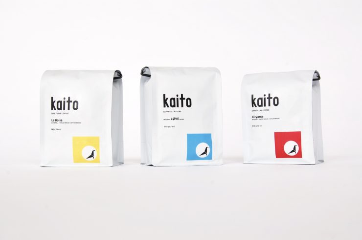
Quebec coffee roaster Kaito keeps their coffee design clean and simple. Co-Founder Holly von Hoyningen Huene tells us that this “comes from our desire to make people feel that specialty coffee is not a complicated, intimidating affair. It can be fun and easy and everyone should feel welcome to appreciate it.”

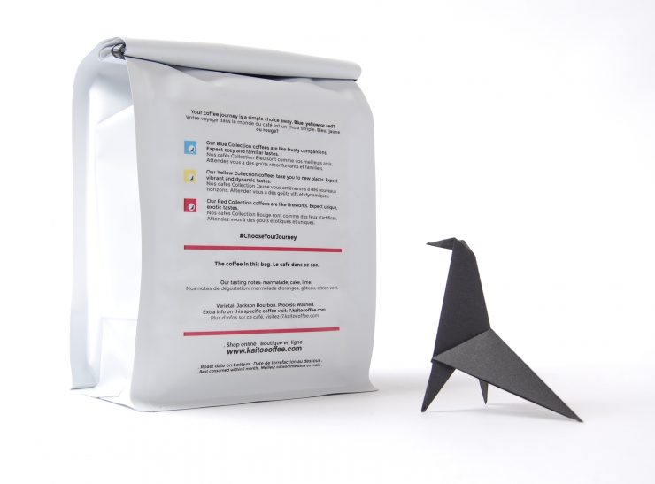
Sounds good to us! They don’t want to go overboard with simplicity, because how dreadful would that be? “We don’t want to oversimplify and undo all the hard work we are all doing to educate coffee drinkers about the truths and facts about their favorite beverage,” says von Hoyningen Huene, “so our back label has all the other important details about the coffee in the bag and our color-coded approach.”
Let’s take a closer look at Kaito Coffee Roasters with Holly von Hoyningen Huene.
Tell us a bit about your company.
We launched Kaito Coffee Roasters last year in our hometown of Hudson, Quebec, Canada, which is near Montreal. We roast on our beloved Loring S15 in a small but beautiful space.
Our mission is to showcase the amazing (and too often unknown!) spectrum of taste experiences that exist in the world of coffee. And we want to do it as simply and delightfully as possible. We do it by curating the coffees we source into one of our three color-coded collections, each defined by their own gustatory profile. This way, we cover the full range of experience you can have with coffee. Appealing to coffee novices and connoisseurs alike, these collections are designed to encourage anyone along their coffee journey–easily allowing them to discover and navigate the world of coffee like a pro.
We describe our collections as follows:
Coffees in our blue collection are like trusty companions. You can expect a cozy, familiar taste experience with these coffees. Perfect for people looking for full body coffees, low in acidity, with flavour notes more in the nut, dessert, spices and subtle fruit categories.
Coffees in our yellow collection take you to new places. Expect a vibrant and dynamic taste experience. Perfect for people looking for coffees with brighter acidity and varying mouthfeels, with flavour notes more in the fruit, dessert, flower and subtle herb categories.
Coffees in our red collection are like fireworks. Expect a unique, exotic taste experience. Perfect for people looking for wondrous, and sometimes curious coffees.
When did the coffee package design debut?
We launched our business last year with this design. Since we print the labels in-house, we’ve been able to make small adjustments to fine tune the design.
Who designed the package?
We worked with the awesome Dima Yagnyuk at designstudio.io in Vancouver who helped us create our branding.
What coffee information do you share on the package?
The front of the bag is very simple. It states what’s in the bag with the color-coded logo. The back of the bag elaborates on the front. It explains our color-coded system and offers pertinent details about the coffee itself – origin/producer, varietal and processing info with a link that leads to the coffee’s full story on the webpage.
 Where is the bag manufactured?
We purchase the bags from Pack Plus Converting. The labels are from Onlinelabels.com.
For package nerds, what type of package is it?
It’s a 12 oz matte white, flat-bottom bag with a black tin tie and valve.
Is the package recyclable/compostable?
Unfortunately not. We care deeply about this issue though and are currently looking into a few different options for sustainable packaging. We plan to transition within the next year and we’re very excited! But even thought the packaging material itself will change, the concept and values that drive our package design will live on.
Where is it currently available?
Our next door neighbor and main local partner in town, Mikko Espresso & Boutique, is always
stocked with our coffees. Our bags can also be found at various independent partner shops in Quebec and Ontario. Otherwise, our coffees are always available to order from our online shop. We ship globally.
Can you tell us about the bird in your logo?
His name is Wazo. When we developed our logo, we drew on our admiration for the design duo Charles and Ray Eames. We used their Eames House Bird as an inspiration to our own bird’s shape and form. Like the Eames, we wanted to have our own bird live in the world with us and be part of our day to day and storytelling. We worked with origami artist extraordinaire Ross Symons from White on Rice in Cape Town to bring him to life. Anyone can learn to fold their very own Wazo here:
Location: Hudson, Quebec
Country: Canada
Design Date: 2016
Designer: Kaito Coffee Roasters & Dima Yagnyuk at designstudio.io
Coffee Design is a feature series by Zachary Carlsen on Sprudge. Read more Coffee Design here.
Photos courtesy Kaito Coffee Roasters

