


Inspired by “lux, high fashion”, the graphic design duo of Seth Herman and Chuck Anderson developed packaging for our friends and partners at Madcap Coffee all the way back in 2010. In the years since the brand’s signature look has become iconic in American specialty coffee circles, and today still feels as fresh as ever. We spoke with Herman & Anderson for Coffee Design on how they achieved that Madcap look.
As told to Sprudge by Seth Herman & Chuck Anderson.

When did the coffee package design debut?
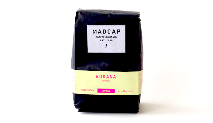
The current Madcap branding & packaging first debuted in 2010.
Who designed the package?
The branding and packaging is done by two independent designers who collaborate on all of Madcap’s design work, Chuck Anderson and Seth Herman. Chuck Anderson is an artist, designer, and photographer in Chicago who runs a studio called NoPattern, and Seth Herman is a multi-disciplinary designer with his own studio in Grand Rapids.
Any design highlights you want to share?
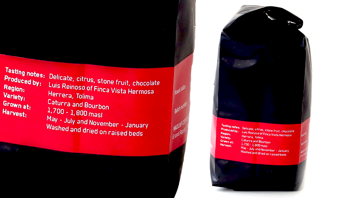
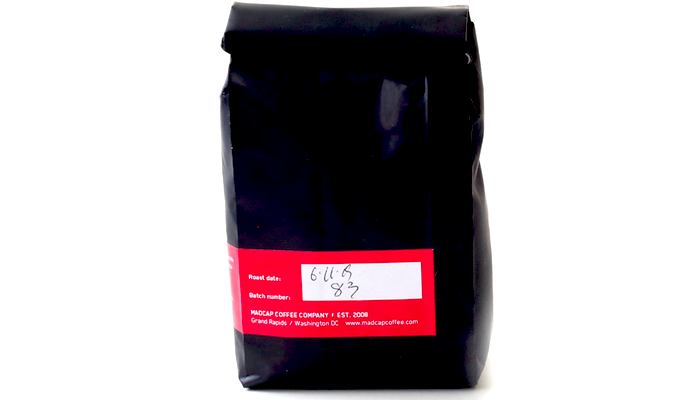
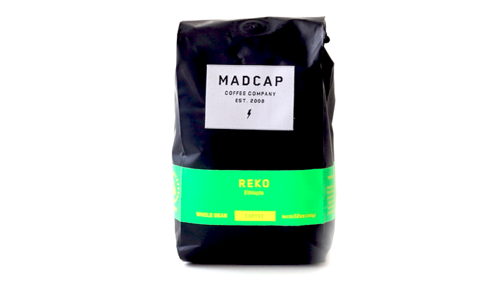
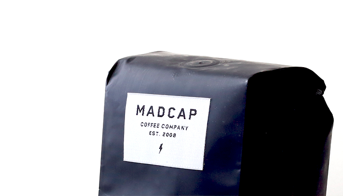
The signature part of the Madcap packaging is the fabric label with the Madcap logo design. This is something that a lot of people don’t realize at first until they have a chance to hold the bag in their hands and interact up-close. The other key part is the individual coffees’ unique colors on the band. The black and white of the packaging is constant but the use of different colors to represent each coffee makes each experience really unique and memorable.
Please describe the look in your own words.
Speaking as designers, we loved Madcap coffee and were excited to visually represent the skilled intentionality that makes Madcap exceptional. We didn’t want Madcap to look like they fit in because we felt it misrepresented their approach. So we took a lot of time to research what was out there and find out what was and wasn’t being done. At the time, we found that most coffee brands were looking to other coffee brands for inspiration on packaging, seeing things like kraft paper bags, stamps, and earthy colors on almost everything. A few had bold blocks of a single color or a brash posture. In contrast, the Madcap logo and packaging—from the typeface to the lightning bolt to the colors to the fabric label—were directly inspired by lux, high fashion. The black and white overall look we developed is something we feel really stood out and the packaging has since become instantly recognizable on shelves.
What coffee information do you share on the package? What’s the motivation behind that?
We include general taste descriptors, roast date, batch number (for QC purposes), and a short, two to three sentence story about the coffee.
Where is the bag manufactured?
Our current bags are manufactured by Pack Plus Converting in Chino, CA.
What type of package is it?
Foil gusseted bag with a one-way valve.
Is the package recyclable? Any other pro-environment info about the package you want to share?
The package is not recyclable. However, we are currently working on switching to an environmentally friendly bag. The demand for environmentally friendly packaging has finally reached a point that companies are responding and we are able to make the move without not only not compromising our brand but not compromising quality as well.
Coffee Design is a feature series by Zachary Carlsen on Sprudge. Read more Coffee Design here.