


Saint Frank Coffee has had a whirlwind couple of years—supporting their staff at national competitions, running a fast-paced Palo Alto location, teaming up with noted pastry chef Andrea Correa to open the bakery Juniper, and celebrating its tenth anniversary. 10 years ago, the San Francisco-based coffee company teamed up with designer (and former schoolmate) Dana Tanamachi to develop its original branding and recently tapped Tanamachi for a bit of a brand refresh.
We spoke with founder Kevin Bohlin digitally to learn more.

Can you tell us a bit more about designer Dana Tanamachi? You’ve collaborated on some exceptional work! How did y’all meet? How long have you collaborated with Tanamachi?
Dana and I met in art school where she crushed the Communication Design program that weeded me out! I love her quiet and humble yet powerful confidence and talent. She is an absolute joy to work with, we are able to sync up really well.
We’ve worked with Dana since our beginning in 2013 for our original direction in branding and then again in 2017 for an amazing installation at our first roastery from our shared love for the short story and film “Babette’s Feast.” In 2020, we were ready for a new look in our packaging and there was no one else we wanted to work with.
When it came time to develop a new packaging look, what did you want to convey? How long did the process take?
We wanted an approach that could express layers of meaning through a friendship built on trust. Design that followed the patterns of our brand and sourcing.
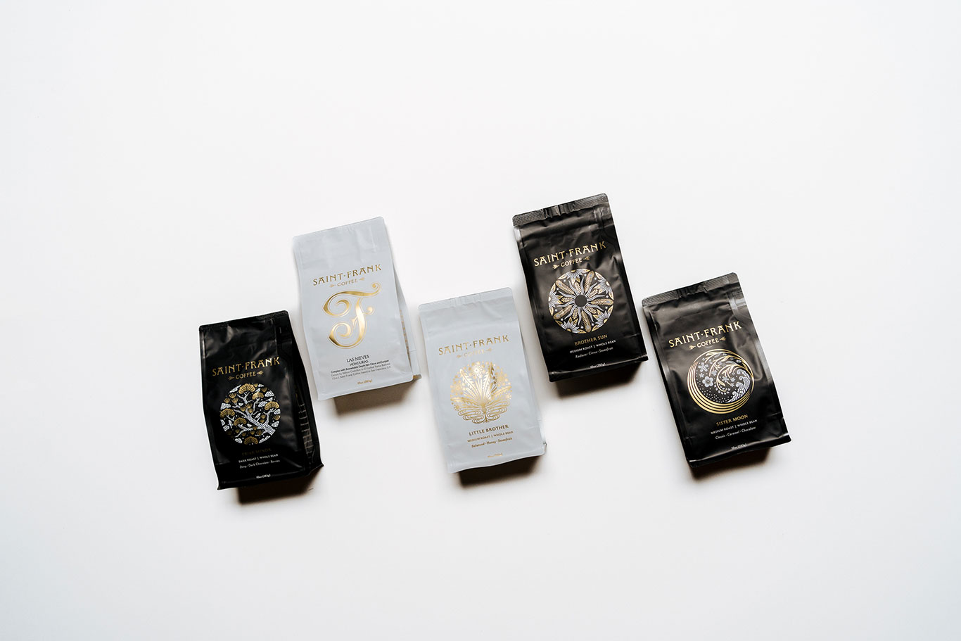
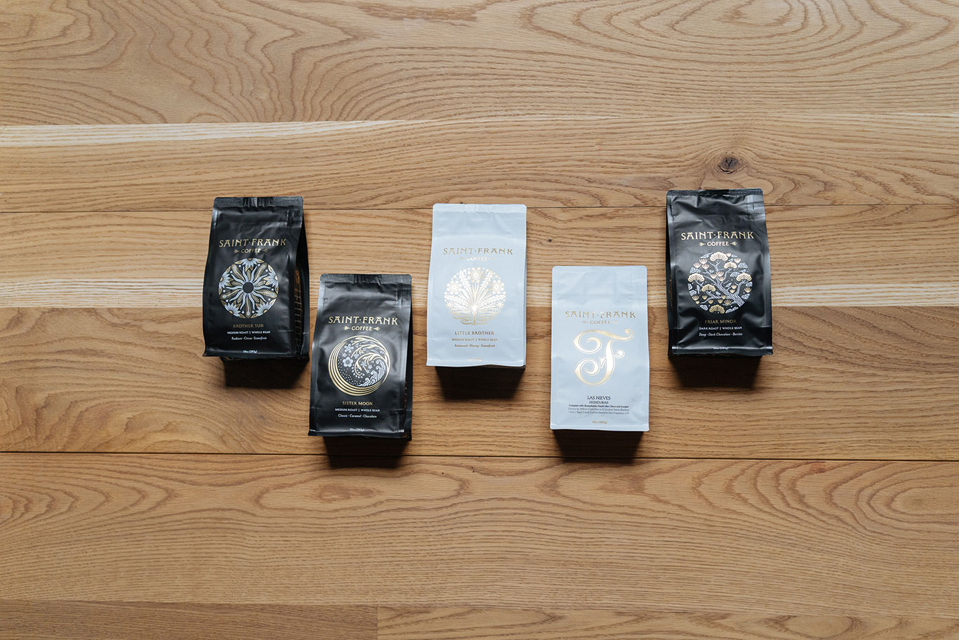
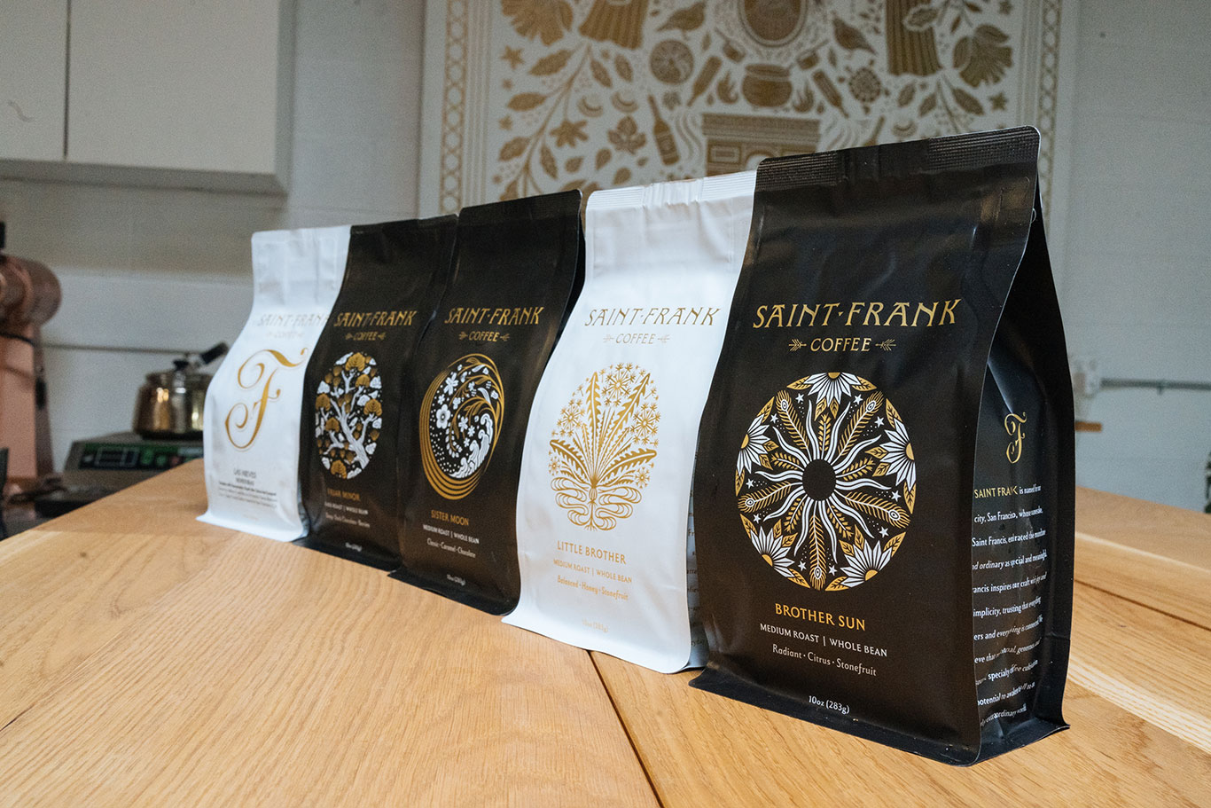
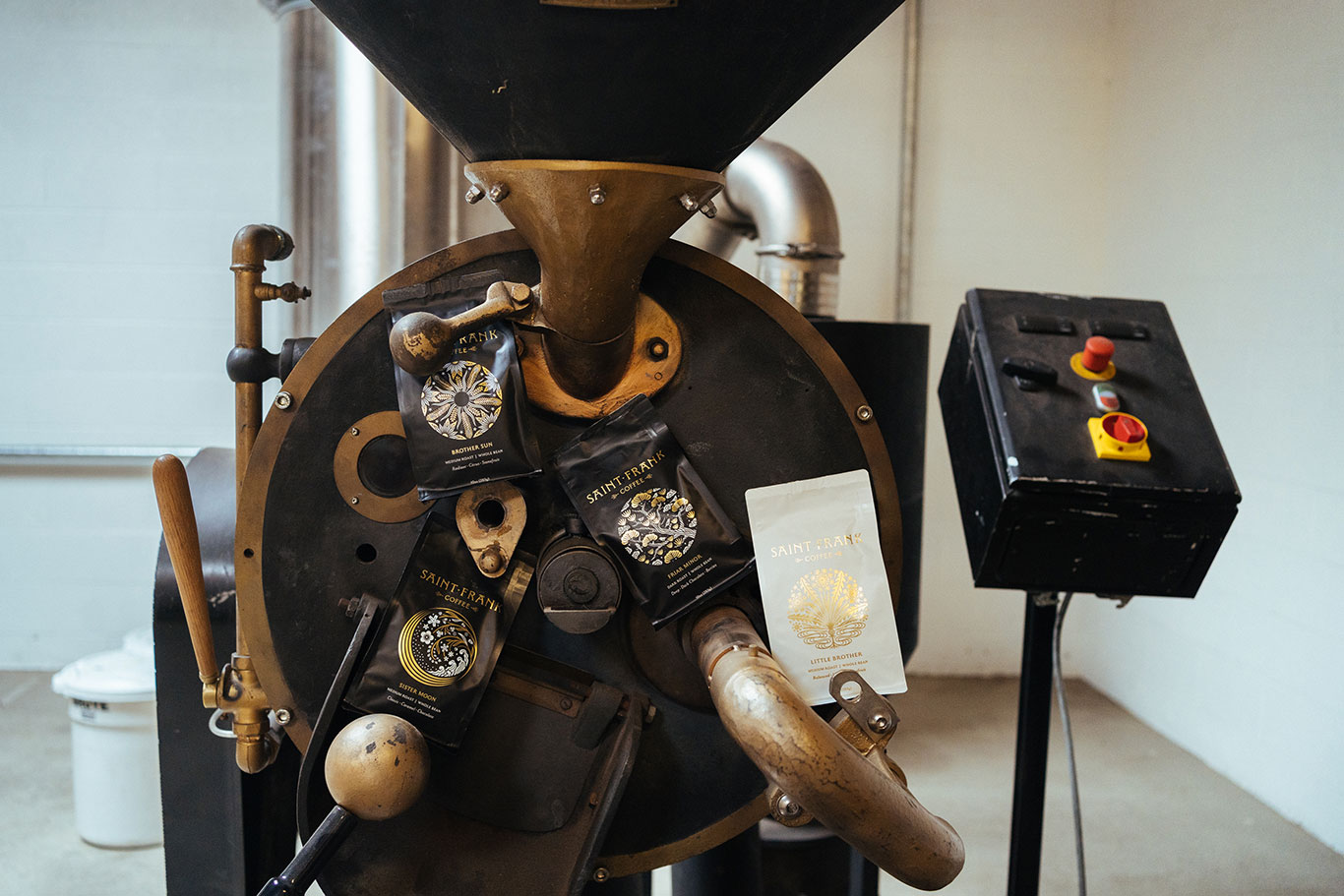
It all started with the commission for four original illustrations representing our four blends and led to a comprehensive process for designing five distinct bags including our original “F” mark bags for microlots and single origins. Dana ended up doing all the design work and helped bring an editor in for all of my rather enthusiastic copywriting. This the first time any packaging has had any storytelling or messaging. The whole process took a little over a year.
Can you walk us through the four special designs introduced last winter?
Wow, there’s so much rich meaning in each of these we couldn’t really get into all of it but “Little Brother” is a great example of how the process worked itself out.
This blend was always about our original passion for featuring everyday small scale producers. The white and gold style was kept for continuity while getting a new look. Dana worked with my goals and philosophy in sourcing and really immersed herself in the themes for the products.
She created a simple yet ornate dandelion that beautifully expressed the paradox of our approach to “everyday extraordinary” coffee. The dandelion is both a flower and weed at once, potentially looked over and unappreciated yet full of beauty and potential. You have to put on new eyes to see and new ears to hear this kind of wisdom and enjoyment. I love it.
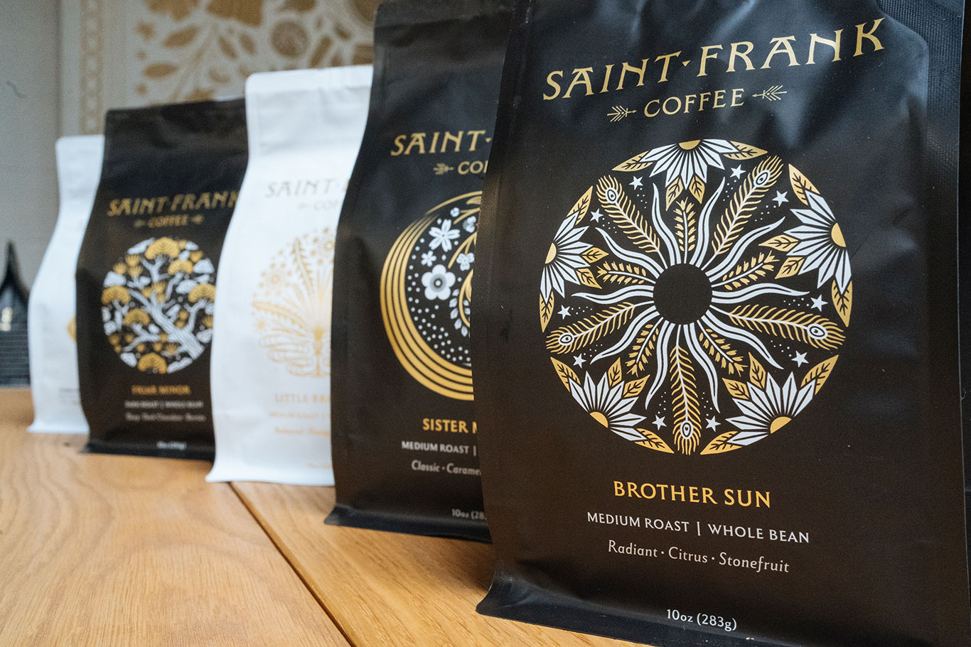
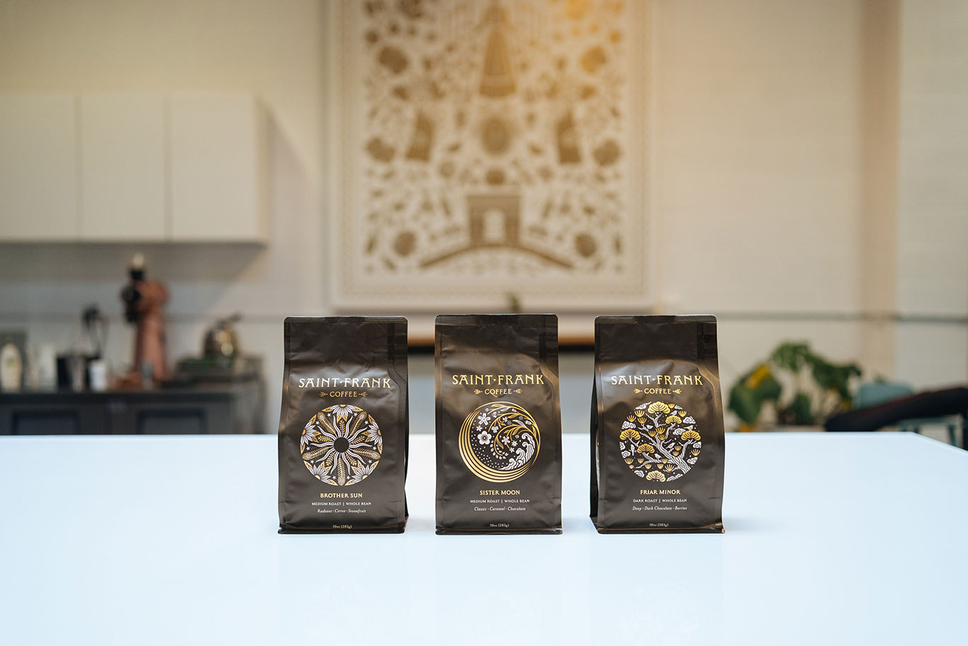
Brother Sun and Sister Moon come from a famous poem Francis composed. Brother Sun features the fruited and brighter flavors of our producers and the design is a kind of living mandala.
Sister Moon has this compelling clarity and movement to her that plays to the more classic and approachable flavors like moonlight to the brightness of the sun. Dana’s Japanese heritage emerges in the powerful wave that evokes the famous woodcuts of Hokusai, this is my favorite of the group.
Friar Minor is latin for little brother or lesser brother and is the old school sturdier version of Little Brother in a darker roast. Here opposite the dandelion Dana chose a Japanese Pine that has a certain rootedness to it.
Tell us about the bags you’re using (let’s get nerdy for a second) and special packaging for limited releases.
We worked with Savor Brands on this project particularly because we knew we could have the best quality protection possible for the coffee in material while being able to recycle the bags properly. Each of our locations have receptacles for receiving used bags we can ship back to Savor for recycling. We are also working on a fun plan to facilitate and incentivize a program for shipping used bags back to us as well.
With five new designs we have an elevated pathway for all of our producers that we are really excited about from each blend to the microlot bags. They are all everyday extraordinary coffees, people and places.
In that sense we’ve decided to not produce special packaging for limited releases, I want the otherwise obscure coffee from Teodocia Castro in the jungle of Bolivia to be featured in the same manner as an anaerobic natural geisha from the more famous Benjamin Paz.
One of our values is “Elevate for All” and I think this is one of the many ways we can practice what we value and what we believe. And I love that.
We love that! Thank you!
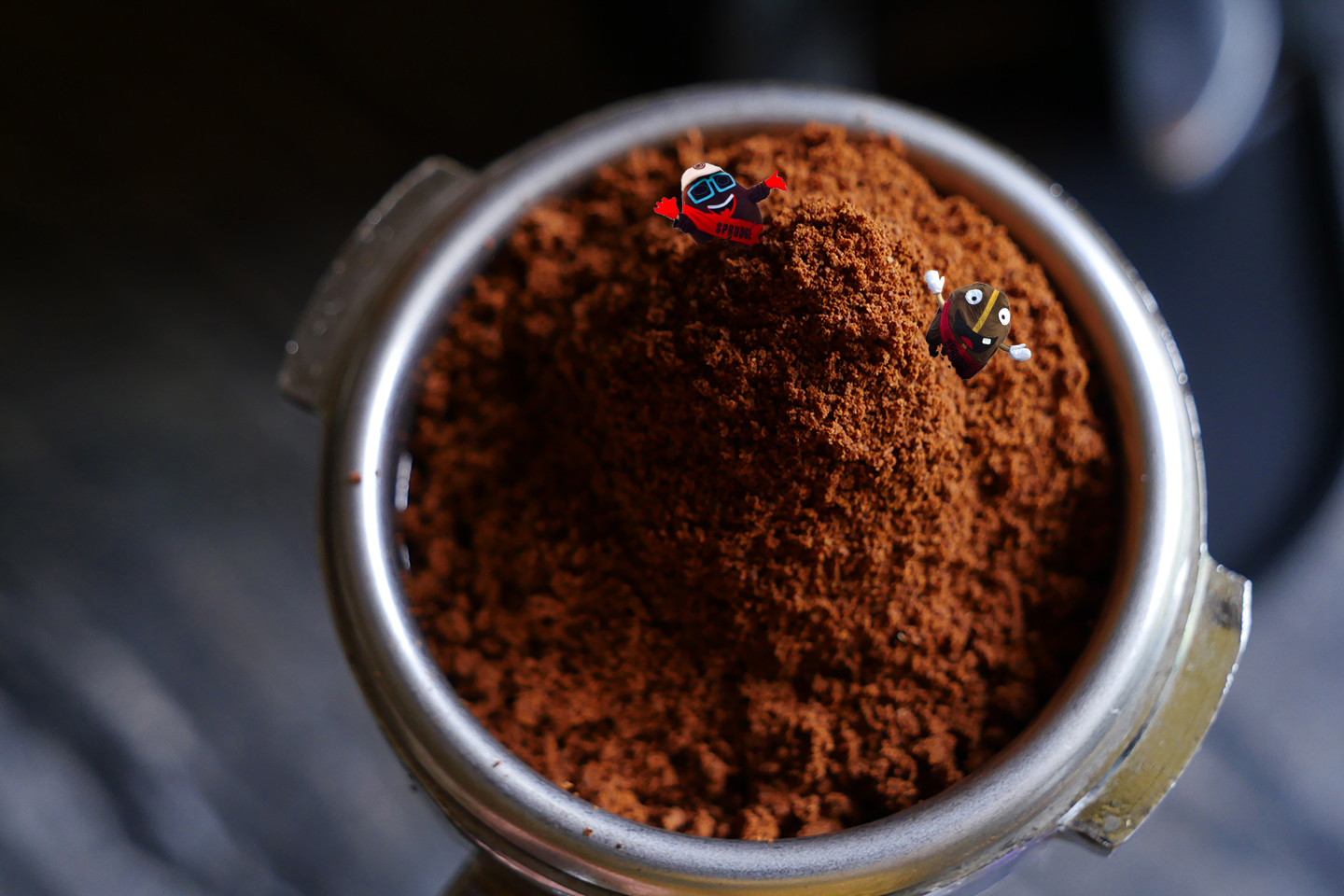
Photos courtesy Saint Frank Coffee.
Coffee Design is presented in partnership with Savor Brands. Explore Coffee Design archives at our exclusive Coffee Design hub.