


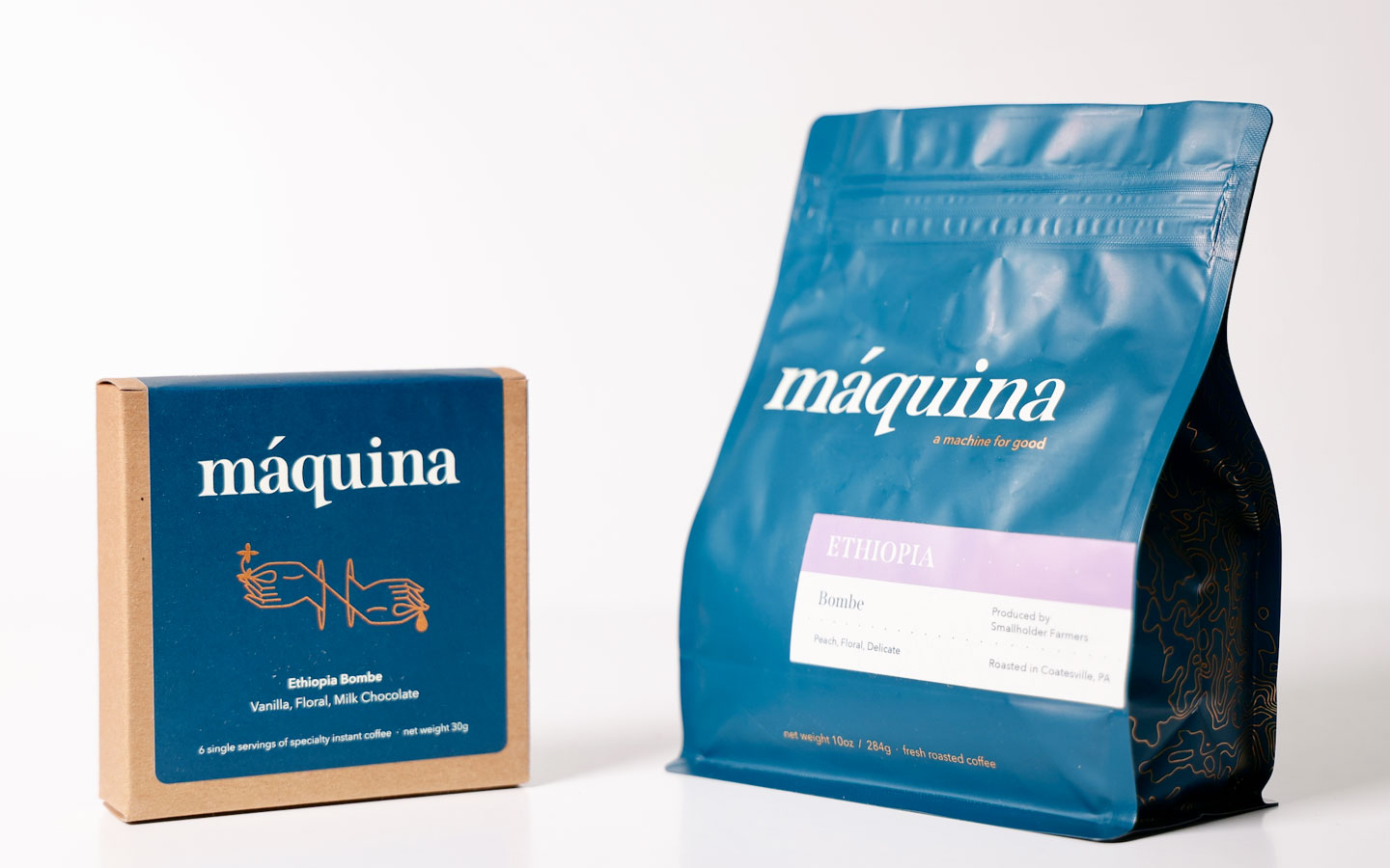
Gabriel Boscana was inspired by nautical and mechanical themes for Máquina Coffee‘s fresh new packaging. The roaster, based in Coatesville, Pennsylvania, went in a new direction with the bag’s branding and color: opting for a deep water blue, reflective copper, and a new brand mark. We spoke with founder Gabriel Boscana to learn more.
When did the new packaging debut?

It debuted in July 2022!
What’re some of the big differences between the old style and the new style?
The most obvious difference was the color of the bag. I wanted it to be reminiscent of deep waters. I am from Puerto Rico, in the Caribbean sea, and coffee often travels by sea. The actual bag is a little wider and stouter in order to allow more space for a well designed label and the brand mark which is now just the word “máquina” rather than just the hand and crank logo. We decided to re-tool the hand logo and place it on the back of the bag to pay homage to the original design without repeating it exactly. On the gussets there is a copper topographic map of Puerto Rico, specifically the San Juan region which is where I was born and raised. I also thought it looked beautiful. Maps represent our journeys and where we get amazing coffees from. Maps remind us that we are both small and connected on this planet. The label is simple and direct. Customers can get more info on the website about the coffees. I didn’t want the bags to look too busy. We wanted elegant pragmatism. After almost six years we were due for a reboot.
Who did you work with for the new look?
I worked with a friend of mine who is super talented and genuinely gets my perspective from both a design and intention point of view. It was incredibly easy and I feel great gratitude for having her help me design the bag and bring it to life.
Did you draw inspiration from anywhere when developing the new look?
I drew inspiration from my inner world and what I find beautiful. I also got inspired by nautical, mechanical and steampunk colors such as copper and a re-imagined Mechanic’s Blue plus the simplicity and elegance of maps and schematic drawings. I also wanted the word “máquina” to be front and center in an almost old fashioned newspaper type font. I wanted the bag to both feel very straight forward but thoughtful. There is magic inside this bag—but you don’t need a secret code to crack it.
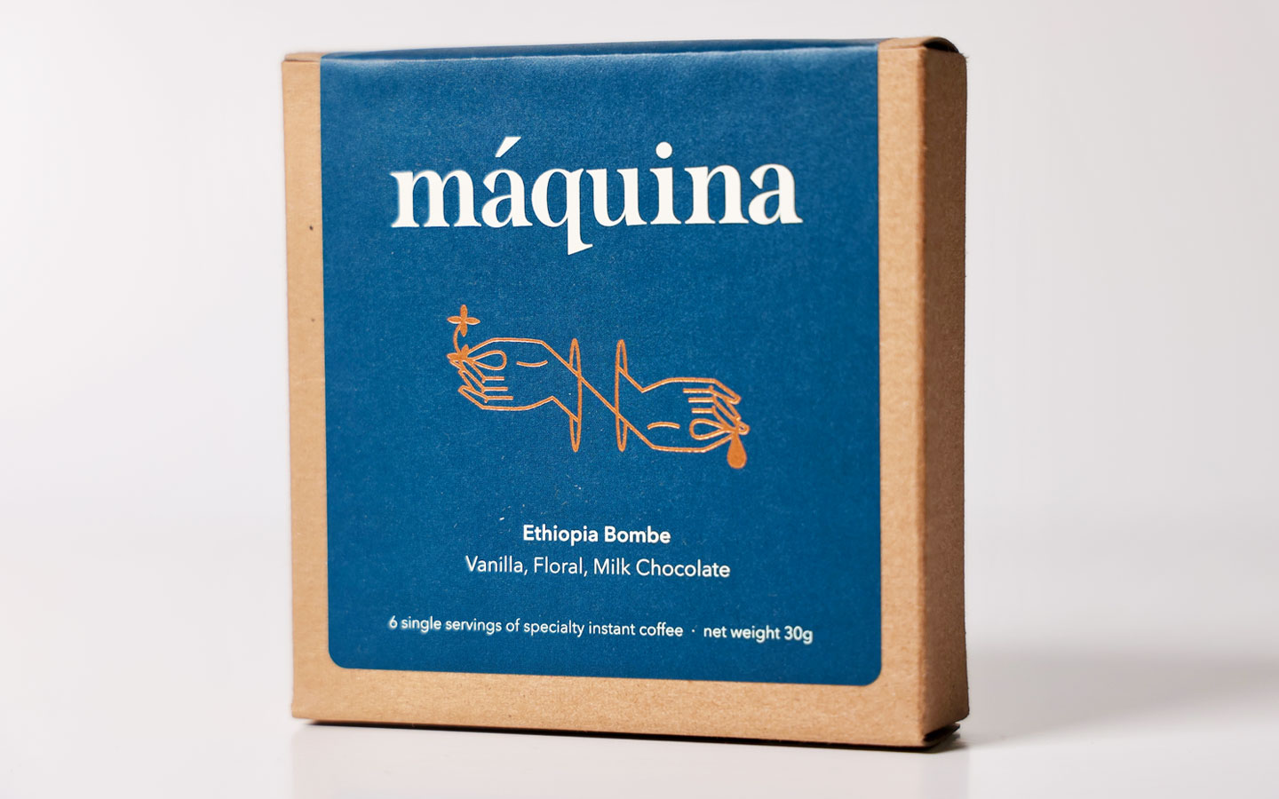
Tell us about your foray into instant – how is it going?
Instant is going very well! I have found that people really desire a super quick and delicious way to get some good ol’ caffeine in their system no matter where they are. Swift has been great and easy to work with and local (the Máquina roastery is about an hour away). The flavors are great and I have found that folks that want to try “fancier” coffee without the perceived hassle of brewing it have found the instant coffee to be very helpful.
What are some coffees you’re currently excited about?
I am very excited about the newly launched Colombia Laboyano. This is a coffee we have purchased the last three years and are excited to have back on the menu. I’m also excited for a new beautiful Ethiopia Natural, Peru Gesha and a very very special microlot Colombia that will all be on the menu in the next few weeks just in time for the holidays. Oh and some delicious Ecuadors will be back on the menu too!
Where is your coffee available?
Máquina is available in several shops across Pennsylvania, some in Brooklyn, and scattered around some amazing small shops in the States. Best way to get your hands on some though is to go to the website www.maquinacoffee.com.
Thank you!