


Coffee Manufactory, the San Francisco-based coffee company, debuted its fresh, new look this month. Bags of coffee now sport a lovely saturated color palette in delicious letter-pressed Biotre bags. Coffee Manufactory also refreshed its website and brand-identity with the help of NY creative agency Gin Lane. To learn more, we talked to Maja Vojnovic over e-mail.

Hi, Maja! Can you tell us a bit about Coffee Manufactory?
Coffee Manufactory was born from a conversation about what is possible in coffee. With over two decades of green coffee supply chain experience, we hope to look at new ways to work with producers through our buying practices, multi-platform roasting strategies, and interconnected retail and supply chain collaboration.
Our focus on sourcing impacts and sets the standard for every part of our business. We believe that through key sourcing partnerships, coffee quality will reach its highest potential. To do this, we are working towards a more sustainable future for our producers. We want to bring customers closer to farms, farms closer to roasters, roasters closer to baristas, and back again. Back to the roots of great farming relationships and precise roasting. Back to being good. Balanced. Clean.
When did the coffee package design debut?
Starting October 1, 2018, Coffee Manufactory will launch its new packaging, website, and branding, this launch represents nearly a year of heavy thought, research and design work.
Who designed the package?
We worked with Gin Lane, a creative agency based in New York City. Their main focus was to have our packaging reflect our simple, humble, and global approach toward design and connections.
What coffee information do you share on the package?
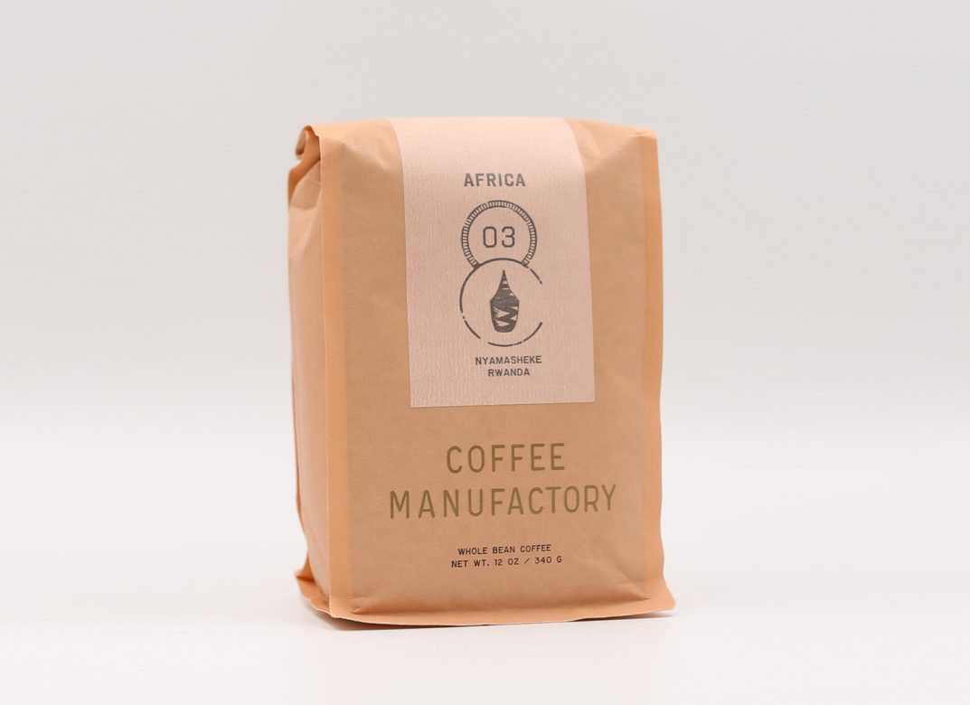
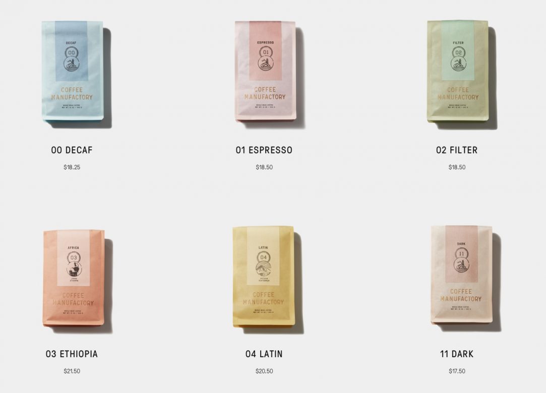
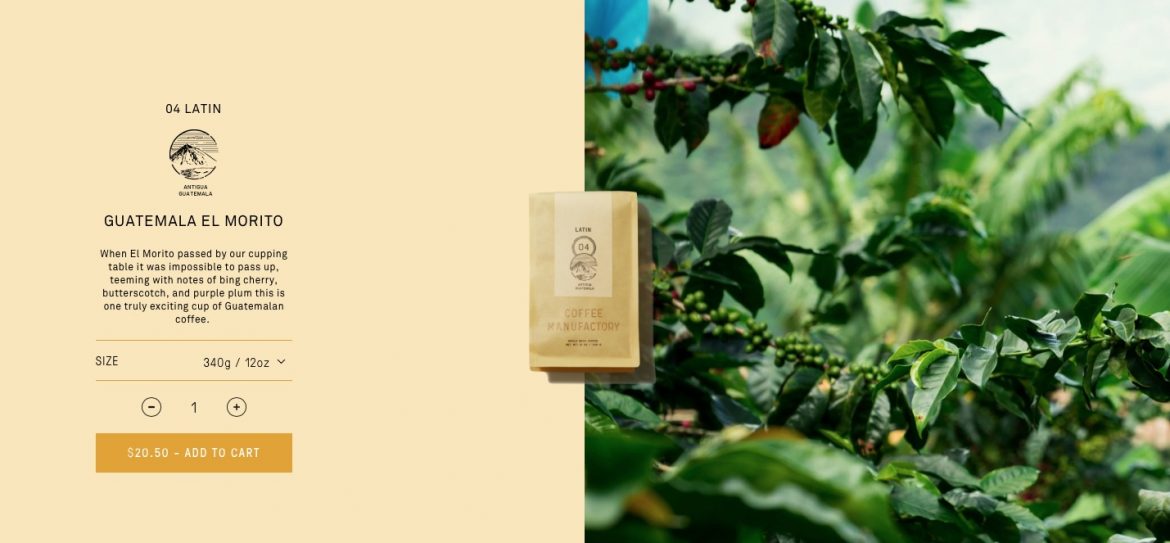
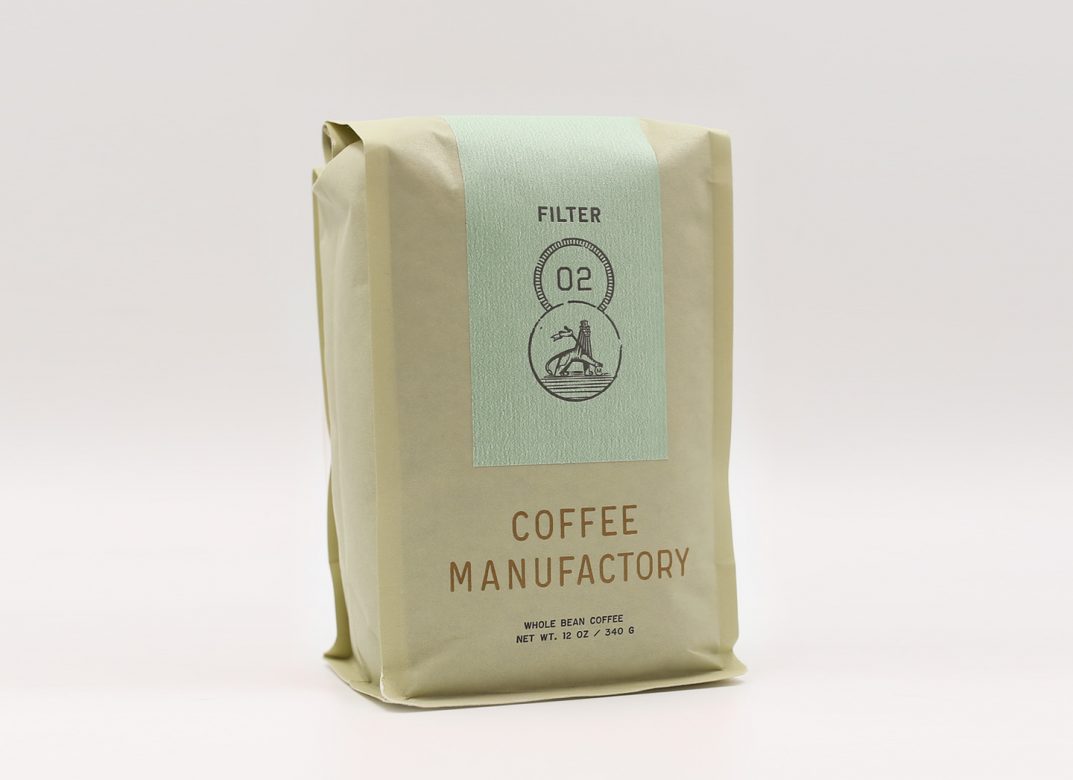
Each bag has a correlating letterpressed label which is made by our close friends at Aesthetic Union, an artist-run letterpress print shop in San Francisco. Each label contains the SKU number (00-11), name (Decaf, Espresso, Filter, Africa SO, Latin SO, Dark), and coffee components. Our blend labels have a % breakdown for all the coffees that go into them listed by country and name. Our SO’s have the coffee name listed. One really unique feature is the product marks and regional markers which are featured in the circle on the label front of our bags. Our blends and 00 Decaf receive a product mark featuring the CM lion, while our single origin, 03 and 04, coffees are branded with a mark representative of the coffee’s origin. We worked with Gin Lane to design regional markers for each origin region we buy coffee from. These marks are designed to capture “on the ground” experiences from these coffee growing locations – whether its the local flora and fauna, an architectural landmark, a municipal monument or sign, or a local form of transport, such as the Kenyan “boda boda,” or scooter taxi.
The CM Lion:
So much of our story is rooted in our work and efforts at origin. We choose to pay homage to Ethiopia, the birthplace of coffee and one of the origins we have immense involvement in. The CM Lion is inspired by the 1954 modernist Lion of Judah statue by Maurice Calka located in Addis Ababa, Ethiopia. This mark is a symbol of producer independence and the origin of coffee.
It is proud, humble, regal, and respected.
What’s the motivation behind that?
With our markers, we wanted to feature a visual system that aims to connect consumers with origin and give them a sense of where our coffees are come from. We are very upfront with our blend composition %. Since we source our blends with the utmost intention and roast profile in mind, we wanted to be very transparent about what goes into our blends.
What are some of the improvements made in the packaging?
We chose to go Eco-Friendly and work with Pacific Bag Company to create a custom sized block bottom white kraft BiotreTM bag. Our bags are made up of 60% compostable and renewable plant-based materials which have been shown to break down into healthy compost in 12 weeks. We also added a zipper to ensure optimal freshness once the coffee bag is opened.
Why are the aesthetics of coffee packaging so important?
Packaging has the ability to say so much about a brand and their story. We want our new bags to tell our story. A story of origin and simple design that is approachable and conversational. Whether it’s via our regional markers or our color associated SKU’s, we want our consumers to feel connected to what they are buying.
Where is the bag manufactured?
The bag is manufactured by Pacific Bag.
What type of package is it?
Our bags are made out of BiotreTM, which is a packaging material composed of multiple, laminated layers. The outer layers consist of cellulose from wood pulp. Also, all colors printed on the bag are printed using Eco-Friendly water-based ink.
Is the package recyclable/compostable?
The bags are made up of 60% compostable and renewable plant-based materials. However, the zipper and valve need to be removed before placing these bags into a compost bin. Pacific Bag is currently working on a version that will have an eco-friendly valve and zipper, so look out for that!
Where is it currently available?
Starting October 1st, you will be able to purchase our bags from our website or from any of our amazing wholesale partners!
Tartine Bakery
Subrosa Coffee
Bi-Rite
Triniti – Echo Park
Fred Segal Café
Constellation Coffee
Float
Thank you!
Location: San Francisco, CA
Country: United States
Release Date: October 2018
Designer: Gin Lane
Zachary Carlsen is a co-founder and editor at Sprudge Media Network. Read more Zachary Carlsen on Sprudge.
#/media/File:Lion_monument_Addis_Abeba.JPG)