


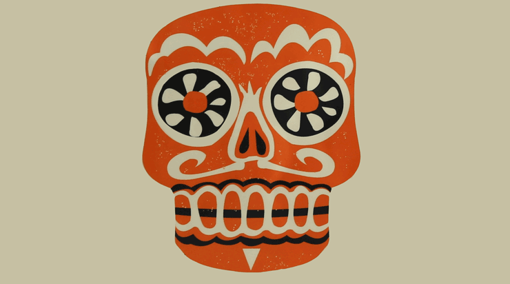
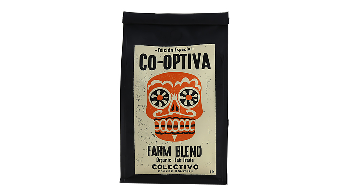
It’s getting spooky out there, people, as we prepare to ring in the Halloween holiday with all variety of tricks, treats, and tropes. Our friends and partners at Milwaukee, Wisconsin’s Colectivo Coffee are no strangers to undead design: a Dia de los Muertos design aesthetic can be found throughout their product line. But when Halloween comes around (October 30th) with DDLM just two days later (November 1st), it proved an unmissable opportunity for Colectivo to play with seasonality and design.

Behind the scenes out there in Milwaukee, the folks at Colectivo have long been home to one of the best internal design & media teams in specialty coffee, putting out beautiful packaging, video, and brand design with an overarching unified aesthetic. Learning more about their design team is just one of the perks of them serving up an undeniably good looking coffee bag.
As told to Sprudge by Cody Kinart.
When did the coffee package debut?
This packaging rolled out last Monday, October 26th as part of our “coffee of the week” program at Colectivo. Every week our cafes change out which coffee they’re brewing on our FECTO system, along with several other options on our brew bars. This week we thought, why not take advantage of the one week special and do something cool with halloween? Halloween and Dia de los Muertos are just a couple of days apart, and so that led us to think about repurposing our “sugar skull” logo design, which we’ve used across our brand for a long time now. We use this design all year long, but this is the week for it to shine.
Who designed the package?
It was designed by Kevin Callahan, who has been the in-house designer for our company for well over a decade. He does almost all of our t-shirts, bags, posters, and really anything that we create. Lately we’ve also added a guy named Sam Seger to our design team, who started with us a bit more than a year ago. He’s kind of Kevin’s sous chef at this point, and they both have the incredible ability to turn concepts into designs very quickly. You go to them with an idea, and then 20 minutes later he’s got 3 or 4 different designs finished. For example, I did a recent Bartender & Barista Guild joint party here in Milwaukee, and Sam had a menu printed up in like six minutes that was just 100 times better than anything I could ever create. Sam is young and coming up under Kevin, and has a really promising future as a designer.
Are there any design highlights for this package that you’d like to share?
I think what I would point out is, the details of the bag: of course the label is beautiful, the back label is beautiful and reads easily with a quick, short description, but what I really love about our bags is the stamp on the side of the bag. We’re using these block bottom bags, and if you look at the top where we roll the bag, there’s two little lightning bolts, which a lot of people miss, right on the top of the crease. We’ve been using these bags for well over a year, and I just really like them. They’re heavy duty, they roll really nicely, and they take the stickers really nicely too.
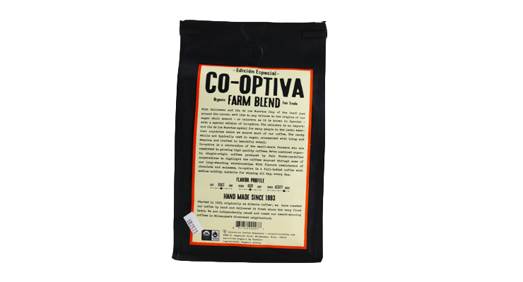
What coffee information do you share with your package? What’s the motivation?
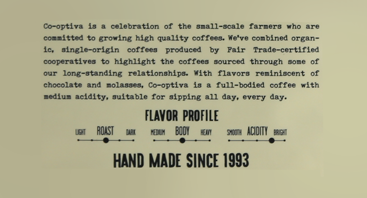
For almost all of our bags, the back label is set up the same. That’s for consistency: if you’re looking to purchase coffee, you don’t have to search too hard if you know what our bag looks like. The first paragraph is generally a description of our relationship with that coffee, why we purchased it, how long we’ve been purchasing that particular coffee, and then the last sentence of that paragraph is always going to have a description of the body, the acidity, and then a couple of flavor notes. I tell everybody buying our coffee, “If you’re just looking for flavor notes, it’ll be in the last sentence or two.” And then right beneath that decription we have a roast, body, and acidity scale info set.
That information is super important to our customers. In fact, if you go to our website you can actually select coffee just by those parameters: roast, body, and acidity. I think most of our customers are more interested in selecting by roast, body, and acidity than they are by flavor profile, which is interesting.
Where was the package manufactured?
The bag is made by Pacific Bag. Specifically, it’s a block bottom bag. They stand very nicely on the shelves; they’re heavy duty and attractive.
Is the package recyclable?
This package is non-recyclable, unfortunately, but! One reason why we went with such a thick bag is that most of our cafes still offer a discount for customers who choose to return with an empty bag for refilling. In fact, we get people who are coming in still with bags from 2 or 3 years ago—-some even have bags with our previous company name on them. Keep filling it up, guys. Keep filling it up.
Coffee Design is a feature series by Zachary Carlsen on Sprudge. Read more Coffee Design here.