A bit of breaking news from the coffee design & branding world, as our friends and partners at Counter Culture Coffee get set to unveil a newly redesigned line-up of coffees on October 3, 2014. This launch is a refresh of sorts for Counter Culture, a leading American wholesale specialty coffee company founded in 1995 and based in Durham, North Carolina.
“A lot of the names and looks were created twelve years ago,” Counter Culture owner Brett Smith told Sprudge in a telephone interview. “The market has evolved, and Counter Culture has evolved, and we felt like it was time to communicate who we are now in a better way.” Smith went on: “Our product line has changed over time and we did it piecemeal. We wanted to approach it from a brand new perspective.” The self-proclaimed coffee geek told us over the years he’s seen “thousands and thousands of coffee bags” and that he felt this design refresh is “something substantial.”
The design was executed in-house by Counter Culture Coffee’s design & marketing team–Nathan Brown, Katie Parland, and Christy Baugh–in a project that took the better part of a year to complete. Over the course of eight months, the team worked with all departments of Counter Culture to highlight, as Smith puts it, the company’s focus on “quality, sustainability, transparency, and education.”
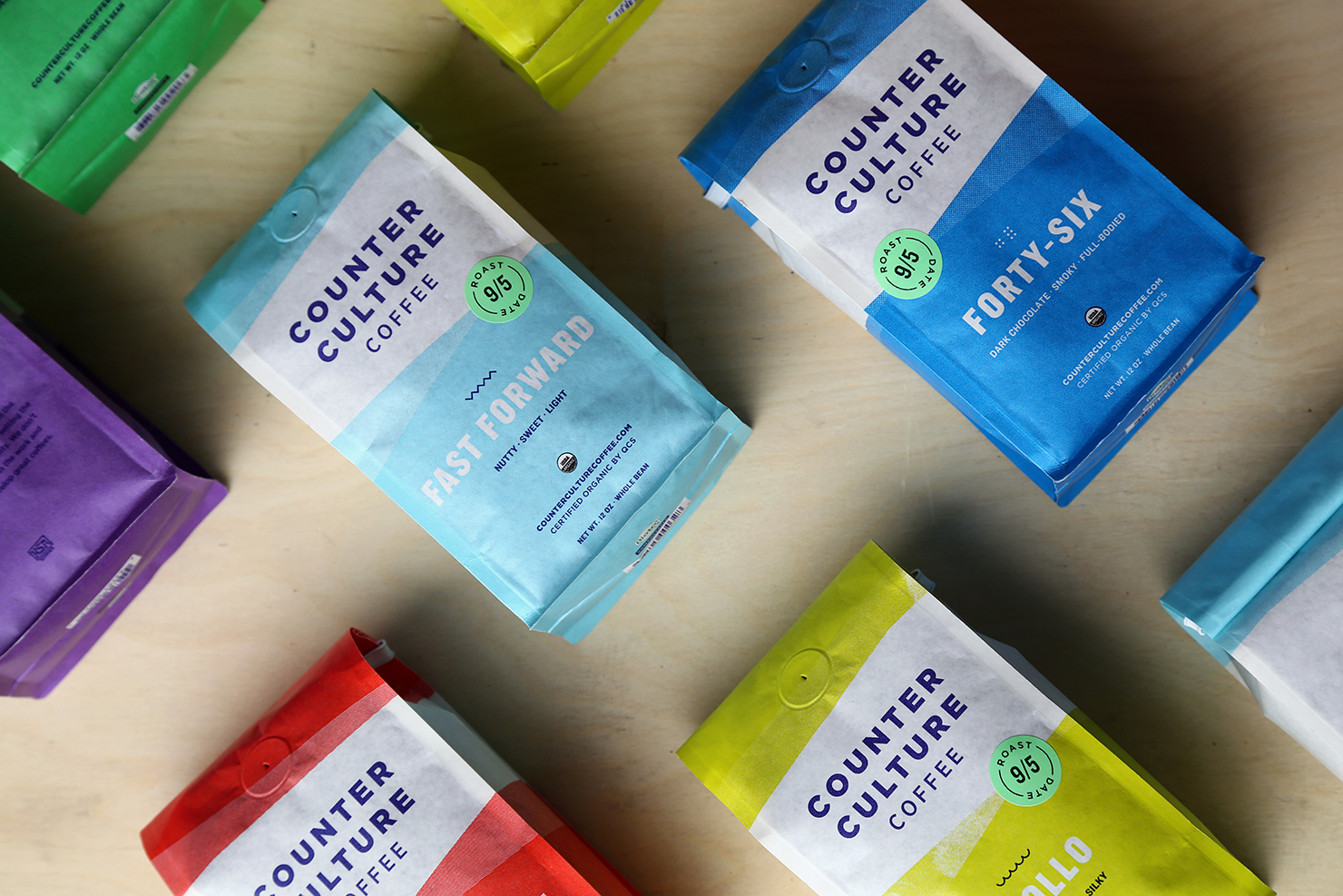
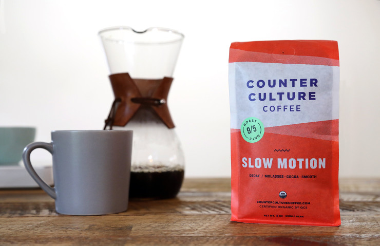
The labels will now feature each coffee’s roast date on the front with a sticker, along with a simplified flavor description on the back.
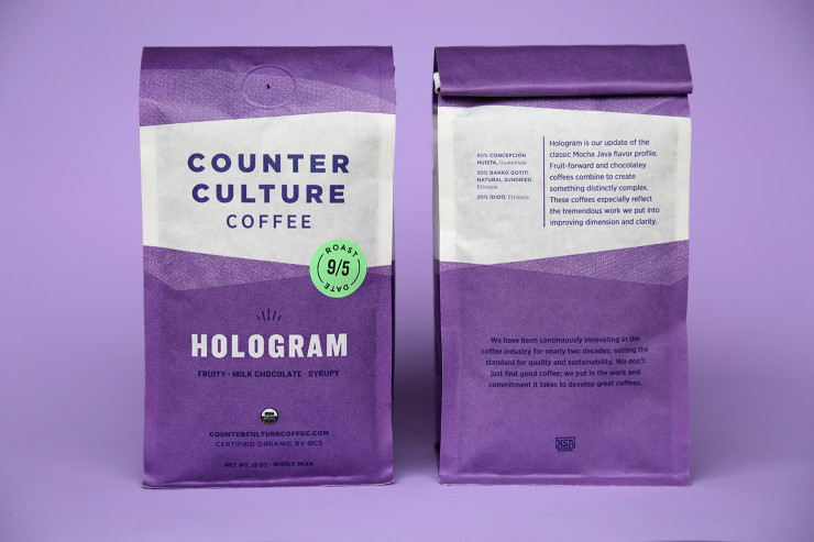
The new, colorful packaging is printed on biodegradable bags, what Smith called “a step in the right direction.” The bag material itself was created by Pacific Bag, a Washington State based company that specializes in sustainable packaging.
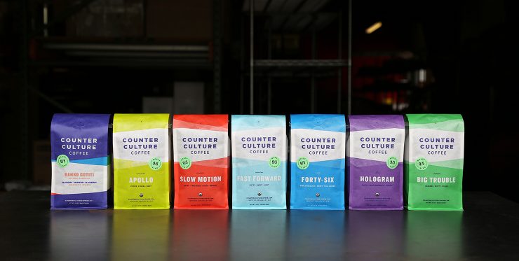
Half of the names in the company’s line of year-round blends will change next month. “We felt like some of the names were great but didn’t reflect who we are right now,” Smith told us. “We asked ourselves, ‘Does the name communicate what we do now?’ Apollo did, so we kept that. Forty-Six, we kept that.” But on the chopping block are longstanding, traditionally-named Counter Culture offerings like Rustico, Farmhouse, Decaf Farmhouse, and Toscano, which will now become Hologram, Fast Forward, Slow Motion, and Big Trouble, respectively.
When asked if there were some names thrown out that didn’t stick, Smith laughed, “I think I came up with some really bad ones.”
“We continue to push and put out what we really like,” said Smith, “and we think people will enjoy it.” The new bags and names launch October 3rd.
SprudgeWire press release excerpted in full below:
The company will rebrand some of its popular year-round products—replacing the rustic names of Toscano, Rustico, Farmhouse, and Farmhouse Decaf—with contemporary names that better embody the sensibilities and humor of its leadership team:
Toscano becomes Big Trouble–Big Trouble, now outfitted in a bold green bag with an undulating icon, offers nutty, caramel flavors which may seem easy to bring out, but it’s actually one of the most challenging for Counter Culture to source—hence the name—because clean, sweet, low-acidity coffees from small-scale farms can be hard to find. [showhide type=”Wire”]
Rustico becomes Hologram–Hologram, now outfitted in a violet package with a geometric half-burst pattern, is in many ways an updated Mocha Java flavor profile. Fruit-forward and chocolatey flavors in this coffee combine to create something distinctly complex. These coffees especially reflect the tremendous work put into improving dimension and clarity.
Farmhouse becomes Fast Forward–Fast Forward, now in a clean light blue bag with a zig-zag icon to distinguish it, combines similar coffees from different harvest periods, which makes for easier enjoyment of fresh coffees throughout the year. Bonus: Fast Forward allows Counter Culture to work with emerging coffee projects.
Decaf Farmhouse becomes Slow Motion [decaf]–For Slow Motion, now in a red package with a zig-zag opposite of Fast Forward’s icon, Counter Culture starts with the same high-quality coffee used for any other year-round offering and decaffeinates it in small batches via chemical-free water processing.
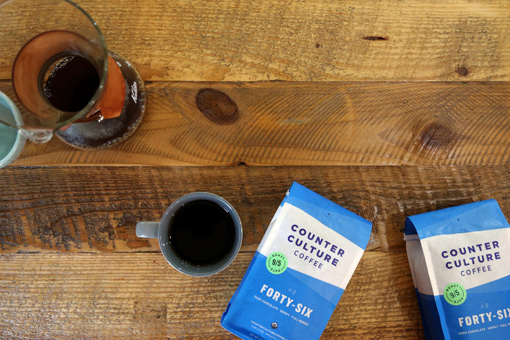
The smoky, full-bodied Number 46 coffee simplifies to Forty-Six and is outfitted in a teal blue bag, and the beloved bright Ethiopian coffee-inspired Apollo will keep its name, and will be in a fitting bright yellow package.
“Our goal was to better communicate the core values that have guided Counter Culture for almost 20 years, while presenting a more contemporary and cohesive look,” says Counter Culture President Brett Smith. “I am happy to say that the final product more than accomplishes this goal. The bright colors, updated names, prominent roast date, and transparent coffee information—all in more sustainable packaging—are a great combination of the old and the new.”
Conceived and developed by Counter Culture’s in-house design team, with work beginning in earnest in February 2014, the rebrand progressed at an accelerated pace. Each year-round product will have its own design variation for 12-ounce packaging, and all single-origin coffees—representing dozens of countries and farms—will go into a single bag design with differentiated labeling unique to each origin. Each vibrant, eye-catching color used is representative of a year-round product or single origin coffee, allowing buyers to easily distinguish the varieties, and each product has a unique texture and icon that is representative of that coffee. Additionally, the roast date appears in a more prominent location on all bags, further underlining Counter Culture’s commitment to quality and transparency.
All 12-ounce whole-bean bags will be made of Biotre film, a material created by Pacific Bag Inc. at the forefront of sustainable, biodegradable packaging initiatives. Up to 60 percent of the material comes from renewable resources—shown to break down in well-managed compost environments in approximately 90 days—with the remaining materials breaking down in five to 10 years in a landfill.
Counter Culture is committed to being carbon neutral—having begun purchasing off-sets and working toward reducing consumption since 2011—which requires annual measurements of carbon activities from roasting coffee to facility energy consumption and beyond. Counter Culture’s strong relationships with the farmers and communities who create their coffees are yet another facet of their business that epitomizes their commitment to environmental, social, and fiscal sustainability.[/showhide]
All photos by Christy Baugh, courtesy of Counter Culture Coffee.

