If you’ll grant me a moment of maybe controversial opining, I’m so very tired of paper cups. Yes, they are the lifeblood of the modern, to-go-only cafe model brought about by the pandemic, and thus they are a necessary evil for coffee shops worldwide attempting to make ends meet while temporarily incapable of operating as a third place. And because of this, I begrudge neither the paper cup nor the cafes relying on them.
But I miss a good ceramic cup. Sitting at a counter, listening to the jingling and clinking of mugs and saucers and spoons, feeling the sheer weight of a thick-walled cup in your hand, it all adds a bit of extra ceremony to what is a perfect moment, though perhaps a completely unfamiliar one at this point.
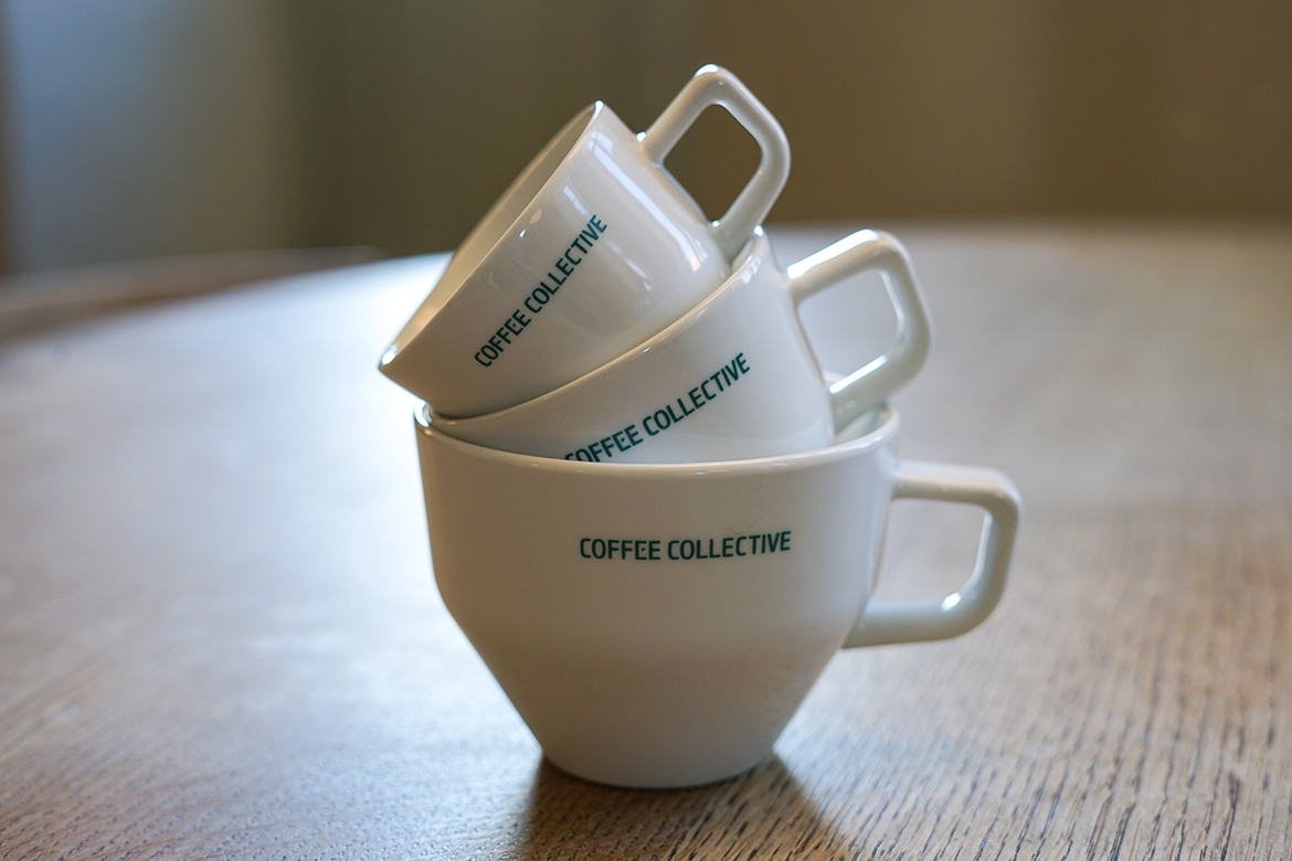
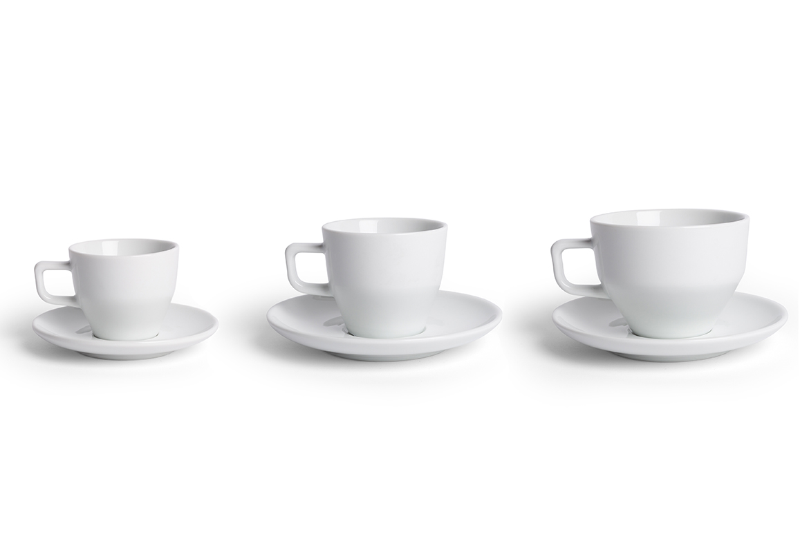
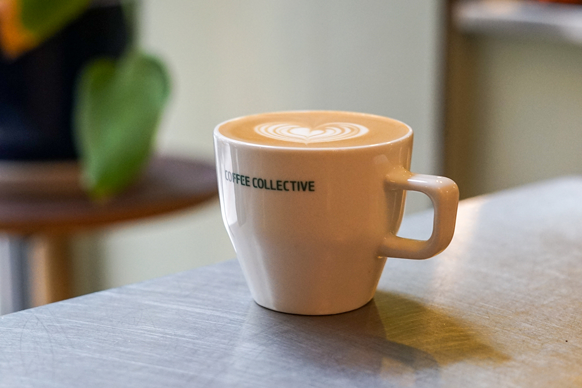
We’ll be back to those halcyon cafe days at some point, but our newest entry into the Coffee Merch series is hoping to manifest them sooner rather than later with a look at the brand-new cup collaboration between Acme and the Coffee Collective in Copenhagen. With a ground-up redesign, the collaboration consists of different sized cups that give a completely new look to Acme’s traditional Range line, with a host of thoughtful details coming from the Coffee Collective team. To learn more about the Collective x Acme Range cup set, we spoke digitally with Coffee Collective co-founder Klaus Thomsen and Acme’s Sales and Marketing Manager Megan Wyper and Lead Designer and Operations Manager Paddy Kennedy.
Do you have any new merch you want featured in the Coffee Merch series? Let us know!
This interview has been lightly condensed and edited for clarity.
Hello everyone! So can you start off by telling us how this collaboration came to be?
Klaus Thomsen: Designing our very own cup from scratch has been a dream of ours for years. We knew we wanted to make proper barware as handmade ceramics tend to break too easily and isn’t designed for use in a busy coffee shop. We have been following Acme for years and love their work. Coincidentally, Megan had participated in a roasting course we held years ago, while she was working for a Scottish roastery. So there was a connection and from there it really took off.
Megan Wyper: Paddy and I met up with Klaus in Copenhagen when we did a bit of a Europe tour prior to the Amsterdam World of Coffee show in 2018. We chatted through cup possibilities and then Klaus contacted us a few months later and we rolled with it from there. It’s all felt very organic and easy. It’s our first design collaboration so the fact that it’s worked so well was a happy bonus really.
Can you tell us a little bit about the design updates you made and how they affect/improve the drinking experience?
KT: Over the years we’ve tried countless cups for every coffee drink out there. This was a culmination of all those experiences. We had a long list of wishes and ideas that was combined into one cup.
The espresso cup needed to be perfectly round in the bottom to mix the espresso while it’s flowing. We wanted it to hold both a single and double espresso in way where the crema is evened out, without becoming too thin, and have proper headspace in the cup to capture the aromas before drinking. But we still wanted it to be a demitasse, so there was a lot of work in getting the proportions just right.
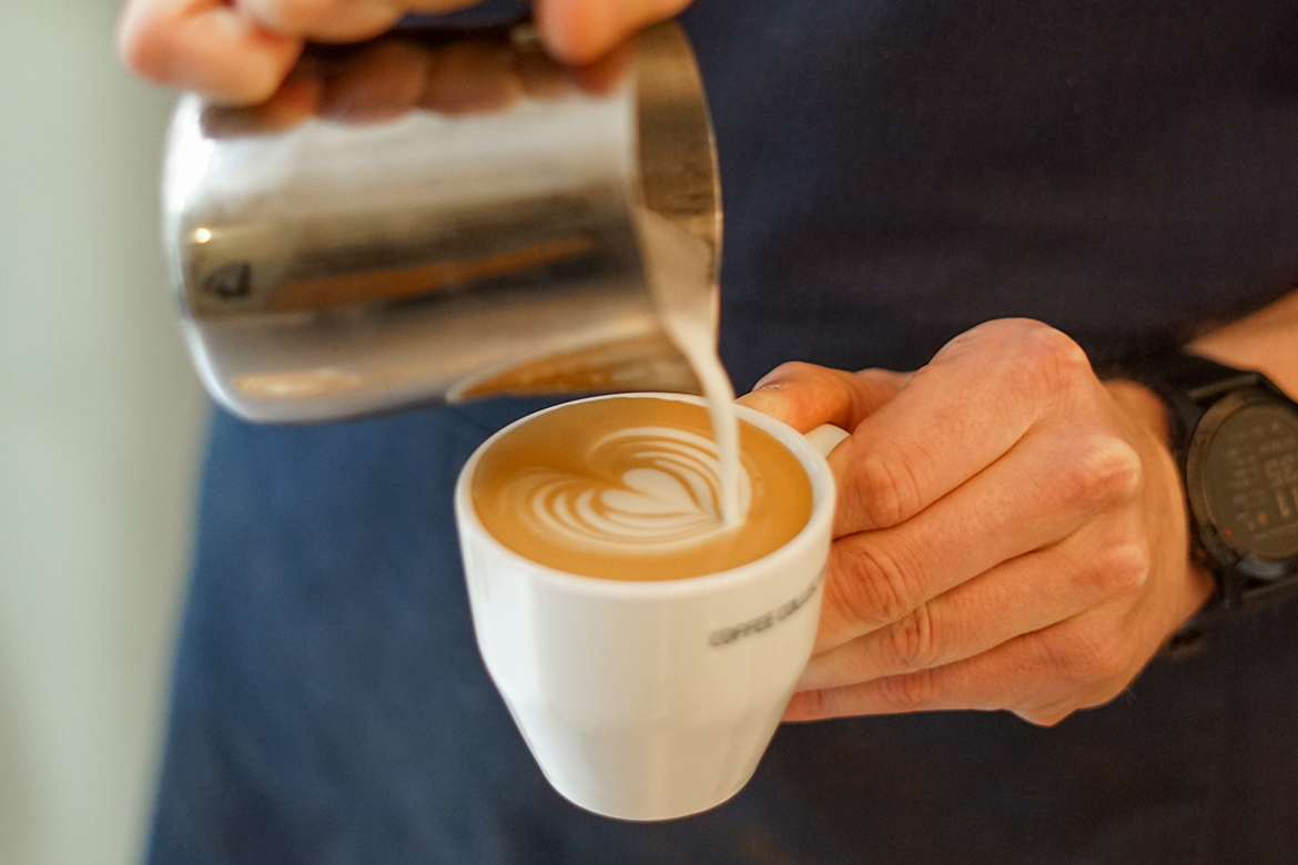
The small cappuccino cup (medium of the three sizes) is based on what we think is the perfect milk-coffee balance of a single espresso and a total volume of 150 ml. It was designed with the old tulip cups popular in competitions in mind. We wanted the top part to be slim so the foam collects and creates a super rich and creamy texture. It required the top part of the walls to be very vertical, while going into a perfect circle in the bottom. The Large cup is twice the size of the medium, making it perfect for a double cappuccino and for filter batch brews.
Lip feel on all cups was super important to us. We wanted it to be delicate and not a heavy feeling. It sends a signal to your brain that you’re about to drink something delicate.
This has been over two years in the making. Can you tell us about that process and what all went into the creation of the cups?
KT: Our initial work started with getting input from our whole team of bar managers, who were instrumental in laying out their needs and desires for every day use. Casper and I then workshopped our ideas combined with the input and started doing some sketches. We sent the initial drawings to Paddy at Acme and he would take those and start the actual design in his program. It required quite a few back-and-forth even at the drawing stage, again with valuable input from our whole team. Next we had cups 3D printed to be able to see them physically, hold them, evaluate size, shape, thickness, and so on. This was such a crucial step for the end result, and being able to actually pour drinks in the cups to see if our ideas worked was essential. Eventually we tested different porcelain types and factories, to find the exact hue of white we wanted and with the most beautiful surface and glaze.
Megan and Paddy at Acme has been amazing to work with, and been able to transform our ideas into a physical product. I lost count of how many iterations we did, but actually Paddy was always surprisingly fast at getting things right and executing our suggestions. From start to finish it was a longer process than we had thought, and ultimately delayed a lot as Chinese factories closed down due to COVID-19. We received the cups in Denmark just around New Years as the country had gone into a second lockdown and we were only doing take-away. But what a nice treat to have our brand new cups available for guest as we are now able to welcome them back for seating.
Paddy Kennedy: Klaus gave us some drawing and images of what they liked—how the cup should look and feel. I started by looking at the cup from a functional perspective. How does the cup feel to use? I think of how it will meet the needs of the barista and the end user; stackable, wide enough to catch the drops of a double espresso, etc. The tactile experience is important too. I like this cup because it makes you feel like you are manipulating something and interacting in the experience; it’s not hyper-ergonomic, it’s tactile and enjoyable. The finer rim is the opposite, this is where all attention is given to the coffee and the sensory aspects of the cup fade into the background.
People often forget about the saucer, but there’s actually a lot of thought put into this as well; how they stack on each other and in the dishwasher, how it is lifted off the table, how the spoon sits beside the cup; the weight, strength, and structure are all considered.
What is the process, from Acme’s perspective, of custom making an entirely new cup design? How do they become real-life drinkware?
PK: Once we had a design we liked, we started talking with the factory about technical challenges. We got samples produced and sent to our office in New Zealand, in different material options to compare merits. Design adjustments were made and a second round of samples produced. Once the final samples were approved, one set was sent back to the factory in China to be used as reference samples in quality control and one was held at our office for reference.
The manufacturing process is a combination of manual and automated processes. The handles are moulded separately to the cup bodies and then applied by hand. Finally they are fired at a little over 1300°C, which fully vitrifies the clay. Then it’s out of the oven and off to our warehouses in New Zealand and the Netherlands.
Was there any other drinkware—wine glasses, glen cairns, other types of coffee cups, etc—that helped inform some of what you were looking to create these?
KT: Lip feel is definitely something that Zalto glasses has inspired us to be aware of. They are our favorite wine glasses. We also took inspiration from the classic Illy cups and their bowl shape too for the inside part. And from the Pitchii coffee server and Magdalena Kaluzna’s cups for the exterior design. We also had countless other cups ranging from Royal Copenhagen‘s delicate porcelain to small competition cups on stoneware.
How do these cups differ from Acme’s standard Range line?
MW: The key visual differences to our standard “Espresso” range are the more pure white color of the material, the finer lip, the more angled handle, and the taller profile of the cup. The porcelain material is different as well, the collective range are constructed of a bone china porcelain.
Even though the cups have a finer lip than our Espresso range, they still feel quite substantial, not much lighter that our Espresso range. There is a lot of weight in the base of the cup. As long as the cups are hot to start with (which they should be!), the coffee temperature is maintained by the thermal mass of the heavier base. I think this combination of weight, and a fine lip is something quite special and really does make it a lovely cup to use.
Are these cups in use at any of the Coffee Collective’s cafes?
KT: The cups are now in use in all our coffee shops and available for home use both in shops and online. We offer our branded cups with the CC logo in our signature green color on side for wholesale partners. But we wanted this cup to be accessible to more people too, so Acme is also offering them without logo directly to any coffee shop, cafe, restaurant or roaster who’d like to use them via their website.
Thank you!
Do you have any new merch you want featured in the Coffee Merch series? Let us know!
Zac Cadwalader is the managing editor at Sprudge Media Network and a staff writer based in Dallas. Read more Zac Cadwalader on Sprudge.
All images by Acme, used with permission

