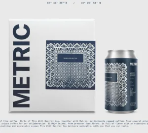


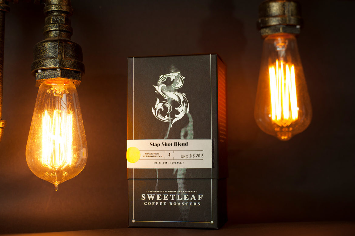
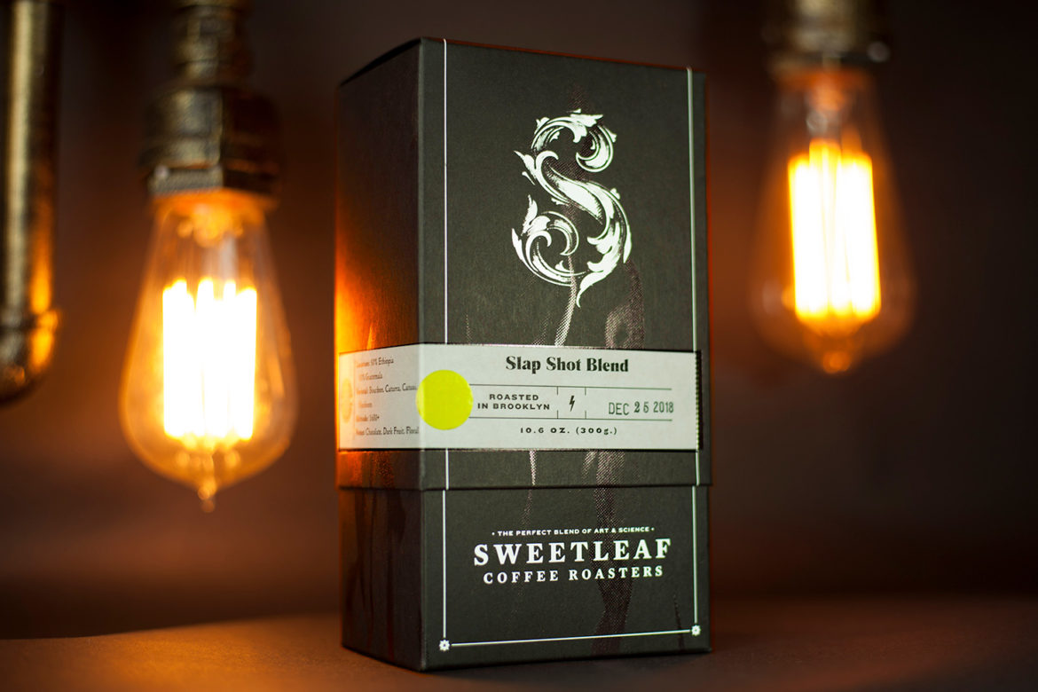
Many interesting and important things have been put into boxes over the years. Textiles, other boxes, and even children’s candy. Perhaps the most important thing that has gone into boxes is coffee. But how do you make a box really pop? Maybe start with a box that has an Epic Black Classic Crest Eggshell Finish and add a flourish of glossy embossed flames (on the interior and exterior). You can finish it with a customizable letterpress printed, foil stamped label that can be customized in-house. That’s what our friends at Sweetleaf Coffee Roasters did, anyway, and we think it looks fabulous. We spoke with them electronically to learn more.

Tell us a bit about your company
I began Sweetleaf back in 2008 with our first location in Long Island City, Queens. Being born and raised in Queens myself, I’ve always seen Sweetleaf as a Queens-based company, even though we’re now roasting just across the Pulaski Bridge in Greenpoint, Brooklyn. I named Sweetleaf after the Black Sabbath song—that should tell you all you need to know about me.
It wasn’t until 2014 that we began roasting with other like-minded people in Brooklyn and shortly after, opened the doors on our own roastery.
Now we’ve come one step further and updated the look and feel of our boxes to coincide with the launch of our new website and online store.
When did the coffee package design debut?
Our new packaging started making its appearance in our cafes in Greenpoint and Long Island City (and to a few beloved wholesale customers) in September last year but now it’s available to anyone with an Internet connection.
Who designed the package?
We worked with the crew at Topos Designs, in collaboration with Studio on Fire. Studio on Fire had the job of bringing to life the vision of the crew at Topos Designs.
It was great to be able to work with Topos because they do such amazing work for so many New York institutions, including MoMA PS1, which is right down the road from our original location in Long Island City, Queens. Keeping ties with our roots is always important to us.
Studio on Fire also do incredible work that I’ve always admired so having both teams contribute so much to us was a dream come true.
What coffee information do you share on the package?
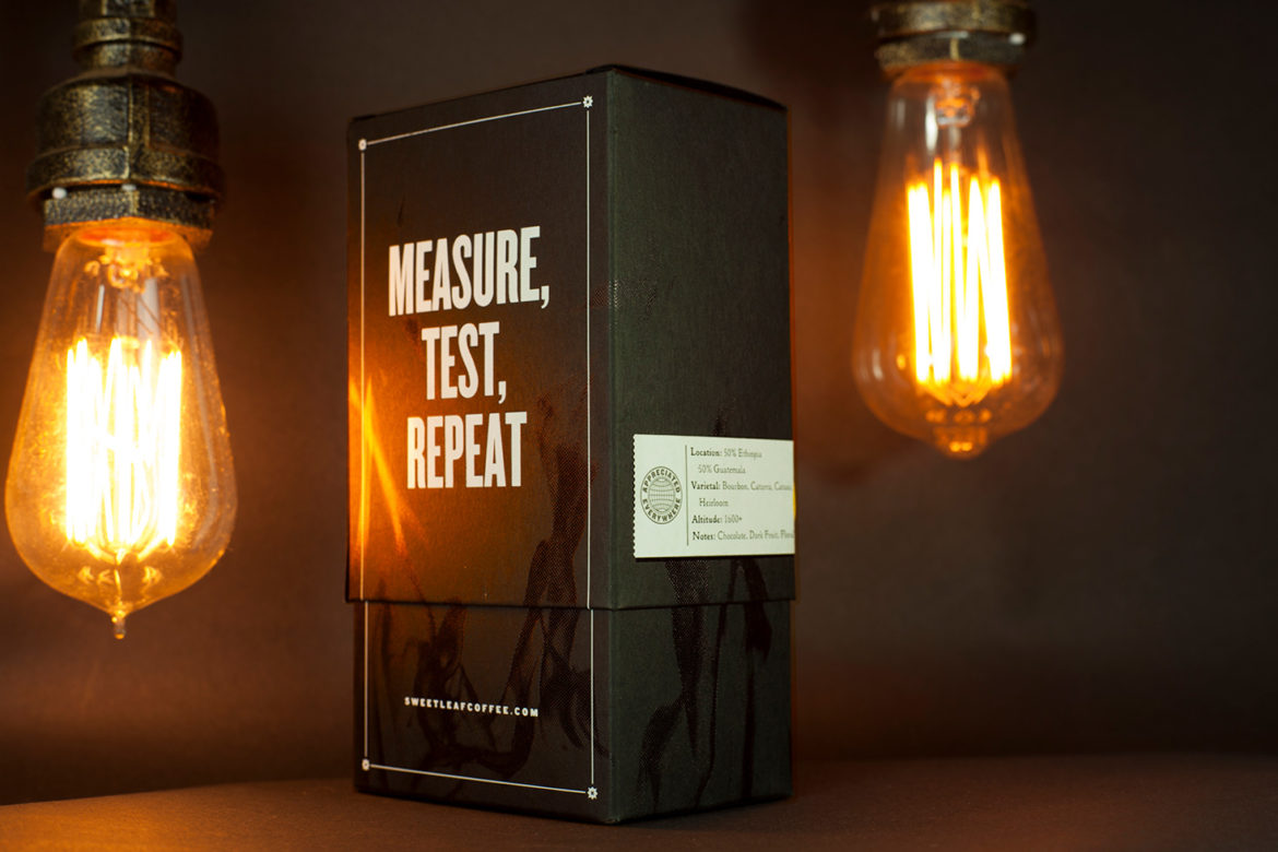
We share the location, varietal, altitude, and tasting notes.
What’s the motivation behind that?
We wanted to keep it simple as there is already so much going on with the packaging.
Why are aesthetics in coffee packaging so important?
For us, it was important to have an aesthetic that tells the story of where we’ve come from and where we’re going. When we began in 2008, Queens was a very different place, even then. When I look at the box design, I can feel the grittiness of that time but also feel some maturity in how far we’ve come since then. Hopefully, our long-time regulars will feel the same way.
Where is the packaging manufactured?
It’s printed at Studio on Fire in Minneapolis and then lovingly assembled at our roastery.
Is the package recyclable/compostable?
The box is 100% recyclable and compostable. It’s FSC certified, which means it meets the mark of responsible forestry.
It’s also manufactured using 100% renewable electricity and is Carbon Neutral Plus, meaning the manufacturer has made a commitment to reduce carbon emissions and conserve natural resource and wildlife habitats.
On top of all this, it’s Green Seal Certified, meaning the stock is manufactured with a minimum of 30% post-consumer fiber (which is fancy-talk for “it’s made from 30% other peoples’ garbage”—it’s clean, we swear!) and meets federal procurement guidelines.
Where is it currently available?
If you’re in New York, come by to our locations and pick up a box. Or if you’re too far away (or in New York but too lazy) you can order online here.
Location: Brooklyn, NY
Country: USA
Release Date: September, 2018
Designer: Topos Designs & Studio on Fire
Zachary Carlsen is a co-founder and editor at Sprudge Media Network. Read more Zachary Carlsen on Sprudge.