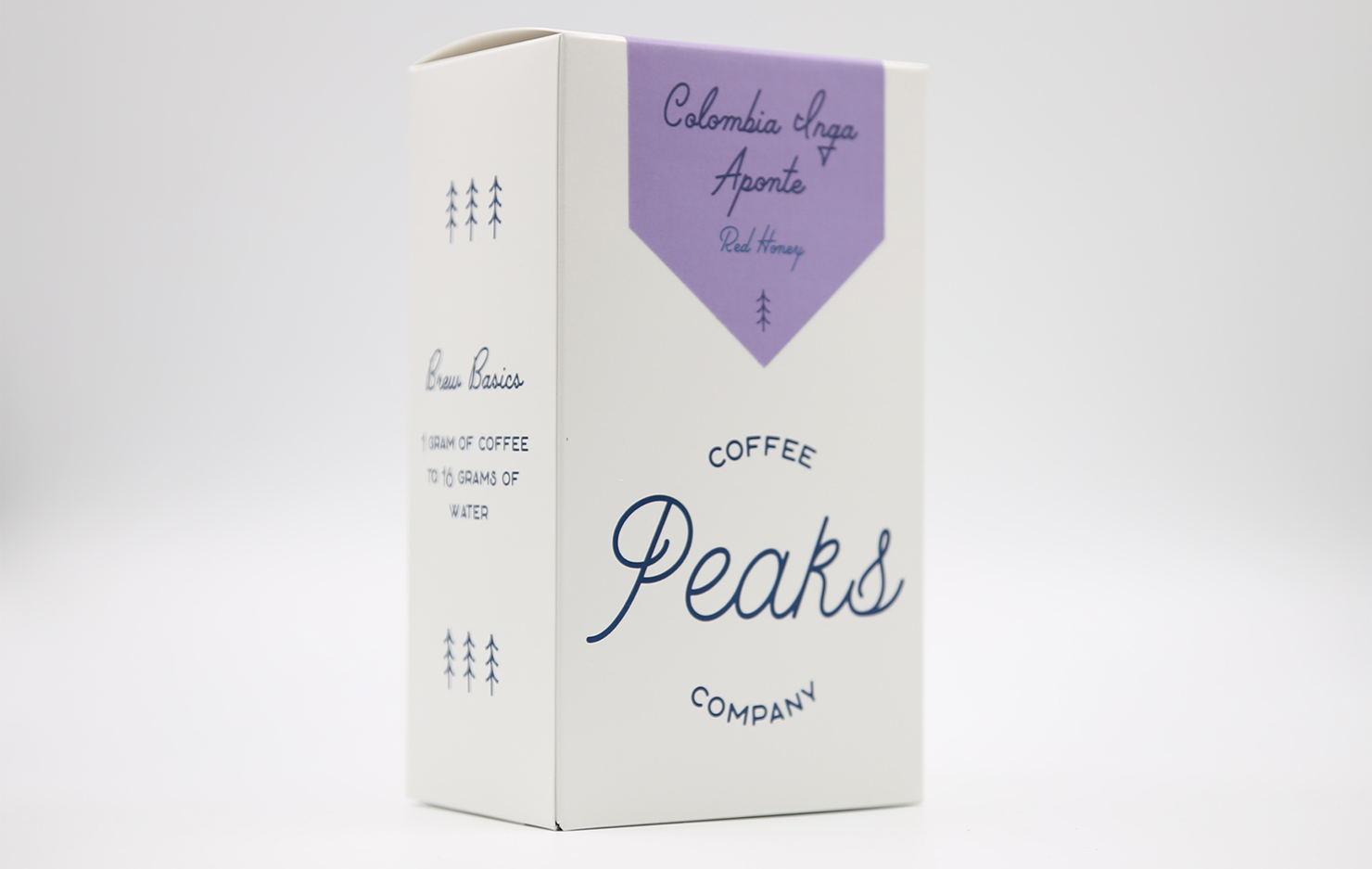
About 7,000 people call Cazenovia, New York home including Sam Bender and Kelsey Ball, founders of Peaks Coffee Company. Peaks Coffee Co. opened in the Summer of 2015 and last October debuted a fresh new look for their coffee offerings. They worked with designer Lottie Caiella to give the branding an Upstate New York camp vibe. We talked to Sam Bender to learn more.
Tell us a bit about Peaks Coffee Co.
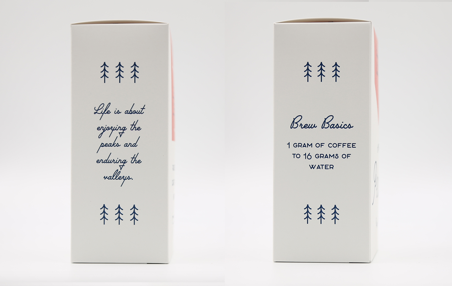
Our company was founded in July 2015 between myself (Sam Bender) and Kelsey Ball (my now wife as of this past fall). Both Kelsey and I suffer from anxiety and depression. It was so challenging for Kelsey in her senior year of high school, that she had to be placed on homebound learning. One day when her mental health was at an all-time low, her dad told her a phrase we’d both come to lean on; that life is about enjoying the peaks and enduring the valleys.
Having been shaped by both our peaks and valleys, our goal of this company began as a desire to create a place where people of any and all backgrounds can enjoy a great cup of coffee with a friend.
We wanted to fill a hole in the market with roasting as well. Over the past few years we have started working with a roasting consultant, and establishing partner producers in Colombia through Campesino Specialty Coffee. Our goal is to source seasonally and roast fresh.
When did the coffee package design debut?
We spent roughly a year (from concept to execution) working towards our rebranding. We launched our rebrand on our second birthday, October 3rd, 2017.
Who designed the package?
Our rebrand was done by our good friend and self-taught graphic designer, Lottie Caiella (@thecaiellas). She is based out of Upstate herself and in spending time in both Washington state as well as LA, she is as equally passionate about delicious coffee as we are. She’s been known to infuse most of her designs with a classic Upstate NY feel; pine trees and the like, and as our passions have always been in alignment she was a logical choice to help us translate our vision for the rebrand into something truly us.
What coffee information do you share on the package?
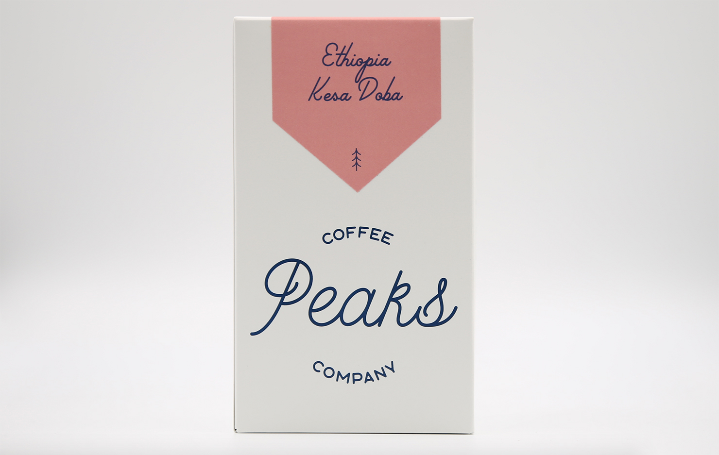
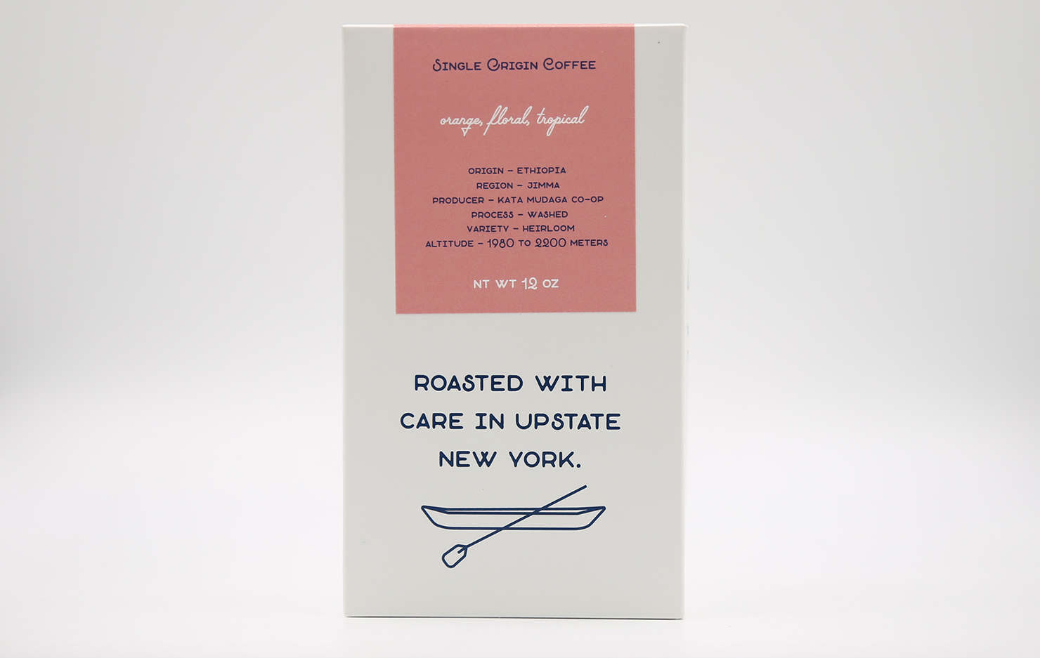
You can find the basics (our logo and information specific to each coffee) as well as our standard brew recipe and our mantra across each box (with no shortage of pine trees too, of course). We do our best to customize our labels to match each coffee’s vibe (color-wise), and they display the tasting notes, origin, producer, process, varietal, and altitude of each coffee. To keep things fun, we continued our branding on the inside of the box which is a sweet little surprise when folks crack the box open after they’ve taken it home.
What’s the motivation behind that?
By nature (excuse the pun) we are a product of Upstate, NY— therefore we inherently have a somewhat camp-y vibe. However, we are still working every day to advocate for our product and industry in this part of the country as a legitimate product. When we rebranded, we wanted our product to evoke our modern camp vibes while representing quality and care.
What are some of the improvements made in the packaging?
When we started out, we were a tiny roasting company. This meant we were hand stamping all of our bags and could afford to do so. We used brown Biotrē bags, stamped, and printed our labels in house. We were small enough to do a few packages and distribute them around town.
Our old packaging was relatively fragile and did a poor job communicating who we are as a company or perhaps more importantly, what sort of flavors and experiences lied inside. Not only did we overhaul the visual components, but we wanted our new package to withstand being tossed into your backpack for a drive up to Maine.
As we transitioned into becoming primarily a wholesale business, we needed to streamline our production. We now use custom professionally printed boxes and labels.
We wanted to create a product for consumer and business alike that when they looked at a package from Peaks, they knew what our aesthetic and mission was right away without having to be in our shop.
Why are aesthetics in coffee packaging so important?
Since prioritizing communicating our brand via our packaging, we’ve seen across the board an overwhelmingly positive response from customers both in our shop as well as at stockists’ businesses. We always felt like aesthetics were important to us, but have truly learned a great deal in what that actually looks like in this year since rebranding. If we neglect putting as much care into the visual representation of our product as we do in actually sourcing and roasting amazing coffee, we’ve failed to do a complete job.
Where is the box manufactured?
The box is currently printed by The Mid-York Press in Sherburne, NY. All of the board comes from GP Mills in Baton Rouge.
For package nerds, what type of package is it?
The boxes are on .018 SBS (Solid Bleached Sulphate). They are PEFC, SFI, FSC certified. These cartons were coated with a Matte Coating which provided the flat finish and the textured surface. The carton was printed on our Xerox Igen 150 using Matte Dry Ink which is FDA approved for consumable goods.
Is the package recyclable/compostable?
The packaging is 100% recyclable.
Where is it currently available?
Our packaging is currently available at our retail location in Cazenovia and around the Syracuse region with our partners. Soleil Cafe (@soleil_cafe) and Flour and Salt Bakery (@flourandsalt) are two well known retailers in the local area. We also work with multi-roasters out of state and they will pick up some cases to sell. You can also buy online at www.peakscoffeeco.com.
Location: Cazenovia, NY
Country: United States
Design Release: October, 2017
Designer: Lottie Caiella
Zachary Carlsen is a co-founder and editor at Sprudge Media Network. Read more Zachary Carlsen on Sprudge.

