Spectracolor
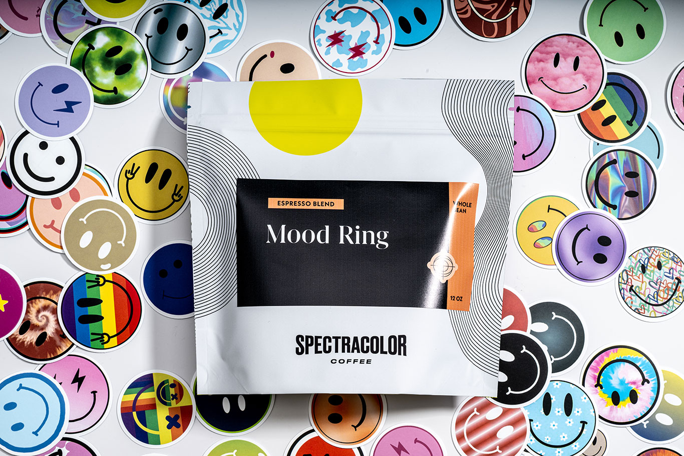
Spectracolor’s mission is to help our customers vibe. We believe in the vibe. And we believe in boosting the vibe — whether that’s energetic or calm, dreamy or focused, outgoing or introspective. Color and visual cues are an important aspect of delivering on this mission — for us, every mood is a color, and for every color there is a coffee. This is the philosophy we presented to the Portland, Oregon, design agency Central Office when we asked them collaborate on the creation of our packaging. Many mood boards and iterations later, we chose a combination of logo, package, and labels that perfectly expressed in physical form our founding mashup of vibes and colors.
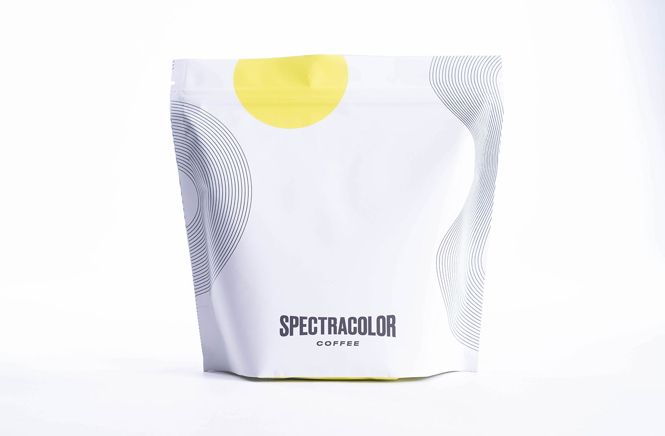
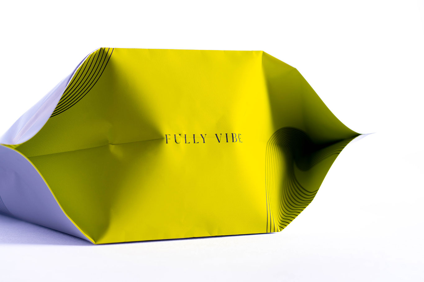
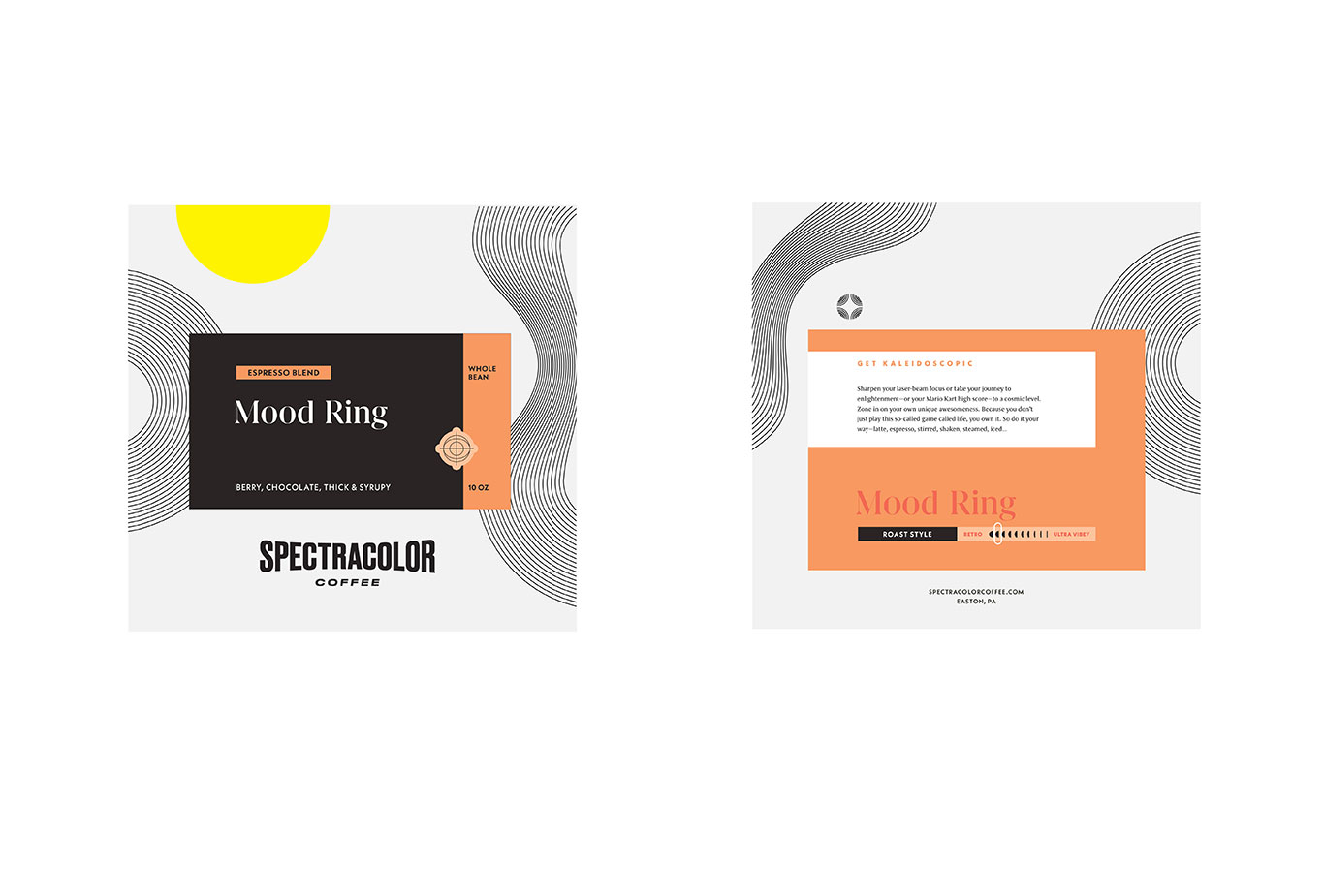
With the design elements in place, and powered by dream-pop playlists and eclectic Substacks, we revised our original textual ideas, and dreamed up new words and phrases that complemented or, in some cases, amplified the messaging. Mood Ring — the roast and the packaging — has come to embody the Spectracolor brand and all that our customers experience when we share our coffee with them.
Official Website | Instagram | Vote Now
Outstanding Packaging: Whole Bean Semi-Finalists
Atomic Coffee Roasters
The Boy & The Bear
Hard Lines
Ilse Coffee
Imunika
Look Alive Coffee
Loquat Coffee
Madcap Coffee Company
motive coffee
Onyx Coffee Lab
People Possession
Roseline Coffee
Spectracolor
Speckled Ax Wood Roasted Coffee
Torque Coffee

