


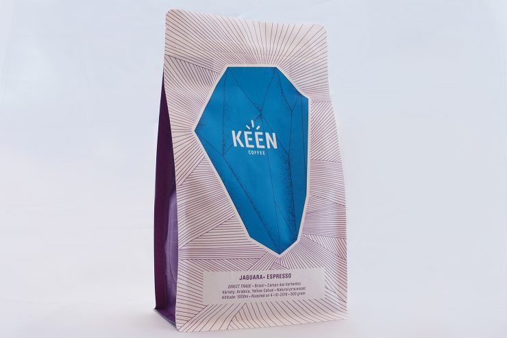
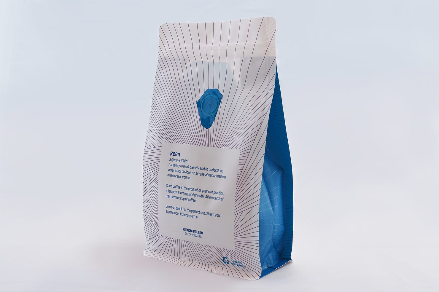
Keen Coffee, a coffee roaster out of the Netherlands, is making a splash in the coffee world as it nears its one-year anniversary. In March, the company debuted their packaging at the Amsterdam Coffee Festival. Bold colors complement striking line-art. Coffees are distinguished by clever accent colors on the sides of the flat bottom bag. Very nice.
As told to Sprudge by Rob Kerkhoff.
Tell us a bit about yourself and your company.
Keen Coffee is a collaboration of baristas Bonne Postma and Rob Kerkhoff, and roasters Jan Schuitemaker and Tosca Schuitemaker. Together, we have over 40 years of experience working in the world of coffee.
Last year, we decided to combine forces and, after much brainstorming, Keen Coffee was born on December 1st of 2015. Keen launched publicly at the Amsterdam Coffee Festival in March of 2016, and we couldn’t have asked for a better kickoff!
The Keen roastery is located in Enkhuizen, a small harbour town just North of Amsterdam, where all of our coffees are roasted to order using a 30 kg Loring roaster. We also give lessons at our roastery, sharing our knowledge of green coffee purchasing, roasting, coffee preparation, and hospitality.
For us at Keen Coffee, discovering new ways to experience coffee is what excites us; sharing these discoveries is what keeps us inspired.
When did the coffee package design debut?
Our coffee package design debuted when we launched our company Keen Coffee in March at the 2016 Amsterdam Coffee Festival. We were introducing our brand on a huge stage, so we knew that we wanted to launch with our own unique package design—not just another brown bag with a white label slapped on!
The package is your coffee’s calling card. Its design is what lures people in, to smell and then taste the coffee housed inside.
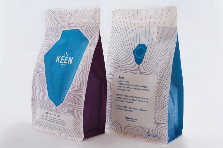
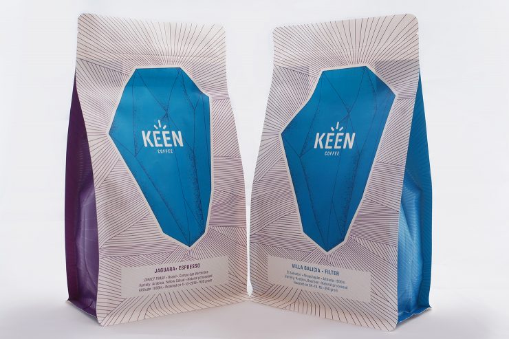
In August of this year, we introduced a second bag design that is a simple variation on the first. This new bag has a purple edge, instead of the original blue, to indicate that the beans are for espresso not filter coffee. We love how good design can make it so easy for our customer to see which bag they should grab.
Who designed the package?
Our good friend and designer, Jorgen Koolwijk (Uncoated Print Club), designed our logo, our corporate identity, and our coffee packaging. Jorgen specializes in designing for music, theater, and festival-related businesses, so we knew that he’d be coming to this project with an outsider’s eye, which we liked. And we just plain love his style!
Please describe the look in your own words!
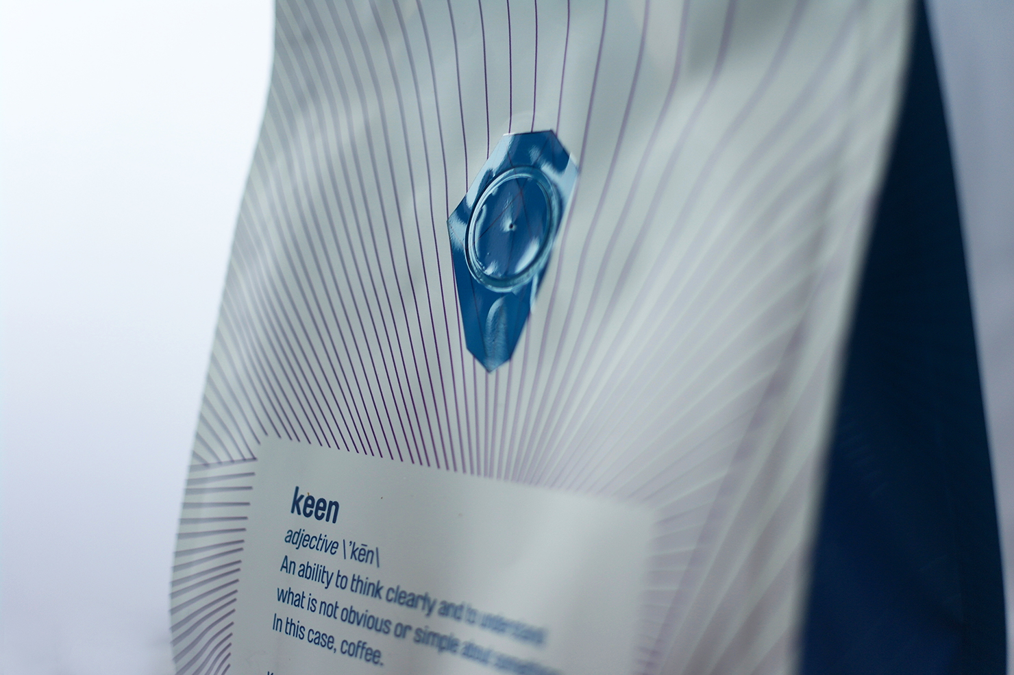
We asked Jorgen for a design that was both striking and innovative and then gave him full creative control. He was inspired by mineral formations and their characteristic crystalline shape. This approach resonates with us because we love the idea of something so crude and rough transforming into something beautiful. The central image on our packaging is based on a single piece of quartz, the lines jutting out from it are inspired by quartz formations, and both were hand-drawn by Jorgen.
The iridescence of the lines featured along the sides of the bag, the front logo, and the small crystal drawing on the package’s back valve, give the design more depth. The rich purple and blue colors work to differentiate our coffee bag and make it truly unique.
We also wanted to get our message just right, so we employed our Canadian friend, Samara Parker, to create copy for our packaging that perfectly captured our values and the playfulness of our brand.
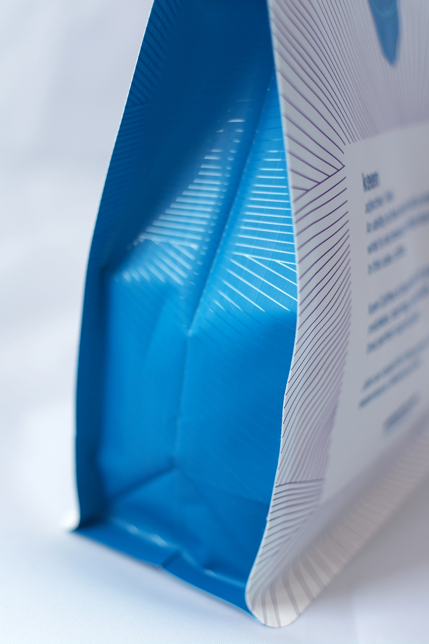
But we weren’t only thinking about branding details when designing our packaging, we were also thinking about our fellow baristas and how we could make things easier for them. We wanted our packaging to be functional as well as beautiful, so we included an easy-to-use zipper top and laser scoring to make opening easy and prevent tearing.
As the architect Ludwig Mies van der Rohe once said, “God is in the details.” We try to apply this way of thinking to everything we do, from the design of our packaging, to our bean selection, to our roasting methods!
What coffee information do you share on the package? What’s the motivation behind that?
We made a conscious choice to lead with the name of the plantation or farm where the beans are grown, instead of their country of origin. This was an important choice for us, as we often carry coffees that come from the same country, but taste nothing alike. Below the farm, we provide more details about the beans, at first the country of origin, the region or mill they’re from, the altitude at which they were grown, the variety of beans, the process method and the date on which they were roasted.
Of course, we also mention basic information such as roasting style (filter or espresso), and quantity (500 grams for espresso and 350 grams for filter) on the label.
Our website, keencoffee.com, includes more extensive stories about each of our coffees and information—for example, how Jan found our direct trade coffee Jaguara from Brazil.
Where is the bag manufactured?
We use a local company (Dutch Coffee Pack) as our supplier, but the bags are made in their Chinese production location.
For package nerds, what *type of package* is it? (hand pressed, one-way valve, what’s it lined with, etc.)
We use a box pouch with a zipper to make the bags resealable, a one-way degassing valve, and laser scoring for easy opening. We also use a custom-made shape that makes the bags look full whether they’re holding 500 grams of beans or 350 grams of beans because empty-looking coffee bags give us the sads. The outer layer of the bags is finished with a matte varnish which gives them a really luxe feel and makes the artwork even more playful.
Is the package recyclable? Any other pro-environment info about the package you want to share?
The materials used for our packages are 100% high oxygen barrier plastic which makes the bags recyclable with plastic waste in most European countries. The inner layer is a dense white film to keep as much UV light out of the bags as possible and ensure the freshness of the beans.
Coffee Design is a feature series by Zachary Carlsen on Sprudge. Read more Coffee Design here.