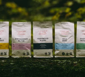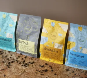


Vancouver-based coffee roaster 49th Parallel got its start in 2004. More than a decade later, they’ve refreshed their identity with a new mark and design layout on their packaging and branding. For the refresh, the team at 49th Parallel worked with their long time collaborator Roger Dario based out of Toronto. Together, they created something new while holding on to familiar elements, and we think it’s really quite nice.

As told to Sprudge by Meaghan Potts.
When did the coffee package design debut?
We released our new bags mid November of 2015. The past 12 months have been filled with exciting changes. We built a new site with a focus on our coffee sourcing practices and a new user orientated subscription program. We also redesigned our coffee bags, all of our retail merch and ceramics, it’s been a big year.
Who designed the package?
We worked with our long time collaborator Roger Dario, based out of Toronto. He was responsible for our previous branding and was an absolute joy to work with on this project. For this project he designed a new primary mark, monogram, illustrations and label artwork as well as the layout of the bags.
Please describe the look in your own words!
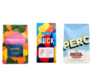
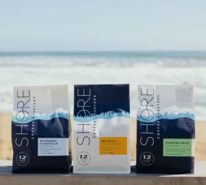
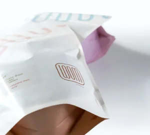
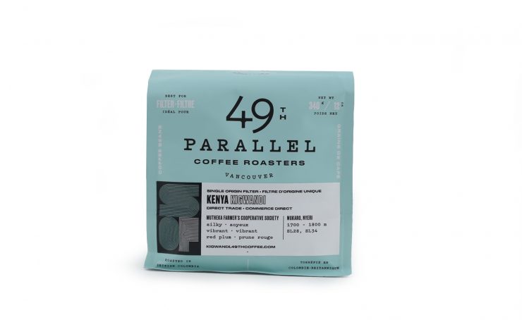
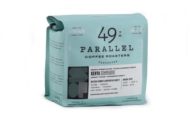
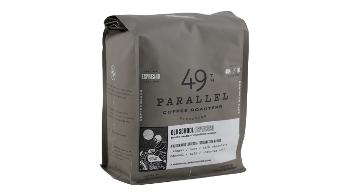
Our intention was to keep the elements we love and that our customers have loved for years and refresh them. Our filter coffees still come in the classic mint green colour we have become known for; it’s a nod to the colour of Vince’s first Bianchi bicycle. We updated our espresso bags to a warm grey to create a more cohesive colour scheme between all of our bags.
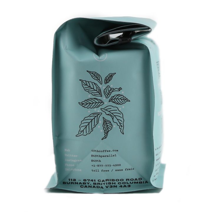
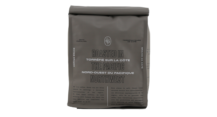
As a Canadian company, it was very important for us to design a bag and label that was fully bilingual. This presented a whole new set of challenges in designing a bag that looked balanced and didn’t have an overwhelming amount of text. We focused on thoughtful framing, and utilizing all of the design space. We saw this as an opportunity to have fun with the redesign and incorporated different illustrations on the labels as well as some Caturra leaves on the side gusset.
What coffee information do you share on the package? What’s the motivation behind that?
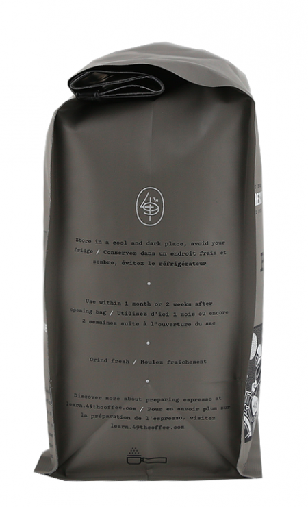
On our labels you will find information about the coffee. You will see the farm name, producer’s name, taste description, region, elevation and varieties. We also wanted to provide the information you might need to brew a good cup of coffee on the fly so you will find some basic brewing guidelines on the side gusset of the bag.
You can also see that our bags are vacuum sealed and nitrogen flushed; this is something we have done extensive testing on and have been doing for a few years now. Basically, this slows down the release of CO2 and the aging process. We found that in doing this, it helps the coffee retain more of the vibrancy and complexity that it has right after roasting.
What type of bag is it?
Our bags are block bottom, with a one way valve to allow degassing. They are foil lined and have a matte finish. It was really important to us to think about how these bags would look stacked neatly on a shelf, to achieve a clean and structured look they are sealed on all four corners and folded with a tin tie.
Where is the bag manufactured?
The bags are manufactured in Taiwan by Pacific Bags Inc.
Is the package recyclable/compostable/reusable?
Unfortunately no, but we are always finding ways to be more sustainable and hopefully will have recyclable/compostable bags in the future.
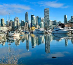
Location: Vancouver, B.C.
Country: Canada
Design Date: November, 2015
Designer: Roger Dario
Coffee Design is a feature series by Zachary Carlsen on Sprudge. Read more Coffee Design here.