


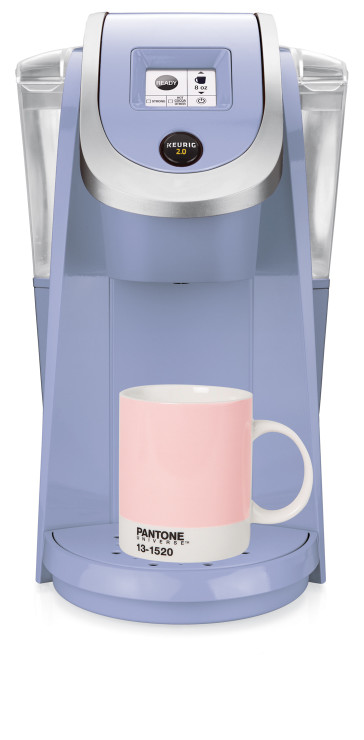
For the first time, Pantone, the world’s most popular standard-setters in color, announced not one but two colors of the year. That means 2016’s fashion and home decor items will wear their fair share of Serenity and Rose Quartz. In the market maybe for a pastel blue Keurig K250 brewer that comes with a contrasting mug in powdery pink?
Pantone has stated that this “more unilateral approach to color is coinciding with societal movements toward gender equality and fluidity.” Right on. But did you know that the 53-year-old company, headquartered in the industrial wetlands of Carlstadt, New Jersey, has many other hues with names that smack of the tastes of the times? And that includes coffee.
Leatrice Eiseman, executive director of the Pantone Color Institute, answered a few questions for Sprudge about coffee and colors.
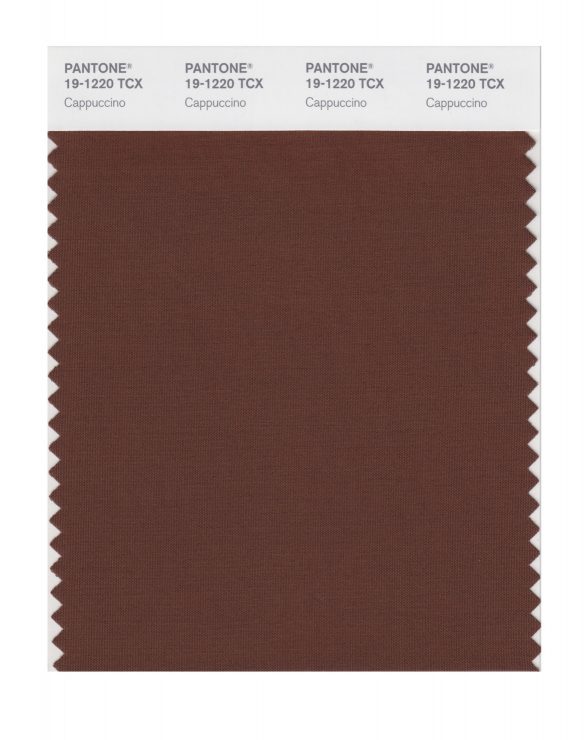
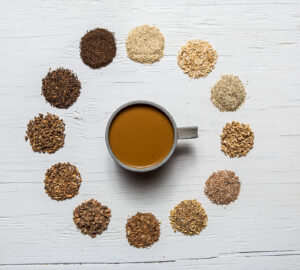
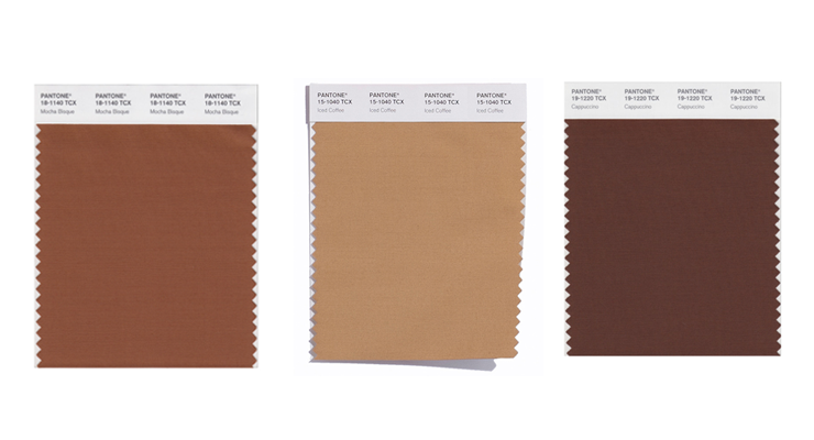
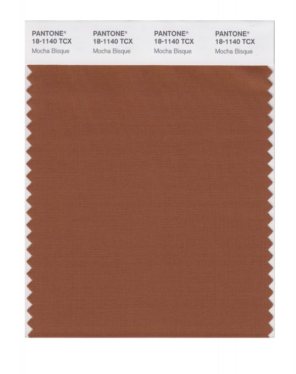
At least 14 Pantone colors have coffee or coffee-related names—Turkish Coffee (19-0812), Coffee Bean (19-0915), Chicory Coffee (19-1419), Mocha Mousse (17-1230), Coffee Liqueúr (18-0930), and Café au Lait (17-1227)—to name a few. How did the company come up with them?

Many of these names first came about in the latter ’90s, when what I have referred to as the “Starbucks phenomenon” came about. People were starting to meet in neighborhood “cafes” and became accustomed to seeing the deliciously rich coffee drinks in a more sophisticated way than a simple cup of “coffee” with an equally simple name. There is a romance implied here—an expectation of beautiful drinks surrounding the varying shades of brown and the names reflect that specific color and flavor .
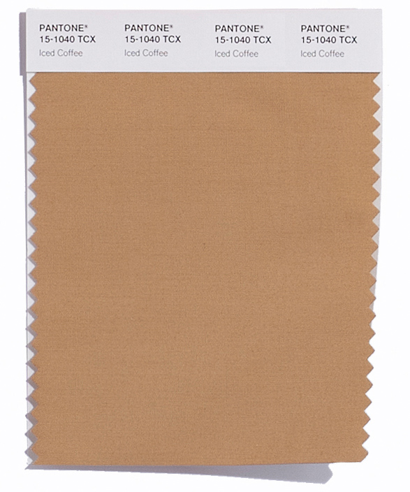
Well before announcing its colors of the year, Pantone named Iced Coffee one of the top 10 hues for spring 2016 fashion, calling it “a transitional color that will take us through the seasons” thanks to “its natural earthy quality, the softness and subtlety.” In how far could the decision have been influenced by the boom of cold-brew coffee in the drinks industry?
There is no question there is a connection between the naming of a color and specific trends. In addition, this is one of our newer colors. We look to varying influences for many sources of color or a specific hue.
A background question: some Pantone colors are only identified with a number, others have a name, too. Why?
The Pantone Fashion, Home & Interiors Color System is a vital tool for designers in the apparel, home furnishings, and interior design industries… As this color system appeals to designers and fashion trends, the names have been assigned alongside numbers to help impart feelings and emotions. This is in contrast to the ink-based Pantone Plus Series that only features a number.
Since Pantone started assigning a color of the year in 2000, two have had distinct beverage connotations: 2009’s Mimosa and 2015’s Marsala. From ripening coffee cherries to the crema atop an espresso, color is an important indicator in various stages of coffee growing and making. Would Pantone be open to suggestions for future hue names from the coffee industry—say, bright flat white or cascara red?
It certainly could play into our ultimate choice if it fits other criteria and is appropriate to the zeitgeist.
Thank you!
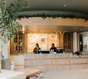
Thirsty for more projects that pair Pantone palettes and palates? Artist Hedvig Astrom Kushner is showcasing her Pantone swatch-matching smoothies on Tumblr. Canadian company Tealeaves has partnered with Pantone to launch an online exhibition exploring the interstices of tea, color, and mood. And could we see a 2016 rendition of the Pantone Café, which popped up in Monaco last summer? We look forward to finding out what’s next in our Carafe (19-116).
Karina Hof is a Sprudge staff writer based in Amsterdam. Read more Karina Hof on Sprudge.
Images courtesy of Pantone.