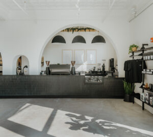


When Sterling Coffee Roasters moved from their original NW Portland grocery store outpost to their current digs, they won us over with white tablecloths, Glencairn espresso service vesselry, and all-around good looks.

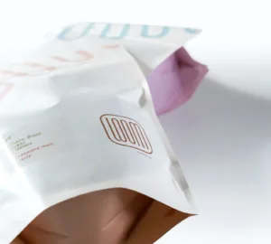
True to form, the micro-roastery has applied their penchant for aesthetics to new whole bean coffee packaging. These bags debuted on Valentine’s Day 2015, which happened to also be the company’s fifth anniversary.
We spoke with Sterling Coffee Roasters co-owner Adam McGovern to learn more.
Who designed the bag? [Sterling Coffee co-owner] Aric Miller and I worked closely with our friend Kali Sanders, who consults with us on all design decisions (for example, our recent remodel).
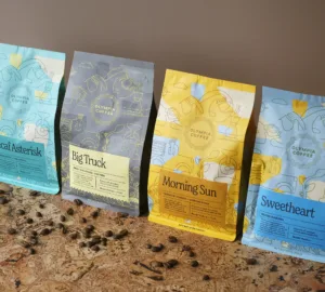
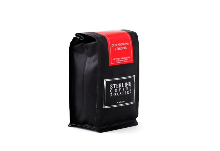
The new bags reflect our coffee program’s emphasis on simplicity and quality. We select just one Africa and one Americas coffee every month to accompany our Blendo Stupendo, and we challenged ourselves to represent that selection with as little embellishment as possible. The central task of the front of a bag of coffee is to convey both constant (brand) and variable (coffee) information concisely and economically, so we chose three colors to convey constant information and two words (country and farm/coop/mill/region) to convey variable information. We chose blue for the Americas and red for Africa because those colors are most often associated with those continents in the industry, and we chose black for the Stupendo because it is our new classic.

What coffee information do you share on the bag? What’s the motivation behind that?
The front of the bag supplies just enough information to distinguish it from the rest of our selection. The back of the bag expands on both the variable information and the constant information with two short sections. The variable section describes what the coffee tastes like and why we chose it (and usually incorporates a systematic play on words because we are nerds), and the constant section describes Sterling’s process (using language that is intentionally and humorously general). We designed the bags like that just to challenge ourselves to only represent the essential task of a bag of coffee.

Sterling means classic and fine, which is why we use Times New Roman, Gil Sans, and Helvetica for most of our type. For our signature “One Hundred Percent Roasted Coffee!” we went with a script to underline the irony, but aside from that our choices are usually very strict. As we grow we will also expand our font palette to include masterworks like Calibre, but for the present we’re happy with the classics.
Is the bag recyclable?
Our initial focus was entirely on the design and nothing else. Now that the new bags are established we will begin working with Pack Plus to find a similar material that is compostable or at least recyclable.
Where is the bag manufactured?
We work with Pack Plus; they have small enough minimums that we could make several design changes over the first few months (although no one else can tell, the current bag is actually the third version of the new design).
Location: Portland, Oregon
Country: USA
Design Date: February, 2015
Designer: Adam McGovern, Aric Miller, Kali Sanders
Manufacturer: PackPlus
Coffee Design is a feature series by Zachary Carlsen on Sprudge. Read more Coffee Design here.