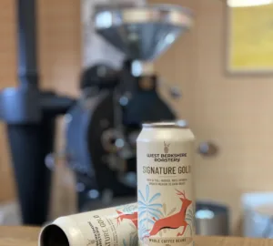


This week we’re featuring the coffee redesign at Morgon Coffee Roasters in Gothenburg, Sweden. The company was founded in 2018 by Gabriella Runesson, Christian Gullbrandsson, and Markus Vestergaard. The team at Morgan believes through storytelling and design, coffee companies can increase the perceived value of a cup of coffee. Earlier this month, the roasting company was featured in our Roaster of the Week series on Instagram @sprduge—and their new packaging received a lot of praise.
We spoke with co-founder Markus Vestergaard and creative director Simon Söder digitally to learn more about the company’s new look.

Hello! Tell us a bit about the redesign!
Simon Söder: We’d like to see it as a next step, more than a complete redesign. The roastery is evolving and our design evolves with it.
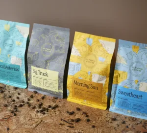
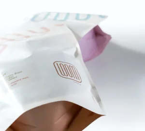
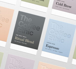
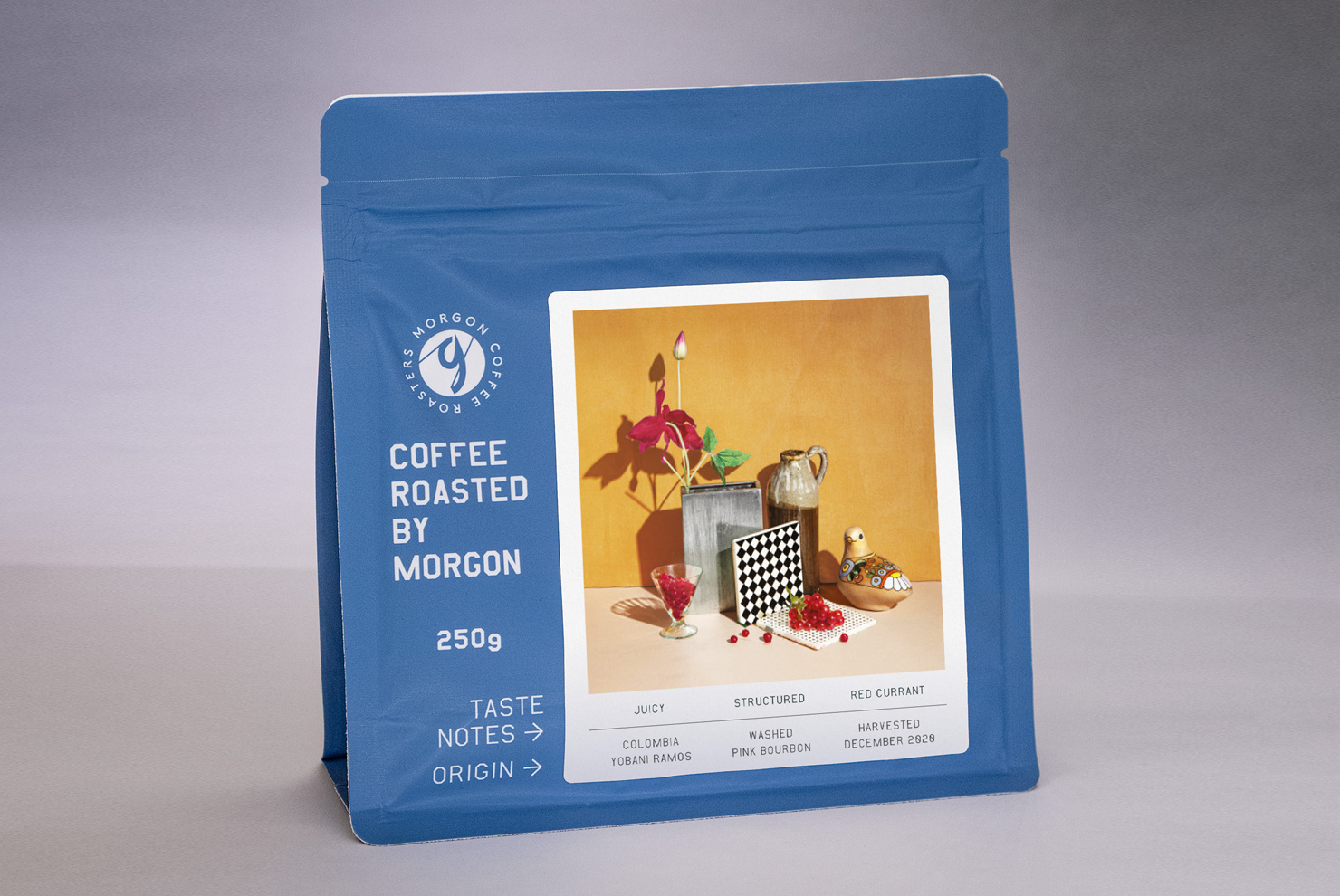
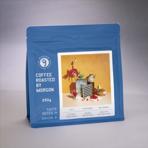
Markus Vestergaard: In 2018 we talked about wanting our products to be fun and eye-catching and pop with color from afar. We told Simon and Elinor that we didn’t want them to look like bags of coffee at all. We wanted the bags to spark folks’ curiosity and have them pick up the packaging to see what they might contain. With the updated design we wanted to better frame the artwork and make the context clear. This is why our new design includes big bold letters, clearly stating that it’s Coffee roasted by Morgon, 250g, and what the little notes on the labels are, our Taste notes, and the Origin information.
Söder: The graphics and style of the bag is inspired by the location of the roastery—the old city shipyard in Gothenburg. While the harbor has shut down, the old signage, freight containers, and cranes are still around. I think the idea of the harbor fits well with Morgon and exploring the world through coffee. That curiosity is the same place Elinor and I draw the inspiration for our label designs. A reminder that each coffee is a work of art and when you buy a bag or drink a cup, the design should reflect the amount of work and miles behind it.
Who designed the new packaging?
Vestergaard: The packaging is designed by Simon Söder, in close collaboration with us, spending quite a lot of time with us down at the docks. The photos are all made by Elinor Vestergaard and Simon Söder, as they have been since the start of Morgon Coffee Roasters in 2018.
Tell us about the photography and imagery and what it conveys.
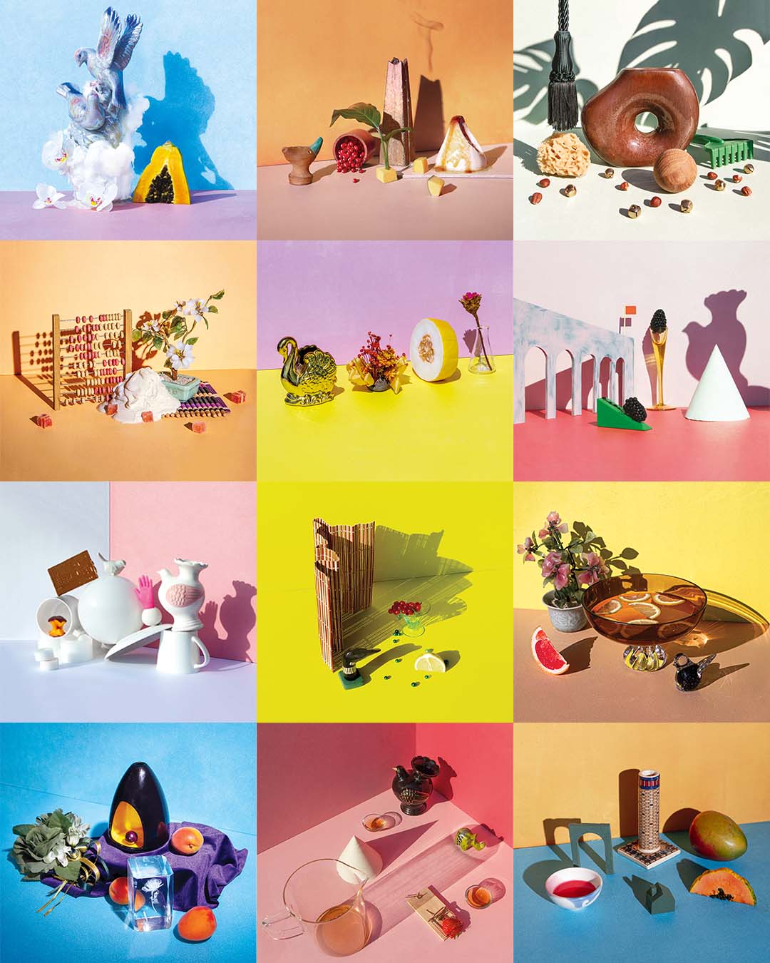
Söder: It’s a kind of visual storytelling. Morgon states that “every coffee has a story,” and the photos are our way of telling them. Markus, Gabriella, and Christian have been very clear with not wanting the producers and their work getting lost in their products. The still-life photography is made to represent the different coffees by giving a visual trace of Morgon’s taste notes, the lot’s process, and stories from the producers themselves. Exploring the coffee through imagery gives us other perspectives and new ways to talk about the experience. This extra dimension is our way to honor the exceptional work being done for the sake of a cup of coffee.
Vestergaard: Here in Gothenburg, as in most places, a cup of coffee is not just a commodity it’s something that’s always expected. With fika being such a big part of our culture, there’s always coffee a’brewing nearby. Despite us having this ritual that in so many ways centers coffee it’s expected to be free, with bottomless refills. Creating a product that raises the customer’s perceived value of coffee has been an idea that we’ve had for a long time. We wanted to add more value and create something more close to fond memories or keepsakes. Attaching Elinor’s and Simon’s designs to each of our coffees, a unique work of art, absolutely helps us do this. It also helps a lot of folks better remember what coffees they enjoy. From first-time buyers who goes straight for the coffee with the big chocolate donut on its label, to regulars who might not be able to remember the name, but that the coffee had a volcano of caramel and red berries on the bag, or even a golden swan.
What kind of bag is it?
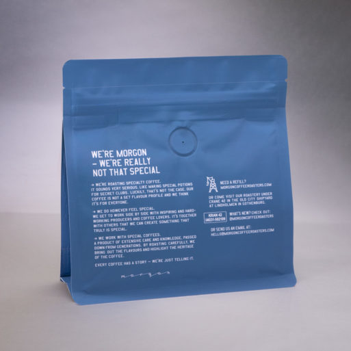
Vestergaard: The bags are manufactured by Dutch Coffee Pack for us. They are 100% plastic to make them easy to recycle and we’ve opted for CO2-neutral production. This is made possible by the work that DCP is doing with the Cookstove Project in Ethiopia and Kenya. A lot of people there are cooking on open fires, which is not only bad for the environment but of course also their own health. Dutch Coffee Pack compensates for the emissions of the production by investing in a project that supplies rural community families with clean and fuel-efficient cookstoves. A single one can save nearly three tons of greenhouse gas emissions in one year, as well as cut the family’s fuel costs by over a third while saving them the time and work of collecting firewood.
The bags are coated with a plastic haptic matte which resembles the touch and feel of paper to add the sensation of texture to the look and smell of the product. We added a laser scoring and a zip lock for easy and clean opening as well as the possibility of resealing them.

Where is your coffee available?
Vestergaard: We’re lucky enough to have our coffee featured in coffee shops and businesses all over the world so it’s not easy to keep it short and be specific. But you can always come by the roastery on weekdays and if you’re a bit far away or maybe limited to travel we have a webshop that offers free international shipping when you order 4-7 bags of coffee.
Thank you!
Learn more about Morgon Coffee Roasters by checking out their official website and follow the company on Instagram @morgoncoffeeroasters.
Coffee Design is a feature series by Zachary Carlsen on Sprudge. Read more Coffee Design here.