


Menus are a product of time and thought.
Before the volcanic eruption in 79 CE, Pompeii was host to one of the first written menus ever documented. Restaurant and pub remains are continually being unearthed at the archaeological site but the presence of frescoes with various food items suggested written menus were around even back then.
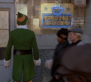
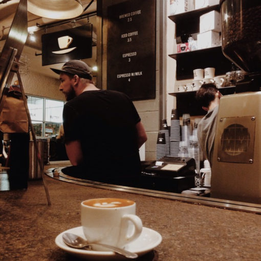
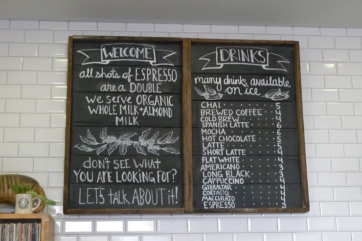
Coffeehouses arrived after restaurants and presumably, menus were also present. With specialty coffee’s rise in popularity, more money and care went into the design of everything: the interiors, branding, and yes, even the menu. A big chalkboard sign was no longer enough to distinguish cafes from the Peet’s and Starbucks. If the interior design of a specialty cafe didn’t scream that it was different, surely the pared-down drinks menu did.
This was before social media connected the coffee industry on a global level, before you had a smartphone to research or snap a photo and before QR codes made their comeback in these apocalyptic times.
For assembling this timeline, I turned to the experts: coffee people who witnessed the changes and have a far better memory than me and Alison Pearlman, Professor of Art History at Cal Poly Pomona and author of May We Suggest: Restaurant Menus and the Art of Persuasion. The trends and the cafes are mostly reference points and examples, though some did heavily influence menu designs elsewhere. And before we get into the modern details, let’s acknowledge the one that set consumer expectations up for coffee that wasn’t made from instant powder.
The Italian-Inspired Menu
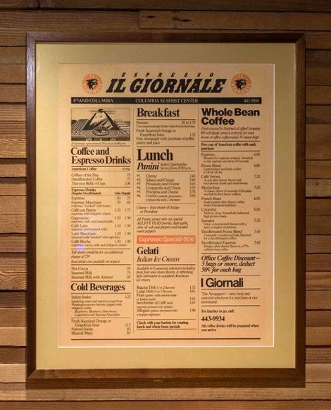
In 1985, Starbucks released an Italian cafe-inspired menu—at least, sort of. This menu actually belongs to a cafe called Il Giornale, started separately by Howard Schultz; later on the business would be absorbed by Starbucks, and Schultz would become synonymous with the brand. This second-wave coffee menu listed drinks in Italian, introducing customers to tasty espresso drinks like caffe con panna. Remember that at the time, Starbucks was trying to separate itself from the instant coffee drinkers (not to be confused with specialty instant coffee; there’s something to be said about trends being circular).
As the decades passed, Starbucks built up a slew of cafe locations, first throughout the Pacific Northwest and then worldwide. By the dawn of the 2000s, the burgeoning specialty coffee movement began experiencing real growth, and from a design standpoint, its menus functioned as a direct opposition of the large Starbucks menu. These new “third wave” bars often featured minimalist menus, limiting words and definitions. Years of “training” Starbucks customers on Frappuccinos, roast levels, and caramel macchiatos went out the window as specialty cafes began the re-education of their customers.
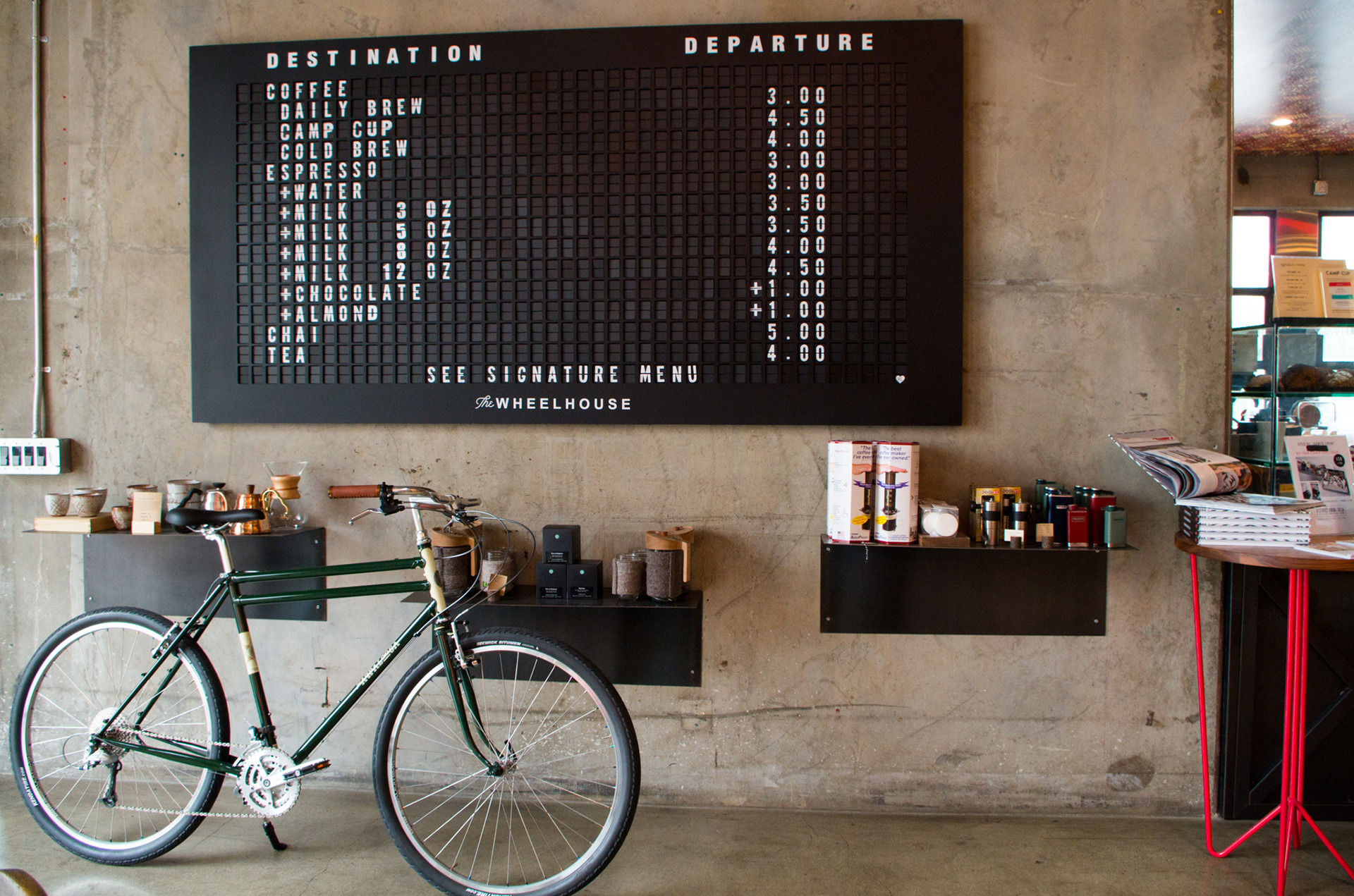
Chalkboard with Rotating Clover-Made Coffee
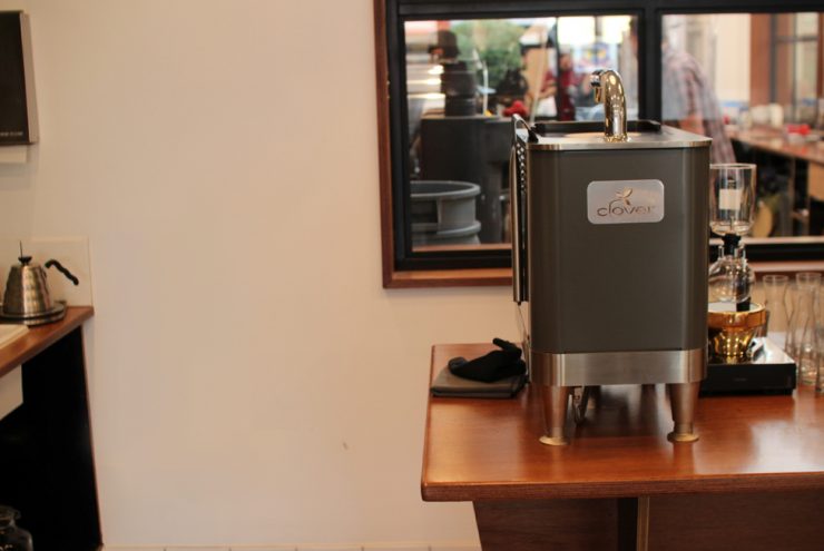
Who remembers the buzz around Clover machines? Before Starbucks acquired the company, Clover machines set themselves apart as the newest, most imaginative way to brew a single cup of coffee. While the chalkboard menu is nothing new, one that featured single-cup offerings was.
With 20 industry years under his belt, Creative Director at Royal Coffee Evan Gilman recalls his experience at Seattle-based Trabant Coffee & Chai around this time: “Each coffee was brewed individually on the Clover, made to order. You could get an 8 oz or 12 oz cup, and they sourced coffee from 49th Parallel in Vancouver.”
Even the ordering process matched the menu, he says, “You needed to make the tough choice of which coffee you wanted, and the barista would give you very informative tasting notes and help you through the experience, even though the line for coffee was 20 deep.”
Chalkboard menus continued in various forms and still exist today in specialty cafes.

Cardstock & Flavor Notes
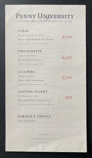
Menus serve multiple purposes. The most obvious is to tell you what the place offers. The next, demonstrated through design choices and selected words, sets expectations. A menu presented on thick letterpressed cardstock, with scripted fonts and carefully formatted lines hits differently than one displayed on a TV. These menus were simple with limited explanations. One such example was Penny University, a 2010 London pop-up coffee bar concept from James Hoffmann and Square Mile Coffee Roasters. It featured only three filter coffees and a tasting flight on the menu.
Meanwhile, in the United States, Costa Mesa-based Portola Coffee Lab opened the slow-bar Theorem in 2012—Sprudge called it “The El Bulli of Coffee”—taking the cardstock menu and backing it with a small wooden plank. To match the alchemic vibes and interactive experience, the menu gave details on the espresso’s dose weight, output weight, and brew temperature. If the reservation-only, six-seat cafe didn’t already imply a unique experience, surely the carefully selected data points did.
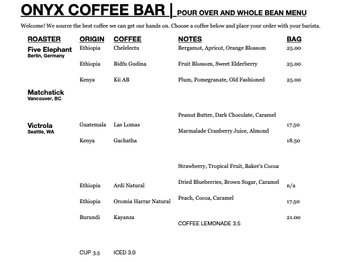
A similar vibe was pursued by Onyx Coffee Bar of Bellingham, WA, which opened only on Saturdays with a limited menu selection. Coffee was the only thing served because “we wanted to take the seemingly inaccessible and open it up to everyone by removing all the potential distractions,” says then-coffee bar manager Kevin Bailey. Simplifying the menu meant that coffee was the sole focus of the cafe.
“Tasting notes for drip coffees became more of a focal point rather than an afterthought,” Bailey says. “This allowed people to access more information about the coffees, including more specific origin info, elevation, variety, and farmer information.” The menu design also offered up conversation with customers on the seed-to-cup process, as the owner also owned a coffee farm in Guatemala.
The addition of flavor notes and origins are reminiscent of restaurant menus that name farm sources. Pearlman observes. “Since their beginnings, gourmet menus, which are often on the higher end price-wise, have featured terms that non-gourmets don’t know, details that only specialists appreciate, or have omitted information whose presence might seem patronizing to those in the know.” It comes as no surprise that this sort of detail is still prevalent today.
Espresso + Milk
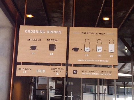
For those who were not closely following specialty coffee in 2012, it’s hard to describe the buzz around Los Angeles coffee bar Handsome Coffee. Co-founders Michael Phillips, Tylers Wells, and Chris Owens launched to what felt like the most heralded cafe opening in the history of cafes (read a summary of the brand’s rise and fall here). For our purposes here today, Handsome’s menu is worth investigating closely. It’s an illustrative and simple menu approach but looking at it more closely, one notices the little adds like “modifications politely declined.” This particular phrase was the cause of much interrogation and debate at the time: some people loved it, many more hated it. Pearlman notes that the policy “indicated culinary integrity—at least to the type of customer inclined to trust the quality and curatorial sensibilities of the kitchen. It’s the ultimate example of the gourmet-type menu that wants to start a conversation.”
Handsome was not alone in its “espresso and milk” approach. In 2014, influential Manhattan coffee bar company Ninth Street Espresso also used the concept of “espresso and milk” but made the menu text-based and far more minimalistic. The item “espresso w/milk” was followed only with the drink price, no other information was provided.
The Secret Menu
As specialty coffee increasingly became a symbol of class and status, coffee bars began going out of their way to evoke prestige and exclusivity for their in-the-know clientele. Enter the secret menu. The biggest appeal of these menus is that you needed to know about them and if you didn’t? You didn’t know you were missing out.
In Los Angeles, Menotti’s Coffee hid their secret menu on the back of a black-and-white photo of Cesar Menotti. The menu items were rotated monthly and provided a space for customers to try out more complicated drinks. One example is The Kitchen Sink, described by LA Weekly in 2015 thusly: “The Kitchen Sink is perfect for the indecisive since it includes many flavors in one glass: cold brew, chocolate ganache, Tahitian vanilla syrup, chai, and milk.”
The secret menu is a great way to make someone feel like they’re part of a small club but it can be tricky to get right. “In order to create that sense of discovery, information about off-menu items has to maintain a paradoxical state of secrecy and rampant rumor,” says Pearlman. “People have to learn about it, but also feel they are one of the few who do.”
The Separated Menu
In a way to appease both the newbie specialty coffee drinker and the more educated one, the separated menu appeared. It showed up in a few different ways but the idea was that there was one menu for the common drinks and another smaller one for the single-origin coffees, rotating offerings, or signature drinks.
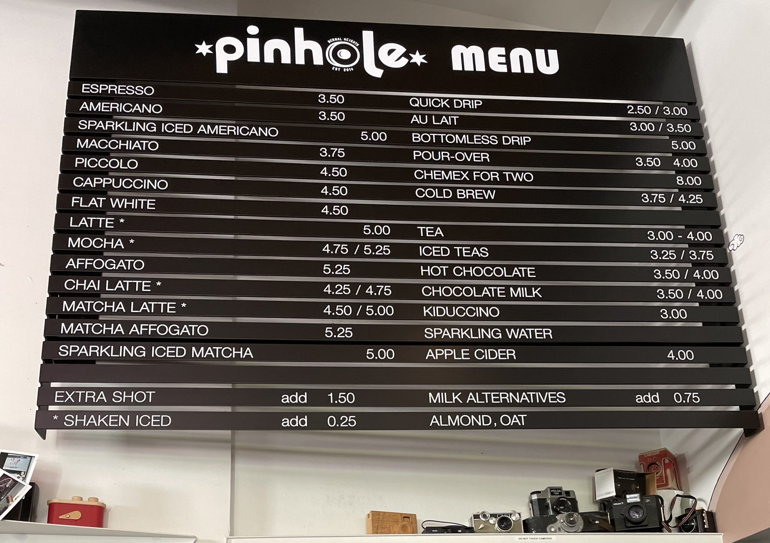
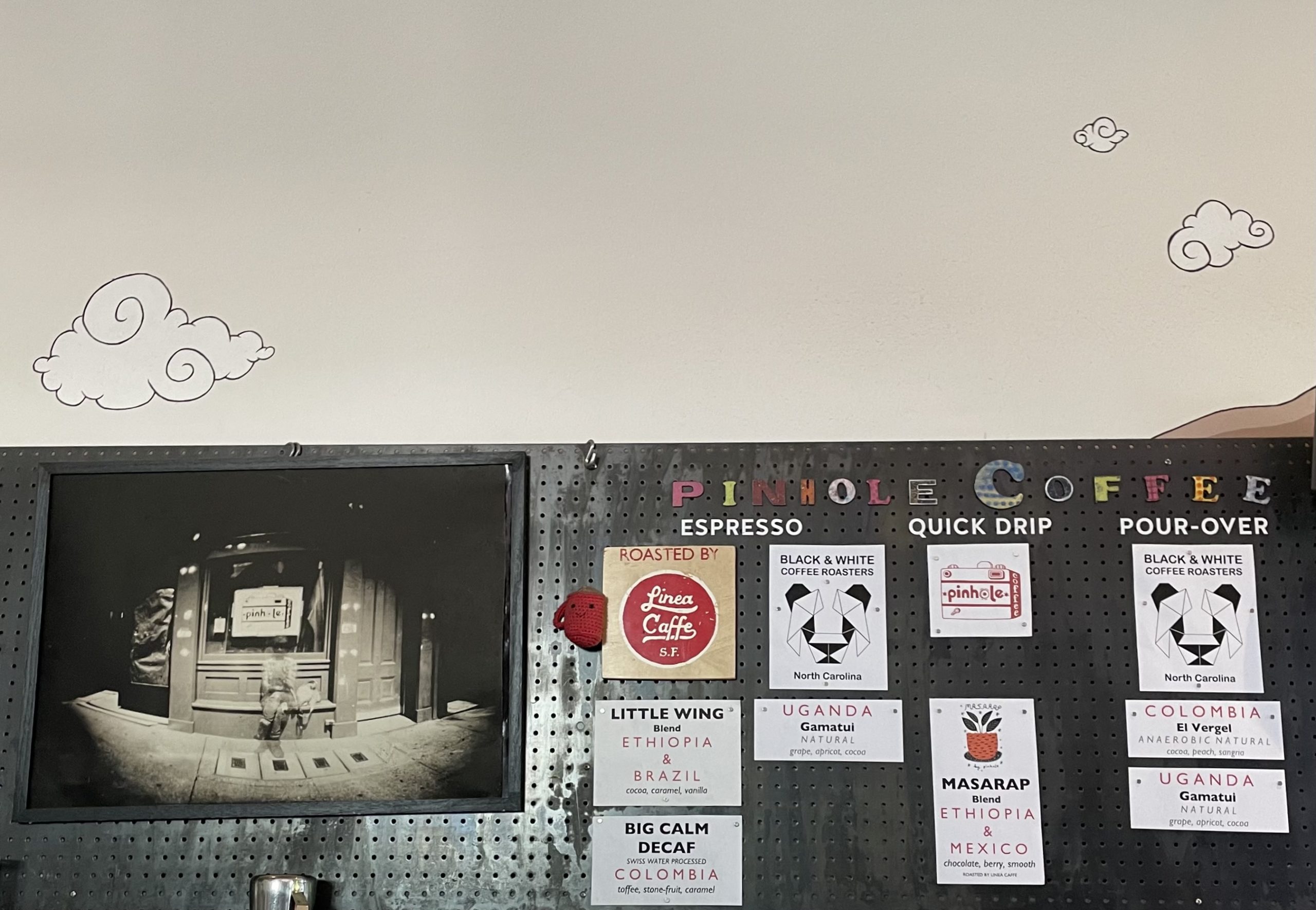
The magnetic menu that Pinhole Coffee in San Francisco has was a deliberate design decision. Owner JoEllen Depakakibo says, “We wanted a menu that we could change over time, knowing that industry pricing and options would change over time too.” Even the way it is angled towards the doorway was a conscious move because it “communicates a greeting in a way.”
The other menu features its multi-roaster offerings with limited options. “Being a parent now, it is reinforced to me to see how having limited options is good and gives ownership to a person,” says Depakakibo. “This parallels how we like to give coffee options for our customers in a controlled way. We want customers to have ownership of their coffee decisions but within our controlled menu.”
The Smart Menu
The smart menu is high-tech. It can be an LCD screen, which has been around for a while, but the newer ones are even more focused on the entire presentation.
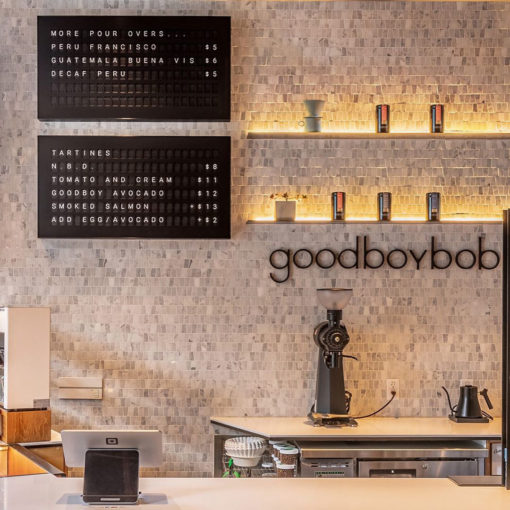
Vestaboard is reminiscent of the manually arranged letter menu but with a modern technology twist. Instead of using an LCD screen, the menu is made up of 132 split-flap “Bits” that displays a wide range of letters, colors, punctuation marks, and more. The display can be edited via an app and messages are able to be scheduled. Because production only just began, there are not many in the world but Coffeebar in Menlo Park, CA, and Well Coffee Co. in Peoria, AZ are two that have them in use.
The Future Menu
Even after all this research, I’m still surprised by the power of menus. One notes why no tips are accepted. Another tells you to sit down. And a third tells you that you don’t want a latte, you want espresso and milk.
It’s no secret that cafes have taken cues from the bar scene. Signature drinks are non-alcoholic cocktails. The same planning, focus, and care go into creating these drinks and they deserve more than a side note on a chalkboard sign. But menu designs today run the gamut of history, evoking and drawing inspiration from a broad synthesis of source materials from across hospitality. From intentionally simplistic to an all-encompassing selection, we wouldn’t be where we are today “without extreme changes to menus and service and the incumbent backlash,” observes Gilman.
What’s next for specialty coffee menus? If the trend continues to match the restaurant menu evolution, then we’re heading towards fine dining territory. “Just as in a fine-dining restaurant, where the product you pay for is not just the food on your plate but also the experience of service and ambiance, at the specialty-coffee outlet you may consider the edifying interaction part of what you’re buying,” concludes Pearlman. Of course, for this to happen, specialty cafes also need to change consumer perceptions of coffee, as well as the coffee experience. And that’s another menu entirely.
Jenn Chen (@thejennchen) is an Editor At Large at Sprudge Media Network. Read more Jenn Chen on Sprudge.