


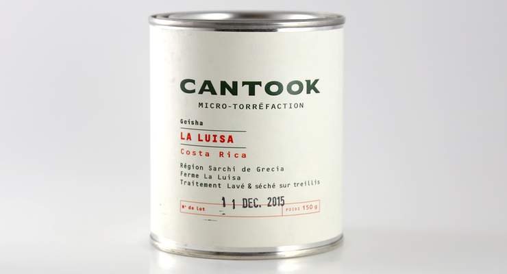
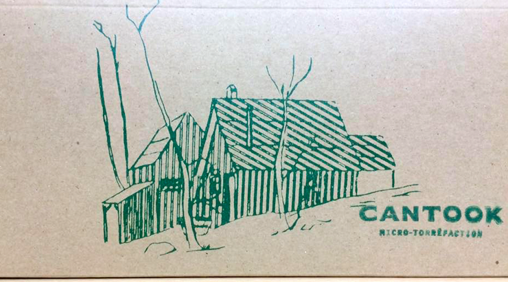
This week we feature cutting-edge Quebecois coffee design from Cantook Micro Torrefaction in Quebec City. Inspired by the North Woods lifestyle, Cantook have repurposed metal tins originally used to store maple syrup and turned them into a striking example of industrial coffee design. Stamped with crucial information for the home user—in glorious French, of course—these tins set a new high mark in our book for special edition coffee packaging. C’est bon!

As told to Sprudge by Simon Fabi.
Can you tell us a bit about yourself and your company?
My family has been in coffee since 1982. Our business on St-Jean Street has existed since 1998, and I’ve been the co-owner since 2005. Back then it was named “Brulerie de Cafe de Québec”. One year ago I decide to become more independent and change the name to something more significant for me and my craft. As I live in the mountains, 40km north of Quebec City, I was very inspired by images of the forest. The cantook is a lumberjack’s tool that helps move big logs.
The word is French in origin, and in English it means “can’t hook”—it’s kind of a phonetic play on words. So for me the word is a representation of the collaboration between native French and English settlers who form the foundation of Canada, a nation with a very deep relationship to ideas of lumbering, the northern forests, wild life, sugar shacks, as well as fishing and hunting. That tool represents the hard work, craft, and determination of our people. The idea is to share a part of our history with our craft. We also love the idea that like all that the cantook represents, every cup of coffee also represents a huge work, a lot of sacrifice, passion, and craft. It’s a tribute to women and men around the world who work for that.
We are an in-store roasting place where people come mostly to buy coffee beans. It’s also a small café where you can have espresso, pour-over, pastries, and a comfortable place for people from the neighborhood to come and sit. Our main mission is to serve coffee for every taste and preference with no judgment but in accordance to our philosophy and standards. We endorse an education mission through every day contact with customers, but also offer cupping sessions, espresso 101 classes, and latté art classes. Art is also something that we want to highlight, and we’re doing that by offering local artists space for exhibition and promotion, as well as by trying to valorize the barista’s work as an art form in and of itself.
We roast on a Diedrich IR-12, and use a Nuova Simonelli Aurelia II T3 espresso machine. We source green coffee from mostly Cafe Imports, NJ Douek and Ken Gabbay Coffee. We went to Guatemala last year to set up a direct-trade relationship, but it did not work due to some technical issues. This February, we’re heading to Costa Rica to establish a direct-trade relationship.
When did your coffee tin series design debut?
We started the tin series for Christmas, and we’ll make some periodically as special editions.
Who designed the packaging?
A friend named Marie-Joëlle Lemire. She works at Criterium Design as a graphic designer in Quebec City, and for us as a freelancer. She’s the girl behind all our graphic identity… we love her so much!
Please describe the look in your own words!
It looks simple and neat, rustic but refined, and made from noble materials. We hope that people can feel that it’s handcrafted and artisanal. The print of the sugar shack is a wink to invite people into our universe and history.
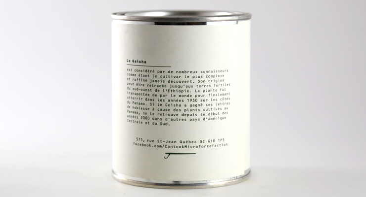
What coffee information do you share on the package? What’s the motivation behind that?
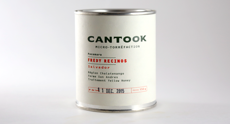
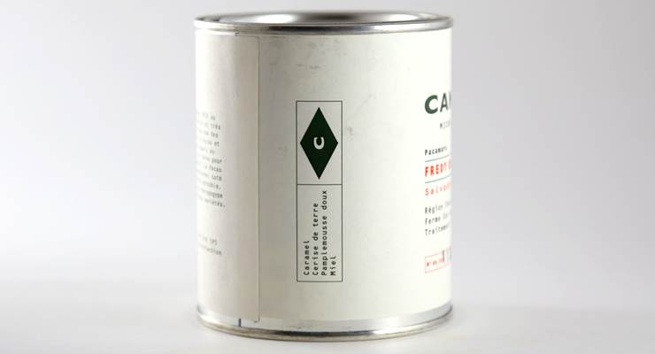
Because of the size of the tins, the problem was not which information to include but rather, what information should be leave out? We focus on varietals, processing, and geographical info because we think those are the most apt to teach and help someone to learn something easily. On the front there’s a kind of resumé for each coffee, and on the back there’s a more explicit explanation about the varietal or process depending on which aspect are more revealing for each coffee. We also include info like country or origin, region, and name of the farm for traceability considerations. The roast date is definitely on there, and finally, we do include a few cupping notes to guide the customer in their tasting experience. Our overall goal is to help people learn, give people the ability to really discover these coffees, and pay tribute to the producer and the product.
Where is the tin/label manufactured?
I was browsing for sugar shack equipment and I saw these tins and cardboard boxes, so the idea of a tasting set just popped in my mind. These tins are usually used for packing maple syrup, and were sold to us by H.E. Cantin of Saint-Augustin.
Are the tins recyclable? Any other pro-environment info about the package you want to share?
The tins are reusable and recyclable, and the box each tin comes in is compostable.
Is this product available online?
Damn, no! Not yet. We’re working on our website. Until then, if someone wants our product, please contact us on Facebook and we’ll manage something.
Coffee Design is a feature series by Zachary Carlsen on Sprudge. Read more Coffee Design here.