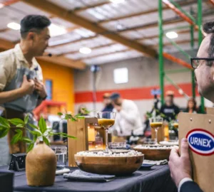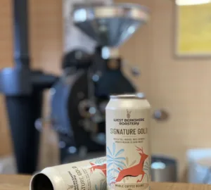


If you spend any time in North American specialty cafes, it’s quite likely that you’ve been served a drink in one of notNeutral’s striking ceramic cups. But did you know that notNeutral is a division of the renowned Los Angeles architecture firm Rios Clementi Hale Studios, and that their signature coffee cups are the result of an intensive design process, developed over hundreds of 3D-printed iterations with baristas from Intelligentsia Coffee?
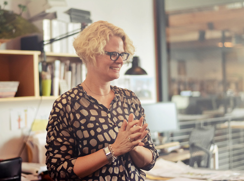
We had a chance to talk with Julie Smith-Clementi, president and CEO of notNeutral, Rios Clementi Hale Principal and Architect Frank Clementi, and Director of Coffee Sales, Hannah Block, and find out more about how the coffee program initially came about in collaboration with our friends and partners at Intelligentsia, the importance of handles, the challenges of working with ceramics, and what Frank Clementi learned in Italy designing a cup for Illy.
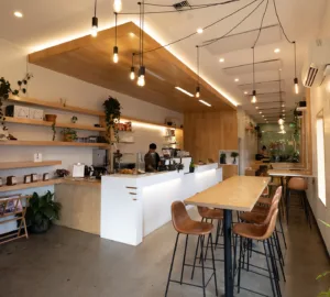
You can find notNeutral wares at their new Pasadena store, opening this Friday, July 18th in the One Colorado complex. The store is their third retail venture, and according to notNeutral, the “1,000-square-foot shop will stock the brand’s colorful rugs, home furnishings, eye-popping dinnerware, stylish textiles and more affordable home decor.”
How did the relationship with Intelligentsia originally begin?
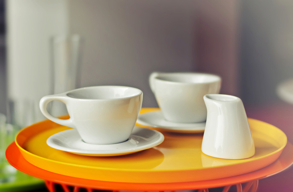
Julie Smith-Clementi: We had an espresso set that was part of our regular line of dishes that was stacked four cups high. Intelligentsia used to sell those in their stores in Chicago. When they came out here and opened in Silver Lake with plans to expand, they thought they should have their own cup. They contacted us. Intelligentsia wanted an iconic cup and a highly functional cup. My husband Frank worked in Italy for Matteo Thun who designed the cup for Illy. From beginning to end the design process through an approved prototype ready to go into production was about 18 months.
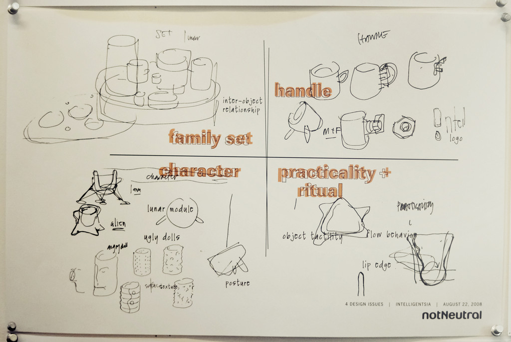
We knew at the beginning we wanted the cups to read as a family. Kyle Glanville was the one who said they should be cousins, not brothers and sisters. They should be related but not exactly the same. The mug is a really strong cup. It is different than the daintiness of the espresso.
Now you have a few series of coffee cups?
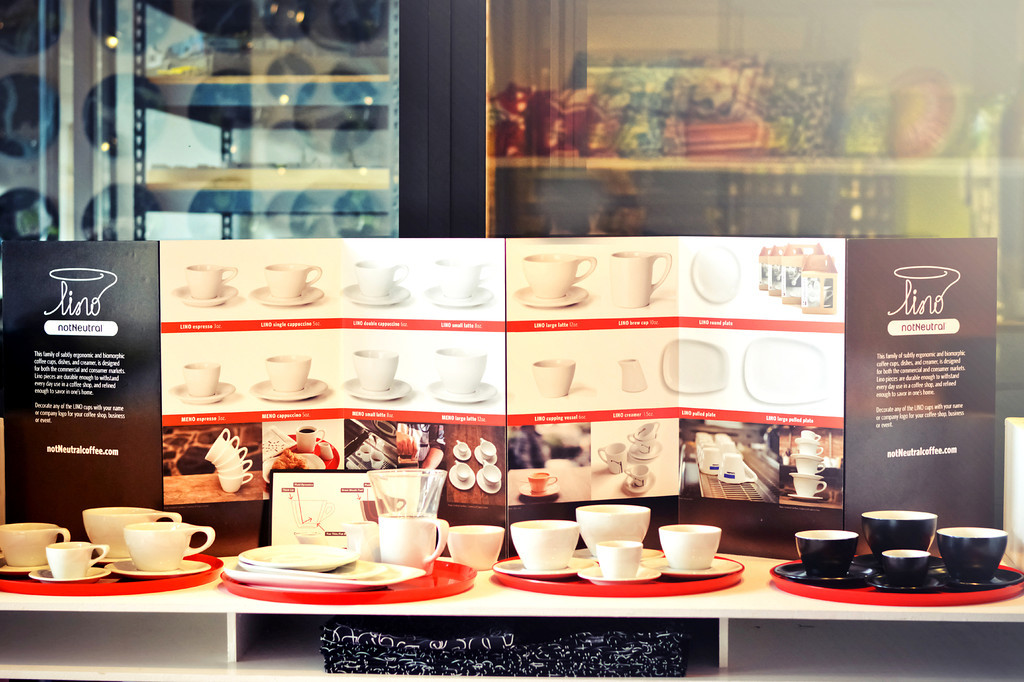
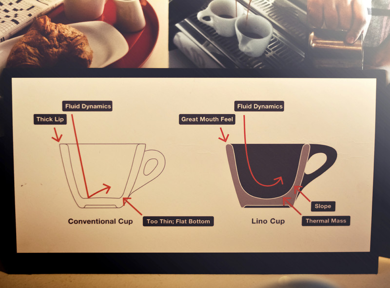
JSC: We have the Lino, the Meno, and the Gino (the glass items). And soon, Fina will be the fine dining line, the cup we designed for Canlis in Seattle.
How many of these cups have you made?
JSC: We’ve done about 50 branded cups. We are at almost a quarter million total cups sold since the beginning. They are made from high-fire porcelain with clear glaze. We have had really good luck with them from a durability standpoint. We’ve modified things over time.
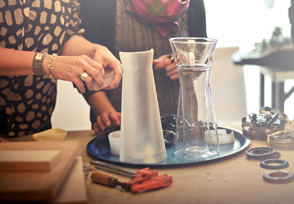

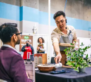
Tell me a little about the Gino dripper and its recent US Brewers’ Cup success.
JSC: We made double-wall glass, eliminating the need for a handle. It complements the design of the mugs and is made to look like they go together. With the carafe you can make two cup and keep it warm. If you are a restaurant you can make it and serve it.
Hannah Block: Todd Goldsworthy and I knew each other before I started working here. We have been collaborating on sponsoring the LA TNT this year. I think he read about the dripper on Cool Hunting and asked me about them. We sent him a couple to experiment with. He and the team at Klatch tested them with various coffee and with other brewers and in blind taste tests they opted to compete with the Gino. And then he won.
Hannah, how has your experience been so far working here at notNeutral?
HB: Working with architects is not entirely different than being around baristas–the level of precision, obsession, and focus on details. Just from a different angle. I worked for Yeekai Lim at Cognoscenti for about a year, he also happens to be an architect. Working there gave me a lot of knowledge about preparing coffee. It gave me hands-on experience to backup what we do here.
Frank, tell us, how did your experience with Illy influence the notNeutral cups?
Frank Clementi: I was just starting out in architecture. I wanted to go to Italy to see what else I could get into. At Memphis they were doing architecture and product design. An architect would normally not have gotten this background. I happened to be in Milan when they were doing a whole lot of ceramic exploration. I was really lucky to get that experience–it was a great opportunity. When I was working for Matteo Thun we were asked to do a graphic cup for Illy. Espresso is a very small volume of liquid. The thing that distinguishes one brand from another is usually the shape of the handle.
What did you learn in Italy about ceramic design?
FC: We had done a product for a porcelain company called Arzberg. We had prototypes delivered to the studio and all of these executives from this century-old family earthenware and fine porcelain company. We were sitting around a conference table and Matteo said, why don’t we get the new pourer and cups to try it. I was just starting out. We had never tested it. The parabolic shape in the bottom of the cup launched the coffee onto everybody’s shirts.
It was a moment in design in the ’80s where you literally tried everything. That’s why I wanted to work at Memphis. The character of the handle was as important as the shape of the bowl. They were saying we haven’t tried all of these things so let’s try them. It was really liberating.

Why is handle shape so important?
FC: One of the drawings we did when we started working for Intelligentsia was to understand that espresso comes at the end of a meal. At Illy, the handle is shaped like a tiny little donut. That was a Matteo Thun fetish at the time. We were putting circles for handles on everything. It became very iconographic partly because of the opportunity to put pattern on such a simple cylinder of a cup.
How does the design process now differ from your experience in Italy?
FC: In Italy at that time, we would draw something and six weeks later get prototypes from the ceramicist. Now in California there is a do-it-yourself attitude, so prototyping and model-making has been part of our identity as architects. 3D printing is great for products and hand-held objects. We were changing the shape so frequently. To do sixty to a hundred prototypes would have taken fifteen years in the 80s. Pretty much every other day we were sending a cup over to Intelligentsia and they were testing it. We were able to move quickly into the perfect proportion, shape, and mass to have maximum utility and maximum character.
When in the process did you realize the shape of the inside of the cup for espresso and milk-based drink was so important?
FC: We were playing around with a triangular form and the idea that your nose has more to do with taste than you tongue. So to get the olfactory aspect of the espresso Kyle Glanville knew that the aromatics coming off of the espresso contribute to your sense of taste. The problem with most espresso cups is when you make them small enough to thermally contain the espresso, you can’t get your nose into the cup, which is why those Riedel glass for wine works so well. We made a triangular shape cup small enough for espresso but shaped for the nose to fit. Then they took it and swirled it one rotation on a flat surface. The triangular cup, bringing back memories of Italy, ejected the coffee.
When we were working on the cappuccino cups they would do test pours and send us DVDs. It was really funny at one point they sent one of Nicely Alameda slow-motion pouring milk with Notorious B.I.G. as the soundtrack. We sent them one prototype with B.I.G. on the bottom. It was a lot of fun to work with them.
How important is the coffee line to notNeutral and Rios Clementi Hale Studios?
FC: For me it is huge. For a long time we were only able to do patterns onto housewares. Part of the reason, the Italy experience for me is a huge part of how I became who I am, was realizing design was not just buildings. It occurred to me when I was teaching a class that there is a connection between food and architecture. I don’t know what it is. Then I realized the meal is the part where the environment enters you. For the most part we exist in the environment. The meal in the environment comes into you. You can sense things with your lips that your fingers can’t sense the difference and your eyes can’t see. The precision of that is really interesting. We got into that when we were making plates for Hans Rockenwagner. After the experience at Memphis, it’s all part of one continuum. It’s not different.
To do these espresso cups was huge. We were able to do the shape with people who knew what they were doing. They are super open-minded. That’s what it takes to design. You need to be open-minded. You need to find the inspirations where you are not looking for them. It took about 18 months to design the cups—about ¼ the time it takes to do a building. Architects are pretty patient. Grand Park took seven years.

Julie Wolfson is a Sprudge.com staff writer based in Los Angeles. Read more Julie Wolfson on Sprudge.
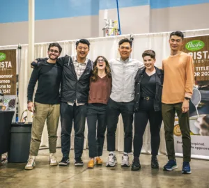
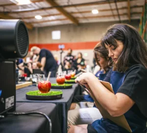
All photos by Amparo Rios.